
Recommandé
Contenu connexe
Tendances
Tendances (19)
En vedette
En vedette (20)
Similaire à Film poster deconstruction
Similaire à Film poster deconstruction (20)
Dernier
Dernier (20)
Film poster deconstruction
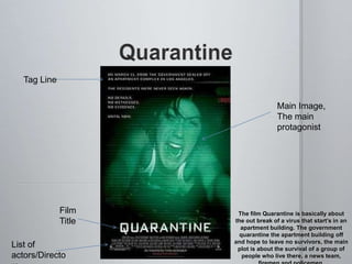
- 1. Tag Line Main Image, The main protagonist Film The film Quarantine is basically about Title the out break of a virus that start’s in an apartment building. The government quarantine the apartment building off and hope to leave no survivors, the main List of plot is about the survival of a group of actors/Directo people who live there, a news team,
- 2. The Film title has been given blocked white text, this is to match the theme of the poster construction which appears to be viewed through the screen of a video camera so the film title looks like one of the menu/setting buttons on a camera menu. The choice of font and color is important in this kind of poster construction because it has a theme, it is aimed to be seen as a video camera because it plays a big part in the plot itself. The block font and white color differs largely from other horror film titles therefore it is implying that there is something unnatural and creepy in this film.
- 3. This tag line is longer than usual, this is because it gives further hints to the plot. The text is blocked and basic because similarly to the mast head, it appears to be on a video camera’s screen. It reveals that the film is aimed to appear as footage from a camera man. The sentences are kept short and snappy to match the pace of the trailer.
- 4. The main image is constructed to have the actor having a fearful expression as if she is screaming. This creates an enigma as the people looking at it begin to wonder what is happening to her therefore are drawn into going to watch it. From the positioning of her body it looks like she is lay on the floor and is being dragged by something (namely the antagonist). This actor was used because she is probably the main protagonist so the audience get an idea of who they’re going to see and are able to make a preconception as to what the film will be like and get enjoyment out of either being right or wrong about it. The colour’s and effects used in this trailer to make the audience automatically think that the film will be seen through one of the characters video camera’s, perhaps that this film is about the
- 5. The list of Directors/Actors differs slightly from the overall style of the poster other than the white text. The font style is the typical small and bunched up type you tend to get on movie posters, this is so people looking at the poster immediately know what the text on the bottom is about and are therefore drawn into it. It’s Important that the audience sees the list of actors or directors because there may be a unique selling point within that list, like an audience’s favorite actor or their knowledge that the main director of the film has produced good films in the past
- 6. Main Image (Main Character) Film Title List of Directors/Actors
- 7. The film title for Mirrors is in plain white font which suggests this film is more of a psychological horror/thriller as oppose to one that causes fear through sheer violence and gore. It’s also in a smart styled font which adds mystery into the film because it get’s viewers wondering why it’s not in a common red horror font. Generally, the colour red represent’s blood in horror film titles so having the film title “clean” implies that the horror is of a nightmare type, either that or it’s to trick viewers into thinking that. The fact the second “R” in the title is reversed implies that this film is largely based around the reflection of mirrors as oppose to something in the real world which further creates an enigma in the viewers mind.
- 8. This main image is composed of a close up of one of the characters in the plot (probably the protagonist) because it shows viewers the expression of the character which in this particular poster looks to be fear and the fact that the mirror is cracked creates enigma because people will wonder why it’s cracked and why is the character bloody and bruised. The fact that it looks like the character is being viewed through a mirror gives further implications that the plot is based around the reflections of characters in the mirrors as oppose to a completely different antagonist.
- 9. Similarly with Quarantine, the font of the list of directors/actors does not match the overall style of the rest of the poster (other than the colour), this is to show the significance of the actor names as well as further advertising a unique selling point. Also, “Kiefer Sutherland” has his name above the film title, this is because he looks to be the main character of the film and he is also a well known producer and director so his name has big significance in the film because he will have contributed to it’s production in nearly aspect, creating an extra selling point.