
Recommandé
Contenu connexe
Dernier
Dernier (20)
En vedette
En vedette (20)
Digipak analysis (rihanna)
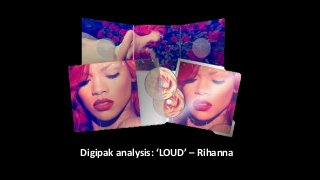
- 1. Digipak analysis: ‘LOUD’ – Rihanna
- 2. A close up shot of the artist is used to catch the audience’s attention. It also follows Goodwin’s theory as close ups create a relationship between the viewer and artist. The viewer also looks for features that attract them. The contrast between her tanned skin tone and red lips and hair create a flawless eye-catching effect. The red lips, hair and blushed cheeks effectively follow Laura Mulvey’s ‘male gaze theory’, as does the bare shoulders connoting nudity and seductiveness. The striking colours relate well to the title ‘Loud’. Rihanna is shown looking down, not making direst address with the audience suggesting shyness and innocence. Her lips are seductively slightly open, but also the key signifier of the image because by using the rule of thirds we are attracted to them, because they are bold, large and central. This also gives the viewer a guide of how to view the cover, because we initially drawn to Rihanna’s lips but because they are facing down, as are her eyes, we automatically look down which is where the title is placed allowing us to be drawn to it by the main image. The purity of the image is challenged by the visible tattoo shown on her neck which emphasises her as an R&B artist, relating the image to the genre of her music. It juxtaposes the stereotypical conventions of an R&B artists CD which Rihanna has done in the past as women associated with R&B are usually portrayed as ‘sexy’, with minimal clothing showing themselves as an object of desire. Even though Rihanna is associated with R&B, she goes against these conventions to create a purer image that reflects the more innocent side of the love theme than the usual sexual objectifying of the female artist.
- 3. The digipak appears to convey a visual narrative, as the inside album artwork suggests a fairy-tale inspired setting showing that the CD may be a story about love as the rose on the CD is an iconic symbol of love and romance. Nonetheless some of the tracks and lyrics on the album are not as ‘innocent’ as portrayed through the visuals on the digipak. Although the majority of the songs do relate to some aspect of love. Roses are iconically used within this digipak, featuring on the inside artwork as well as the CD image. The symbolism of the rose connotes love and innocence simultaneously, as well as relating to the love theme of the CD tracks such as ‘Complicated’ The danger connotation of the colour red can also relate to the risky love themed songs such as S&M. In the song ‘California King Bed’ the artist creates love imagery using the lyrics, ‘inside of a rose’ – showing the connection between the flower and love. On the inside of the digipak, Rihanna is shown lying on a bed of red roses. This conveys a storybook vibe as she appears in a dreamlike state. The princess inspired dress shows Rihanna as innocent – as if a fairy-tale, with the roses conveying love in the artist’s life. The contrasts with the CDs R&B genre as it is more stereotypically representative of the indie genre. The main imagery used on the on the front cover is shown to be taken within a studio, using high key lighting to capture the artist’s facial features in the most effective way, making her look more aesthetically pleasing. This technique of studio lighting creates strong shadows around the artist’s face, which emphasises the focus on her face and make-up. Both the CD artwork and back image follow the red theme, with a pink hazy filter which releases the R&B artist’s feminine side.
- 4. There is a strong use of the colours red within this digipak which is a strongly emotional colour connoting love and possibly danger. This could be relating to the emotional songs featured on the CD. The artist is also shown in a white dress, connoting innocence which relates which follows the fairy-tale theme. The vibrant colours relate well to the title of the album, ‘Loud’ because the boldness of the red is striking and eye-catching to the audience. There is also a hazy filter and the colour balance has been altered to become pinker which also enhances the reds. The font used to write the album name ‘Loud’ is very simple, thin, elegant looking. The letters are very spaced out allowing not attention to be diverted from the close up image of the artist. The spacing of the letters appears to follow the ‘loud’ theme because the title is a statement in itself by being so spaced out. However, the title superimposes the image but is translucent meaning that it isn’t the first thing to attract our eye. It’s rather discreet but if we follow the layout of the cover then we are drawn to it. This digipak is effective because it’s appealing to the female audience because of the feminine colours and representation of the artist. Young females aspire to be like the artist and live her supposedly ‘perfect’ lifestyle. They also enjoy the female power of the songs and independence of the artist. Whereas, young men and teenage boys find her attractive and sexually appealing therefore they desire to be with her.