
Recommandé
Contenu connexe
Tendances
Tendances (20)
Similaire à Mika webiste
Similaire à Mika webiste (20)
Plus de 12cbrannan
Dernier
Dernier (20)
Mika webiste
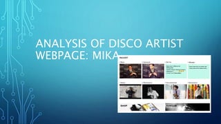
- 1. ANALYSIS OF DISCO ARTIST WEBPAGE: MIKA
- 2. HOMEPAGE The initial home page features a drop down box to other linked pages relating to Mika. The initial imagery is the same fun cartoonlike aesthetic featured on all of Mika’s albums, this reoccurring theme helps the audiences associate the genre of disco/pop to the artists light hearted nature. There is also the links below to the most recent posts related to the artist, displaying to the audiences how recently active the artist has been. The colour scheme remains bright and contrasting to fit with the disco genre. Also the main blog is in the centre of the page with a pale blue background which feels a little bland but changes dependent on which link the audiences takes, bringing a intruging visual contrast between page links.
- 3. Six videos on a loop that run on the homepage. Giving audiences instant access to mika videos available to stream online.
- 4. News link- latest mika news, giving audiences access to latest updates from the artist, making them feel connected and involved in the artists success.
- 5. Biography page, created on the basis that many new fans will discover the artists work and will need a blog type update on the artist so far. Social media links are featured on all the pages for ease of access for the audience.
- 6. Albums link from the homepage: again contrasting colour from the other linked pages. Reoccurring image/typeface of the artists name to ensure audiences have a style (in this case cartoon) to associate the artist with.
- 7. Photo albums of the artist, giving the audiences more than just the artists music. This adds relatability to ’mika’ insinuating to audiences that the artist is still a person adding to his relateabiltiy factor.
- 8. World Map of concerts set for the year. This not only displays how globely appreciated ‘Mika’ is but involves a worldwide fan base into the artists busy lifestyle. This is not a common convention of artists websites in general, however I believe that it gives the website an level of interactivity with the audience, therefore a global map will come under consideration for my web page.
- 9. The store page is the only link on the webpage that doesn’t fit the general aesthetic of the rest of the website. However this is not an uncommon feature of music artist webpages, thus will be something to consider when
- 10. The most common convention that the website has is the option to subscribe and become more connected to the artist via email. However, the Mika website gives the option to sign in with a variety of other website accounts, connecting all of the audiences social media to the artist.