
Recommandé
Contenu connexe
Tendances
Tendances (19)
En vedette
En vedette (16)
Similaire à Eval q 1
Similaire à Eval q 1 (20)
Dernier
Dernier (20)
Eval q 1
- 2. Front cover - Use I mostly based my magazine on NME magazine, but I also incorporated some of my own elements. I used the same shot type as NME magazine, a mid shot. Most indie magazines have an indie artist looking cool on the front cover, so I chose to go with the same sort of thing. My model doesn’t really show any emotion on the front cover. Just like on the NME magazine. I did the same sort of thing with the head line, I made it a lot bigger and in a different font. It also goes right across the main image. I used a little circle with some persuasive text in it, this would stand out because it’s red and draw people in
- 3. Front cover - Develop Even though I got inspiration form the NME magazine there are some things I developed. A thing I had to develop for my magazine is my masthead, the NME used a solid colour where as mine looks eroded and more street. I also used a solid colour on my background where as the other uses 2 different colours. Another thing I had to develop on my magazine was the headlines, on the NME magazine the headlines are dominated by the biggest one, but on my magazine I spaced them out more. I felt that it looked claustrophobic with everything so close together. I had to develop the lighting on my photo, I took the photo in a studio where as the NME was taken out side, I chose to take my photo inside to make it darker and fit in with the rest of the magazine.
- 4. Front cover - Challenge I changed my barcode, I put the price on the side and I added a website above so people could contact the magazine. I didn’t use a selling line on my magazine, I added a red line, because it goes well with the colours on my magazine and it makes the masthead stand out. My front cover also challenged some of the things that the other magazine does. I used many different fonts on my front cover, where as NME just used one. I also used a bands logo when talking about them.
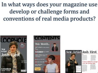
- 5. Contents Page - Use Both magazines use little graphical images to inform you of something special on a certain page. My contents page looks very different to the NME one, this is because I thought there was too much going on, however I did get some inspiration from it. I put all my information into a list, this is what NME did, but the categorised more. I also like the colour scheme so I decide to make all my page number red, this also made them stand out more. I used my masthead logo on my contents page, I noticed that the NME magazine also did this, I think it stands out and improves the over all look of the page.
- 6. Contents Page - Develop I developed on some things from the NME magazine. One of the things I developed on is the layout. NME has a very close together lay out, where as on my magazine I went with a more spacious layout. I also didn’t feature as much as the NME magazine. I used a page number on my contents page, NME didn't. I used 2 photos on my contents page, NME only used one, however they featured more content than me.
- 7. Contents Page – Challenge There are a few ways in which my magazine is challenges the other one because they are two very different content pages One big difference between the magazines is the background, my contents page uses the same background as my front cover, NME use a white background with lots of text. I also included the red line from my front cover because it works here again and gives me a house style. A massive difference is the pictures, as I’ve said I used 2 pictures, one uses a background and one doesn’t. The bottom picture has a brick wall background what looks like it’s fading but the NME one just has a solid background.
- 8. Double Page Spread - Use In my double page spread I started my article with a large first letter in a different font, the other double page spread did this. However they had a bigger letter which stood out more. Both double page spreads have the image on the left, they are both also mid shots. I took inspiration for my double page spared from the magazine on the left. The 2 double page spreads both have large titles which change colour.
- 9. Double Page Spread - Develop Both of these double page spreads are quite similar, however I have developed a few things on mine. One of the things I developed on my magazine in the background, I used the same background as my front cover and contents page to keep the house style. I also developed the story on my double page spread, I made the quote in the middle large and didn’t use that much writing. The other double page spread has 2 images where as mine only has one, I felt that the large picture on the left was enough so I didn’t add another.
- 10. Double Page Spread - Challenge I have used page numbers on my double page spread, where as the other one doesn’t use any. Another difference is the colour scheme of the pages, I have gone with a black, white and red. The other magazine is quite orange looking. I have split my story up into four different sections, and only used one large letter. The other magazine isn’t clearly sectioned and I uses 2 big letters. I used a text box on my double page spared, the other one has some writing but it’s not as clear as mine.