
Recommandé
Contenu connexe
Plus de AlixKelly
Plus de AlixKelly (20)
Ancillary research 1 (1)
- 1. Alix Kelly Ancillary Task Research Ancillary Research- Billboards Masthead design Position of text and images Guttenberg Principle The mast head design is short and catchy, using a pun to make the audience look at the billboard. The masthead from the newspaper is bold and has a contrast by using white on top of red. Using these colours helps to create and brand awareness and the audience will recognise and remember the logo as it stands out from the black text. The box style in the masthead helps to separate the mast head fro the rest of the text in the billboard so that it stands out more to the audience. As “The Sun” has a target audience of middle/working class men and woman the masthead design is basic and doesn’t use any special features or dramatic colours to aim towards a higher target audience. In terms of the position of the text, it is centred in the middle of the billboard and spread across the bottom to help the text become bolder and eye catching towards the audience. The text has bigger spaces between each toward in order to help make the billboard seem bigger and more important. As the text is centred in the billboard, the audience are more likely to notice the text. The image is placed to the right of the billboard as that is the axis of orientation in which the audience will read it. In terms of the Guttenberg principle, this billboard has filled in the weak fallow area and follows the reading gravity by filling in more space in the bottom line in order to make the billboard stand out to the audience. The terminal area has a strong ending as it has been used. The primary optical area hasn’t really been used as the text is more focused in the strong fallow area in which the audience is more likely to read. The use of the different spaces helps to create an easy flow from one area to the next. Typography design In terms of the typography design, the billboard has used bold font to help the text stand out towards the audience and also creates a mature look for the logo. The spaces between each word are consistent and make the words seem short and snappy to give the audience and quick idea of what the aim of the billboard is. The leading of the lines is are close together to make the billboard look punctual and informative towards the audience. The font in the logo is slanted which could suggest the newspaper also aims towards a younger audience as well or focuses on articles that are for a younger and older audience. It also targets towards the middle/working class target audience of the newspaper. The text is in lower case which can be a sign of immaturity, as this magazine focuses on providing information on celebrity showbiz for woman and a page 3 section for men. Colour Schemes Rule of Thirds In terms of rule of thirds, this billboard has put their logo in a centre of intersecting lines on the left to bring the audiences attention to the colours and position of the logo. The text lies in the centre of lines and spreads across most of the lines to help make the most of the space but also fill the most important spaces. In terms of the colour scheme, this billboard has used black, white and red to create a contrast and to make the text stands out. The colours are very sophisticated and stand out to the audience. These colours are clearly targeted at a mature audience. The white background helps to bring out the black text. Using red brings more colours to the billboard but keeps a bold look to the billboard.
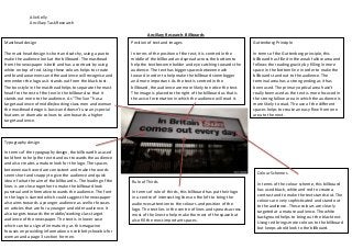
- 2. Alix Kelly Ancillary Task Research Masthead design Position of text and images Guttenberg principle The masthead design of this particular billboard is bold, strong and sophisticated. The name indicates who the newspaper is aimed at and what their objective is to do. The black colour against the yellow creates a vibrant contrast to help make the masthead stand out more to the audience. As the demographic for the newspaper is people who work full time and are under the age of 65, we can see that the masthead is aimed to stand out and inform the readers of what will be happening in the area and across the country. As this paper is delivered every day, we can see that it will get used by people who are going to be at work and wanting to keep up with the news. In terms of the positioning of text, the masthead is quite a contrast with image as it is black and stands against the yellow background. Placing it at the bottom of the billboard helps it to become apparent to the audience. The image used above the masthead is unusual and is centred above the masthead to help catch the attention of the audience. In terms of the Guttenberg principle, this billboard has placed the masthead in the weak fallow area to help increase the sight of the audience and what they will see. The image is spread across the strong fallow area and also part of the primary optical area. Because of the way in which the image flows across the billboard, it helps to direct the audience to the most important part, i.e. the masthead. As there is nothing in the terminal area, this helps to focus the attention of the audience to the centre of the billboard. The use of the dandelion helps to bring a distinctive image upon the audience and links to the make a wish foundation, as you are supposed to make a wish when you blow the flower. Typography design In terms of the typography design in this billboard, the masthead has used a bold yet traditional typeface which helps make the billboard look professional and sophisticated. This helps to attract the target audience of middle class working people. The use of sans serif with no underline or italics helps to create a more mature approach to the billboard as it stands bold and dramatic. This links to the principle of the newspaper which is to inform their audience of news in the local Manchester area and across the country. As the “wish” is written in a more younger font, it helps to create an innocent appeal for the charity which is the ‘Make a Wish’ foundation. Colour Schemes Rule of thirds In terms of the rule of thirds, the masthead is based on a line which follows how the reader will look at the billboard. The image crosses on two intersecting lines which help to bring the audience’s attention to the billboard. The masthead also lies on an intersecting line as this is where the audience will need to look in order to be aware of what the billboard is about. In terms of the colour, the yellow background brings a dramatic contrast from the black and white colour of the text and image. The bold black colour on the masthead creates a sophisticated approach on the newspaper. This helps to aim the newspaper to an older and more mature audience. Yellow is symbolic for happy, which links to the word “wish” which is used in the billboard. This creates a continuous professional effect to the billboard. The white colour can symbolise pure and innocence, this links to the make a wish charity that the newspaper is sponsoring which is aimed at young and terminally ill children.
- 3. Alix Kelly Ancillary Task Research Masthead design Position of text and images Guttenberg Principle In terms of the masthead design, the independent has used a formal, bold title to catch the attention of the audience. As the target audience for this newspaper, is middle class working families with a healthy salary, we can see that the masthead looks professional and sophisticated. Using black colours for the text makes it aimed at male and female audiences. Black is a mature colour and helps to catch the older audience’s attention. The word “independent” links to an older audience. In terms of the position of text, the main story is placed from the left to the centre of the billboard which helps to catch the audience’s attention. The masthead is placed in the bottom right hand corner and is easily recognisable from the design of the text and the image. In terms of the Guttenberg principle, the billboard has used the primary optical area to catch the audie3nces attention. The text is black and against a pale blue background so it helps to create and build a contrast. In the terminal area, the masthead has been placed so that the audience finish reading the billboard knowing who it is about. The weak fallow area has not been used, but the strong fallow area has so the audience will notice the billboard more because the text is centred in the middle of the billboard. Typography design Colour Schemes In terms of the typography design, the independent has used a bold and dramatic text to grab the audience attention. As it says “You” this directly involves the audience and helps to keep their attention. The independent have used a professional and sophisticated text to approach their target audience. The story is based on an article that is written in the newspaper. The short, catchy title lures the audience in and is directly aimed at them. People who read the newspaper will recognise the story and buy the newspaper, as it usually includes articles based on politics and the public. The design of the main text is like a headline from a newspaper which creates continuous approach. Rule of thirds In terms of the rule of thirds, the masthead is placed on two intersecting lines in order to catch the audiences’ attention. The main storyline is placed across the lines where the audience are most likely to read it. This helps to create a professional look and keep the audience attention on the billboard. When looking at the c colour scheme, we can see that the main colour in this billboard used it black. Black is a symbolic colour for dramatic bold experiences. This links to the purpose of the newspaper which is to inform the reader of regular news happening across the country. Generally aimed in the political area. There is also a pale blue back ground used to help create a contrast and bring forward the black text. The colours used at the top of the bold black text brings a sense of trademark, i.e. people who reads the independent will recognise the effect.