
Recommandé
Contenu connexe
Tendances
Tendances (20)
En vedette
En vedette (14)
Similaire à 11.Magazine Front Cover Overview
Similaire à 11.Magazine Front Cover Overview (20)
Plus de Bradley22
Plus de Bradley22 (12)
Dernier
Dernier (20)
11.Magazine Front Cover Overview
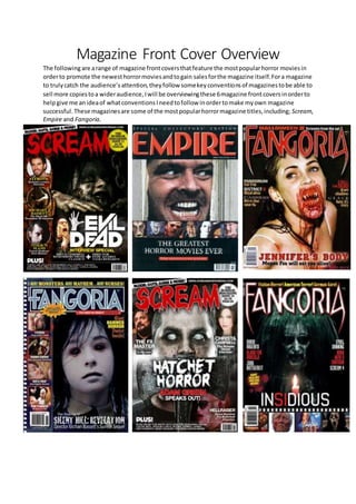
- 1. Magazine Front Cover Overview The followingare arange of magazine frontcoversthatfeature the mostpopularhorror moviesin orderto promote the newesthorrormoviesandtogain salesforthe magazine itself.Fora magazine to trulycatch the audience’sattention,theyfollow somekeyconventionsof magazinestobe able to sell more copiestoa wideraudience,Iwill be overviewingthese 6magazine frontcoversinorderto helpgive me anideaof whatconventionsIneedtofollow inordertomake myown magazine successful.These magazinesare some of the mostpopularhorrormagazine titles,including; Scream, Empire and Fangoria.
- 2. All of these six magazine frontcoversconform tothe mainconventionsof amagazine inthe waythat the mastheadisatthe topof the coverand the main image isthe backgroundandfillsthe wholefront cover so that the audience canrecognise whatfilmthe magazine ispromoting.The mastheadisalso alwaysthe largesttextonthe page,of whichall of the magazinesconformto,andthisistoattract the audience’sattentionsothattheycanfindtheirfavourite magazine amongstthe restof the magazines on show.In additionto this,the mastheadisthe largestbecause an audience mustnotice the brand identity of the magazine so they can continue to purchase these magazinesin future issues and see the symbiotic link between all of the issues. As well as the conventions mentioned, there are many others that are conformed to by these magazines.All themagazinesfeaturethe antagonistonthe frontcoverand fillthe wholebackground, thisisthe entice the audience tomake theminterestedaboutthe filmthatisbeingpromotedinorder to persuade them to go and watch the film or even just the trailer. Horror magazines often use the antagonistto make the filmmore appealingtothe audience,because horrorfilmsare made to scare the audience,soinorder to promote the filmwell,the magazine mustbe able to scare the audience withimagessothe audience willknowthattheirneedswill be fulfillediftheygo andwatchthe movie. For example,the 6th magazine frontcover, Fangoria;promotingInsidious,featuresthe antagonistof the movie whichthe spiritislitwithprofilelightingwhichenablestheaudience tosee thespiritwithin the darkness that surrounds it, this will scare audiences. Once again, like the postersthatI overviewed,mostof the magazinesfeature heavilyonthe colours; red,blackand white andthisisbecause these are the commoncoloursthat feature inhorrormovies. However only one of the magazines use direct address which I thought was a strong convention to have to entice the audience. Fangoria’s magazine that promotes Jenifer’s Body, has a tagline under the title of the filmname that says“Megan Fox will eatyoualive!”andthisis a greatway to promote whatthe narrative andtype of sub-genre thishorrorfilmis.Italsogetsacrosstothe audience of who the antagonist actually is, in this case Megan Fox. Furthermore,all ofthe magazinesfeature askyline.Howeveronlyfive out of thesixmagazinesfeature imagesfromothermovie titlesthatthe magazine will coverinsidethatparticularissue.Thiswillhelp encourage the targetaudiencetopurchase the magazine andhelpkeepthe magazineopentoawider audience, for example Fangoria oftenfeatures a reel of imageswhich suits well for promoting other films.Inadditiontothisallof the mainimagesfeaturingtheantagonistallhave mediumcloseupshots of the characterinorderforthe audience toseeupclosetothe antagonisttobecomemore interested in what movie is being promoted. There are alsosymbioticlinksthatthe magazinehastoupheldinorderforthe audiencetounderstand the relationship between; magazine,poster and film trailer. So having the antagonist as the main image of the magazine will help the audience recognise the poster and trailer to be linked to the magazine.The filmname also createsthis effectwhichiswhy it has to be the secondlargesttext on the page so that audiences can recognise the relation in the promotional package once again. Furthermore the coloursalone canhelpaudiencesasthe colourscheme willoftenfeaturethroughall of the promotional packages. One of the main waysin whichthese magazineskeeptheirbrandidentityisthrough theirmasthead. Asyou can see fromFangoria’smagazine frontcover,theirmastheadstaysthe same unlessthereisa special edition, of which, the masthead is adapted to match the film presented on the front cover. Fangoria’sfontstyle is unique asit is createdto looklike fangssuch of whicha vampire has,thiswill have asymbioticlinktonotonlythe othereditionsof the magazinebywithhaveconnotationtohorror inthe fact that it is promoting horror films and vampires have been in horrors since the late 1920s.
- 3. The Empire magazine has managed to keep itsbrand identity by keeping the same style and font as the other editions,however,ithasmanagedtoadapt the mastheadwhilstkeepingthe same identity to linkwiththe filmitis representing, inthiscase The Shining.Theyhave managedtoachieve thisby having the masthead appear more old school as this is an older horror movie but have still kept the same style for the letter ‘M’ which is the most recognisable letter in the name. Like posters, the mastheadsonthe magazine frontcoversare all inuppercase whichallowsthe audience tobe able to read it for one and also will stand out from the rest of the text allowing the audience to understand that it is the masthead and therefore understandingthat it is the name of the magazine present. Following the masthead conventions, the magazine front covers will always feature the characters rather than the actors/actresses that play the role. Especiallyin the horror magazines this is a huge conventionbecause itkeepsthe theme of the magazine inflow.WhatImean bythisis if youhad the actor that plays the antagonist of Insidious the magazine would not have the same effect and the audiences would be confused of the relevance that that particular actress has in promoting the film Insidious. We know that the characters are being represented rather than the actor/actress due to the use of costume and especially in The Shining, that image is taken straight from the movie. The positioningof the barcode is alwaysfeaturedineitherthe bottomleftor rightcorner and this is seenacrossall of the magazines.Thisisdue tothe rule of thirdsandthismeansthat it will be the last thing that the audience will see as it is the least most important feature magazines have. Puffs are usedmainlytothe special offerthatthe magazine may have inside,butalsoto show the price of the magazine,asshownonthe magazineScream.The coloursconventionallystandoutfromthe magazine to make it more effective andsothatthe audience cansee it,butfor the Screammagazine theyhave used colours that continue the flowing colour scheme throughout,. Each of these magazineshaveconformedtothe conventionsoftypicalhorrormovie magazines,Ihope to be able to take this and implement them into my own horror magazine. All of the magazines enabledme tounderstandwhathorror theyare promotinginthat particular issue andthishas given me the basicknowledge ofhowtogoaboutmakingmy ownmagazinefrontcoverformyhorrormovie. I will also go into more detail of two of these magazine front covers in my magazine analyses.