1. Main title, as quote, in a bold font and colour
which links to the artists hair and clothes. Makes
the contents page feel more personal and
connected to the magazine.
The band’s logo to make
it easy to recognise as
the bands name is not
featured in the title.
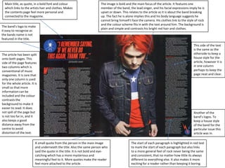
The image is bold and the main focus of the article. It features one
member of the band, the lead singer, and his facial expressions imply he is
upset or down. This relates to the article as it is about the band breaking
up. The fact he is alone implies this and his body language suggests he
cannot bring himself t face the camera. His clothes link to the style of rock
and the colour scheme fits in with the text around him. The background is
plain and simple and contrasts his bright red hair and clothes.
The article has been split
onto both pages. This
side of the page features
two columns which is
conventional of music
magazines. It is rare that
only one column is used
for the whole article. It is
small so that more
information can be
included and the colour
contrasts the
background to make it
easier to read. It does
not spill of the page but
is not too far in, and it
also keeps a good
distance away from the
centre to avoid
distortion of the text.
A small quote from the person in the main image
and underneath the title. Also the same person who
said the quote in the title. It is not bold and eyecatching which has a more mysterious and
meaningful feel to it. More quotes make the reader
feel more attached to the article.
This side of the text
is the same as the
otherside to keep a
house style for the
article, however it is
in one column
perhaps to keep the
page neat and clear.
Another of the
band’s logos. To
keep a house style
of the band for the
particular issue this
article was in.
The start of each paragraph is highlighted in red text
to mark the start of each paragraph but also links
to a more general feel of rock never being the same
and consistent, that no matter how little its always
different to everything else. It also makes it more
exciting for a reader rather than keeping it boring.
2. The line at the top links
back to the categories in
the contents page to let
the reader know they
are in the right place,
and to elaborate further
where they are in the
magazine.
Conventionally split
into two columns to
make it easy to read.
Whit text on a separate
blue background with
yellow text to mark the
beginning of each
paragraph. Title is very
bold and stands out,
but also fits the colour
scheme. Is pushed to
the right so that the
image is the main focus
and the text is very
small so the pages look
neat, clear and more
information can be put
on.
There is a quote from
the band which is
conventional of most
article pages in music
magazines. It is bold and
simple but makes the
reader want to find out
what they “won’t be
expecting”. The text is
more sans, so very sharp
and bold and the black
makes it stand out
against the background
of the picture.
The image is very simple and features all band members looking
comfortable. This shows their childlike personalities as a
conventional photo is very professional whereas this looks like
they are taking the mic. This links back to the genre. They are all
making eye contact with the camera which has a very personal
effect on the reader. Also their clothes are very casual and link
to the modern pop rock theme.
The background looks as if it is in a living room. It
is very simple which means that the main focus
of the image is the band. The brown floor links to
what some of them are wearing and the cream
sofa fits in with it too. The white background is
simple and the drop shadow behind which makes
the quote/title easy to read.