Cd covers
•Télécharger en tant que PPTX, PDF•
0 j'aime•211 vues

This is the analysis to the CD coers a i have researched

Recommandé
Contenu connexe
Tendances
Tendances (20)
En vedette
Similaire à Cd covers
Similaire à Cd covers (20)
Dernier
Dernier (20)
Cd covers
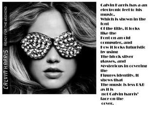
- 1. Calvin Harris has a an electronic feel to his music, Which is shown in the font Of the title, it looks like the Font on an old computer, and How it looks futuristic by using The block silver glasses, and Mysterious in covering the Figures identity. It shows that The music is less R&B as it is not Calvin harris’ face on the cover.
- 2. This front cover is probably my favourite as the image in the Background has absolutely Nothing to do with the song, Or the artist, But it grabs The buyers attention because The contrast in the colours Of the title, and the background, And the font it bold and noticeable.
- 3. This cover is simple but still says A lot. It has the logo for the band In the a contrasting colour to the Background so it is easy to Distinguish but also with Ben (from plan B)’s face on it, It shows That it is moving toward the more Mainstream audience of R&B and Pop. Although, the prop in front him On the cover, steers away from that Kind of audience, by being associated with older, more classic Music,
- 4. At the time that this CD came out The colours used where very Popular as it was in fashion To wear bright colours, and the Font is strange and almost like Graffiti which would suit the Kind of audience it is aimed at. The design is exciting and I live the use of colour of font against the contrasting background.
- 5. This image for a front cover is typical of the R&B pop genre, where it is expected that the artist would have their face on the front cover. Rihanna has used a skinny white font which is also typical for a female artist as a it symbolises femininity. The colours in the picture have also been edited to exaggerate the red, which brings out the colour of her hair and her lipstick. The colour red being the thing that most people associate Rihanna with at this moment in time.