
Recommandé
Contenu connexe
Tendances
Tendances (20)
Similaire à Visual composition slideshow- Alexandria Arriba
Similaire à Visual composition slideshow- Alexandria Arriba (20)
Dernier
Dernier (20)
Visual composition slideshow- Alexandria Arriba
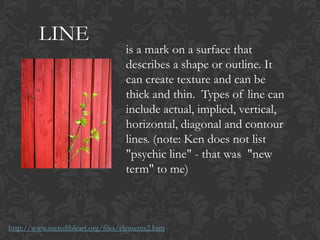
- 1. LINE is a mark on a surface that describes a shape or outline. It can create texture and can be thick and thin. Types of line can include actual, implied, vertical, horizontal, diagonal and contour lines. (note: Ken does not list "psychic line" - that was "new term" to me) http://www.incredibleart.org/files/elements2.htm
- 2. SHAPE (2D) is a 2-dimensional line with no form or thickness. Shapes are flat and can be grouped into two categories, geometric and organic. http://www.incredibleart.org/files/elements2.htm
- 3. FORM (3D) is a 3-dimensional object having volume and thickness. It is the illusion of a 3-D effect that can be implied with the use of light and shading techniques. Form can be viewed from many angles. http://www.incredibleart.org/files/elements2.htm
- 4. COLOR refers to specific hues and has 3 properties, Chroma, Intensity and Value. The color wheel is a way of showing the chromatic scale in a circle using all the colors made with the primary triad. Complimentary pairs can produce dull and neutral color. Black and white can be added to produce tints (add white), shades (add black) and tones (add gray). http://www.incredibleart.org/files/elements2.htm
- 5. DEPTH (Perspective) effects of depth, space, projection toward the viewer add interest. Linear perspective in the real world makes things look smaller in the distance. Some artists try to avoid depth by making large things duller and small things brighter, and so on, to make the objects contradict realism. Many artists don't believe in realism even though they could do it if they wanted to. It seems too boring to them. Realism wouldn't be art for some artists. http://www.goshen.edu/art/ed/Compose.htm
- 6. LIGHT is a form of visual art where main media of expression is light http://en.wikipedia.org/wiki/Light_art
- 7. DIRECTION (Motion) is a visual flow through the composition. It can be the suggestion of motion in a design as you move from object to object by way of placement and position. Directional movement can be created with a value pattern. It is with the placement of dark and light areas that you can move your attention through the format. http://www.incredibleart.org/files/elements2.htm
- 8. MASS (Visual Weight) is a concept that describes how much something in an image “pulls” your eye to look at it. Imagine that you have an almost entirely white image with a small black dot in it. That black dot will pull your eye immediately; it carries a lot of visual weight. http://www.ultimate-photo-tips.com/photography-rules-of_composition.html
- 9. TONE (black and white) This refers to the lightness or darkness of something. This could be a shade or how dark or light a colour appears. http://www.bbc.co.uk/schools/gcsebitesize/art/practicalities/elementsofart4.shtml
- 10. VALUE is the degree of light and dark in a design. It is the contrast between black and white and all the tones in between. Value can be used with color as well as black and white. Contrast is the extreme changes between values. http://artsedge.kennedy-center.org/educators/how-to/from- theory-to-practice/formal-visual-analysis.aspx
- 11. SPACE (positive and negative) Positive space is where shapes and forms exist; negative space is the empty space around shapes and forms. In the photo below the black area is negative space and it serves to balance the area in which the marmot and rock occupy. Areas of a picture that contain "nothing" are important visual elements that provide balance in an image. http://photoinf.com/General/Robert_Berdan/ Composition_and_the_Elements_of_Visual_Des ign.htm
- 12. BALANCE is a feeling of visual equality in shape, form, value, color, etc. Balance can be symmetrical or evenly balanced or asymmetrical and un- evenly balanced. Objects, values, colors, textures, shapes, forms, etc., can be used in creating a balance in a composition. http://www.incredibleart.org/files/elements2.htm
- 13. EMPHASIS say "Center of Interest." It is about dominance and influence. Most artists put it a bit off center and balance it with some minor themes to maintain our interest. Some artists avoid emphasis on purpose. They want all parts of the work to be equally interesting. http://www.goshen.edu/art/ed/Compose.htm
- 14. PROPORTION (scale) Proportion refers the size relationship of visual elements to each other and to the whole picture. One of the reasons proportion is often considered important in composition is that viewers respond to it emotionally. http://photoinf.com/General/Robert_Berdan/Composition_and_the_Elements_of_Visual _Design.htm
- 15. REPETITION (Rhythm) Rhythm refers to the regular repeating occurrence of elements in the scene just as in music it refers to the regular occurrence of certain musical notes over time. In photography the repetition of similar shapes sets up a rhythm that makes seeing easier and more enjoyable. Rhythm is soothing and our eyes beg to follow rhythmic patterns. Differences in the height of the fence posts add interest to an otherwise monotonic rhythm. The yellow marigold is balanced by the negative space of the complimentary colored blue sky. http://photoinf.com/General/Robert_Berdan/Composition_and_the_Elemen ts_of_Visual_Design.htm
- 16. UNITY When nothing distracts from the whole, you have unity. Unity without variation can be uninteresting - like driving on a clear day through Western Kansas on the interstate. Unity with diversity generally has more to offer in both art and in life. Of course some very minimal art can be very calming and at times even very evocative. Even a simple landscape can have a powerful effect. http://www.goshen.edu/art/ed/Compose.htm
- 17. CONTRAST offers some change in value creating a visual discord in a composition. Contrast shows the difference between shapes and can be used as a background to bring objects out and forward in a design. It can also be used to create an area of emphasis. http://www.incredibleart.org/files/elements2.ht m
- 18. HARMONY brings together a composition with similar units. If your composition was using wavy lines and organic shapes you would stay with those types of lines and not put in just one geometric shape. (Notice how similar Harmony is to Unity - some sources list both terms)http://www.incredibleart.org/files/elements2.htm
- 19. PROXIMITY Where items are placed in relation to each other is another important gestalt consideration. Proximity relationships will generally dominate over similarity relationships. The strongest control is available when the two are used together. There are four specific types of proximity relationships that will be studied in this lesson: close edge, touch, overlap and combining.http://daphne.palomar.edu/design/simnprox.html
- 20. VARIETY You create variety when elements are changed. Repeating a similar shape but changing the size can give variety and unity at the same time. Keeping the same size, but changing the color can also give variety and unity at the same time. In visual composition, there are many ways you can change something while simultaneously keeping it the same. http://www.goshen.edu/art/ed/Compose.htm