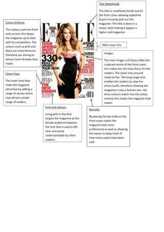
1. Title (Masthead)
The title or masthead stands out on
the front cover allowing repetitive
buyers to easily pick out the
magazine. The title is done in a
classic style making it appear a
higher end magazine.
Colour Scheme:
The colours used are fresh
and current; this keeps
the magazine up to date
with its competitors. The
colours such as pink and
black are more feminine
therefore are aiming to
attract more females than
males.
Main cover line
Images:
The main image is of Jessica Alba this
is placed centre of the front cover,
this makes her the main focus for the
readers. The cover lines around
relate to her. The long range shot
enables the readers to view her
entire outfit, therefore showing the
magazine is also a fashion one. Her
dress colours match into the colour
scheme this makes the magazine look
neater.
Cover lines:
The cover lines help
make the magazine
attractive by adding a
range of stories which
may attract a wider
range of readers.
Font and colours:
Using pink in the font
targets the magazine at the
female audience however
the font that is used is left
clear and easily
understandable by other
readers.
Barcode:
By placing the bar code on the
front cover makes the
magazine look more
professional as well as allowing
the owner to keep track of
how many copies have been
sold.