SlideShare une entreprise Scribd logo
1  sur  1
Good, clear picture. Looking at
the camera. They have put the
picture on one big page so they
can just focus on her.
Really small font not very readable
but this makes you concentrate
more on reading it. Where all the
other font is small it makes lady
gaga at the top right hand corner
stand out drawing attention.
They chose a white background because
this makes her and everything else stands
out more. They have also limited the
colours to black and white. This makes the
big red L on the left stand out.

Contenu connexe

Plus de Charis Creber (20)

Webiste analysis
Webiste analysisWebiste analysis
Webiste analysis
 
Moodboard
MoodboardMoodboard
Moodboard
 
Evalution (1)
Evalution (1)Evalution (1)
Evalution (1)
 
Q3
Q3Q3
Q3
 
Contents take
Contents take Contents take
Contents take
 
Contents take 2
Contents take 2Contents take 2
Contents take 2
 
Double page spread....
Double page spread....Double page spread....
Double page spread....
 
Media question 5
Media question 5Media question 5
Media question 5
 
Zombie makeup
Zombie makeupZombie makeup
Zombie makeup
 
Storyboard
StoryboardStoryboard
Storyboard
 
Soundtrack
SoundtrackSoundtrack
Soundtrack
 
Script
ScriptScript
Script
 
Magazine film cover analysis
Magazine film cover analysisMagazine film cover analysis
Magazine film cover analysis
 
Story board + script
Story board + scriptStory board + script
Story board + script
 
Cover page
Cover pageCover page
Cover page
 
Contents take 2
Contents take 2Contents take 2
Contents take 2
 
%Magzine cover
%Magzine cover%Magzine cover
%Magzine cover
 
Double page spread....
Double page spread....Double page spread....
Double page spread....
 
Wills double page spread
Wills double page spreadWills double page spread
Wills double page spread
 
Evaluation 7
Evaluation 7Evaluation 7
Evaluation 7
 

Tobi dps analysis 3

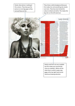
  • 1. Good, clear picture. Looking at the camera. They have put the picture on one big page so they can just focus on her. Really small font not very readable but this makes you concentrate more on reading it. Where all the other font is small it makes lady gaga at the top right hand corner stand out drawing attention. They chose a white background because this makes her and everything else stands out more. They have also limited the colours to black and white. This makes the big red L on the left stand out.