SlideShare une entreprise Scribd logo
1  sur  54
Primary & Secondary Audiences.
My Primary Audience would be teenagers and young adults both male and female in their
20’s that like Acoustic and alternative/indie music. My secondary audience would be people
that would not necessarily buy my magazine, but would read it when partners, friends or
family members had purchased it. Although the age range for my target audience would be
13-25 this may not be the only age range that would read it. I would aim my magazine at a
demographic who are very interested In unique alternative acoustic music . I would also aim
my magazine at people who are interested in having a vintage, unique and interesting style.
Ideal Reader

Although they would be unique they also would typically use social
networking sites such as Twitter, Facebook and Instagram like most 13-25
year olds do. Not to mention my ideal reader would most probably have a
blog where they post their interests particularly their love of music.

The ideal reader
for my magazine
would be either
males or females
who have a unique
style and want to
stand out from the
crowd. They would
be people who are
very up to date
with their music
taste and
constantly are
aware of new gig
listings, festivals,
acoustic sets and
covers. My ideal
reader may also
play a musical
instrument
particularly the
guitar or the
ukulele.
Audience Idols.
Within my research, I have been looking at the artists and bands in the genres of Acoustic
music and alternative/indie rock music which I have featured in my magazine. I decided to
feature artists such as Ed Sheeran, Darwin Deez, Passenger and Ben Howard to reflect the
Acoustic genre of my magazine. I also chose to feature bands such as A Day To Remember,
Architects, Deaf Havana, Mayday Parade and Anavae to highlight the alternative/indie sub
genre of my magazine. I chose this genre and sub genre for my magazine because I think a lot
of alternative/indie artists perform acoustic sets/gigs and produce unplugged covers of their
own songs as well as others music. Both these genres are unique and therefore combine
perfectly together highlighting how individual the sound of stripped back simplistic acoustic
music is. Each of the artists and bands that feature in my magazine have their own image and
sound that makes them distinct and stand out to their fans.
Similar Products.
An example of products similar to my own on the market at the moment would be
Acoustic magazine. I would want my magazine to be sold throughout the UK but differently
from Acoustic magazine I would have indie and alternative artists in my magazine as well
who are producing acoustic versions of their music or others. I believe there is a gap in the
market to combine the Acoustic and alternative /indie rock genre as a lot of these types of
alternative artists often strip down their music or do acoustic covers however this music
isn’t publicised.
Final Drafts.

In order to perfect my magazines cover and include as many
conventions as possible I added a brand statement above my mast
head ‘the most unique magazine the world’s ever seen.’ I also
added ‘acoustic covers from these bands/artists’ to make the
genre of the magazine clear to the reader so they’re aware of
what types of musicians will feature in the magazines issues.

After doing further research of real media products I realised that
they do not number the contents page with the number zero so I
changed this to ensure every detail is perfected and accurate.
From my research of real media products I also realised that the
mast head of the magazine needs to be displayed on the majority
of if not all the magazines content particularly its contents page.
Final Draft.
In order to interest my target audience and appeal to them, my
cover star represents an idealised version of the reader. To do this I
have chosen a cover star that is unique and has a vintage style that
stands out and reflects the stripped back unique sound of the
Acoustic genre she plays.
In my magazine one of the main articles is about the cover star
Emily and her collaboration with the well known star Ed Sheeran.
On the following slides I will demonstrate how both Emily and Ed
Sheeran who my target audience are interested in are known for
both having a unique appearance as well as having their own trade
mark, and how these qualities represent the acoustic genre and
alternative/indie sub genre of ‘unplugged.’ I will also show how the
star Ed Sheeran filters his performance when preforming duets with
other artists that have a different genre to his.
Emily.

Her body
language with
her arms
hugging her
body further
suggests she has
a reserved
personality and
that she is not
used to the
sudden publicity.

Emily is positioned on a sofa telling
her audience that she isn’t a hard
core artist. It further reflects how
simple yet brilliant her music is and
that she plays a relaxed genre.

Emily is in
the same
age range
as my ideal
reader
which
makes her
perfect for
being my
cover star
Emily.
Emily’s guitar is the key to all her music and is what my
target audience know her for.

Her vintage, unique
style of outfit reflects
what my magazines
ideal reader may also
dress like. It also
reflects the unique
qualities acoustic
music has as it
stands out from
other genres just like
Emily’s style.

The fact Emily’s complexion
is natural as she is barely
wearing any makeup
highlights how she is a
good role model to her
target audience (my ideal
reader.)

Emily’s casual pose
propping her body against
the wall suggests she has a
relaxed personality and
doesn’t let her fame make
her overly confident.

The minimalistic background of the brick wall
represents how stripped back the acoustic music Emily
plays is. It further highlights that her talent as an
artist is so unique that she doesn’t need lots of
technology and backing to make her sound good.
Ed Sheeran.
His bracelets highlight his individual style.

Direct eye contact with audience.

His casual pose and clothes reflect
how his acoustic music is stripped back
and laid back like his personality.

The minimalistic café which he is at reflects
who he is as an artist as he still wants to live
an ordinary life despite his fame.

His bright eye catching ginger hair
is what he is well known for from his fans.
The paw print on his guitar and on
his arm as a tattoo is his trademark
Ed Sheeran’s (travel) guitar is what he is
known for preforming with and is the main
feature In all his music.
Ed Sheeran - Alternative/urban representation.
Over the last year Ed Sheeran has gradually
got more tattoo’s which are all detailed and
extremely unique highlighting his
individuality as an artist.

His messy hair style reflects his laid back personality as an artist.
Ed Sheeran often collaborates with different artists of
different genres which shows how adaptable and unique
He is as an artist. In the image to the right he is with
artist Devlin. Both artists direct eye contact is purposely
dominating to reflect the rebellious side of the rap
Music Ed is preforming with rap artist Devlin.
Also a change in the clothes Ed typically wears from a
jumper, t-shirt and jeans to a denim jacket highlights
the change in style of the genre rap compared to his
usual acoustic music. The denim jacket also is an
example of the type of style the target audience
of the rap genre would typically have.
Final Drafts.

In order to perfect my magazines cover and include as many
conventions as possible I added a brand statement above my mast
head ‘the most unique magazine the world’s ever seen.’ I also
added ‘acoustic covers from these bands/artists’ to make the
genre of the magazine clear to the reader so they’re aware of
what types of musicians will feature in the magazines issues.

After doing further research of real media products I realised that
they do not number the contents page with the number zero so I
changed this to ensure every detail is perfected and accurate.
From my research of real media products I also realised that the
mast head of the magazine needs to be displayed on the majority
of if not all the magazines content particularly its contents page.
Final Draft.
Q3: What kind of media institution might
distribute your product?
My magazine ‘Unplugged’ would be a sister publication of
Kerrang magazine. Kerrang was first published on 6 June
1981 and in the early 2000s it became the best-selling
British music magazine. Kerrang’s publisher is ‘Bauer
Media’ and the magazines growing success leads me to
conclude that I want ‘Bauer Media’ to publish my
magazine. I believe ‘Unplugged’ would be successful as a
sister publication with Kerrang as both magazines work
with similar bands/artists but my magazine focuses on the
acoustic, stripped back music of these musicians. Although
working with similar musicians may create rivalry at times
I believe there is a gap in the market for my magazine as it
focuses on the unique, simplistic qualities of unplugged
rock music whereas Kerrang does not do this. Both
‘Unplugged’ and ‘Kerrang’ have a similar target audience of
teenagers and young adults both male and female and as
Bauer Media are used to working with this audience this
would be an advantage for my magazine.
The price of a printed issue Kerrang magazine is £2.20, a
subscription of Kerrang Magazine for 25 Issues for 6 Months oosts of
£34.00 and for 51 issues for 12 months costs £68.00.
Looking at Kerrang magazine, „Unplugged‟s‟ sister publication I can
conclude that Unplugged will also release 51 issues a year. As my
magazine will be a slightly larger magazine than Kerrang and will
contain considerably more competitions I will price my magazine at
£2.99 per issue. However if consumers subscribe to Unplugged either
at their local newsagents or at Unplugged‟s website
(www.Unpluggedmag.com) they can purchase all 51 issues for the
year for £102.49 saving them £50.
My magazines unique selling point is its brand statement „the most
unique magazine the world‟s ever seen‟ this statement helps to sell
the magazine as It tells the reader that they‟re getting a magazine
that is different to the average music magazine. Another unique
selling point my magazine has is that is offers the consumer the
chance to win brand new Dr martens.
Distribution.
Like Kerrang my magazine also has a website (www.unpluggedmag.com)
which is advertised to readers in the magazine at the end of each article.
Similarly to Kerrang‟s website I would advertise Unplugged‟s radio
station on its website which is called „Unplug FM.‟
I would use my magazines website to advertise the latest issues of „Unplugged‟ and
what they include so that this entices more people to buy the magazine. I am
aware that with technology increasing rapidly not as many people purchase
magazines therefore on my website I will also advertise a E-issue of the magazine
where online users can purchase the magazine as an internet copy to access on
their Pc‟s, laptops, tablets and/or smart phones which will increase sales and
profit.
With more and more people becoming owners of smart phones apps
are a great way of gaining a wider audience and making more sales
and profit. All social networking sites now are easily accessible as they
have their own apps. Kerrang have obviously seen the potential of
connecting with their audience through these social network apps as
on their website they advertise „getting in touch‟ with the magazine.
Not only would Unplugged‟s website advertise its social network pages
on Twitter, Facebook and Instagram but on the latest issues contents
page there is an article called „Instagram Challenge.‟ The reader can
take part In this challenge by uploading photos of themselves in any
of the bands merchandise that featured in Unplugged‟s latest issue
competing for a free subscription to the magazine and/or gig tickets.
App & Blog.
Not only can the consumers of my magazine get involved with
the magazine through social networking apps but also through
Unplugged‟s own app. Unplugged‟s app features news of the
latest issues and what‟s coming up in the next. As well as news
of the bands and artists that feature in Unplugged. The app will
also provide its users with various music related games and
quizzes to play. In order to make as much profit as possible the
app costs £0.69 to install however, subscribers to Unplugged
magazine get the app for free by typing in their subscription
code when installing the app.
Not only does Unplugged have an app which is advertised to its
audience on its website (www.Unpluggedmag.com) but a blog is
also currently being made which features pictures of the bands
and artists that feature weekly in unplugged and behind the
scenes pictures and gossip. Users will be able to access this blog
on the site Pinterest as well as through Unplugged‟s website.
Brand and Merchandise.
The brand statement for Kerrang magazine is “the worlds
biggest selling weekly rock magazine”.
This statement helps sell the brand as it uses statistics to
entice the reader as if it‟s the „world‟s biggest‟ it must be
good; which results in an increase in sales and profit. My
brand statement is „The most unique magazine the
world‟s ever seen.‟ This entices the reader in a different
way to Kerrang as it tells the audience that they will not
find another magazine like this which therefore
encourages them to buy it, increasing sales and profit.
Unplugged sell some of their own merchandise but its
focused on selling band and artists merchandise that
feature in the magazine as this will overall be more
popular and increase profit. Selling different bands and
artists merchandise means Unplugged magazine has lots
of business connections which is good for promotion and
advertisement.
Final Drafts.

In order to perfect my magazines cover and include as many
conventions as possible I added a brand statement above my mast
head ‘the most unique magazine the world’s ever seen.’ I also
added ‘acoustic covers from these bands/artists’ to make the
genre of the magazine clear to the reader so they’re aware of
what types of musicians will feature in the magazines issues.

After doing further research of real media products I realised that
they do not number the contents page with the number zero so I
changed this to ensure every detail is perfected and accurate.
From my research of real media products I also realised that the
mast head of the magazine needs to be displayed on the majority
of if not all the magazines content particularly its contents page.
Final Draft.
In what ways does your media product use,
develop or challenge forms and conventions
of real media products?
I believe my magazine front cover has developed the forms and conventions of real
media products as like acoustic magazine I have used a house style of black, white,
orange and red consistently throughout my magazine. In order to develop forms and
conventions of real media products as acoustic magazine have I have reflected the
colour orange typically associated with the star Ed Sheeran on my cover to create a
consistent house style. The connotations of orange symbolise happy, upbeat, relaxed
music which suits ‘unplugged’ with its acoustic genre and alternative sub genre.

When designing my magazine’s front cover I recognised the usual forms of real media
products which include a bar code, issue date and the magazines price so I made sure I
presented these on my front cover. From researching real media products such as acoustic
magazine which reflects the main genre of my magazine ‘unplugged’ I noticed that the
majority of effective magazine covers use a pull quote from one of the magazines main
articles to entice the reader so I reflected this in my product.

I further developed the forms and conventions of real media products by positioning a
strap line at the bottom of my cover which tells the reader what other artists/bands will be
featured in the magazine. As I had more space to fill on my front cover than acoustic
magazine I made sure I filled the space of my strapline so that there is plenty to look at on
the cover. The gaze of my main cover image is the acoustic guitar which reflects the
magazines genre and the unique outfit the artist in my cover image is wearing also
highlights the unique style of the magazines genre and sound.
Front Cover.
Kerrang magazine has the same alternative sub genre as ‘Unplugged’ and
analysing Kerrang helped me to develop the forms and conventions of my
magazine by highlighting to me how many real media products position their mast
heads behind the main cover image in order to use the space effectively. Kerrang
magazine also use a mast head for all their magazines that reflects both their
house style and the alternative genre of the magazine, so I wanted to develop this
form in Unplugged’s mast head. I chose a font for the mast head which compared
to the font of the guitar company ‘fender.’ Using a similar font to fender’s font
symbolises how most of my magazines genre is based around the acoustic guitar,
not to mention the italic style of the mast head reminds me of an ‘unplugged’
guitar lead unwinding.

Similarly to Kerrang I used a few secondary images to entice the reader by making
the cover look eye catching. In order to develop forms and conventions I have used
free poster offer which shows secondary images of what the posters will look like. In
order to use all of my cover space effectively and develop forms of real media
products I positioned a strap line at the bottom of my cover which reflects what
other artists and bands feature in the magazine. The majority of real media products
use clear, bold fonts on magazine covers to grab their target audience’s attention
and in order to keep a consistent house style so I ensured I developed this form in
my magazine.
Contents Page.
The magazine NME has a alternative/indie sub genre like my magazine
unplugged and by analysing the forms of NME I developed ideas of the types
of bands and artists that I wanted to feature in unplugged. In comparison to
NME I believe my magazine also uses the cover space consistently by keeping
the majority of the magazines features to one side of the cover. In order to use
and develop forms and conventions of real media products i presented a few
various competitions on my cover one in a circular pug to fill the space
effectively.

I developed conventions of real media products by recognising from my research of
magazines with the same genre (acoustic) and sub genre (alternative/indie) as my magazine
that a lot of magazines position the masthead behind the main cover image. Also a common
convention of real media products is that the masthead always goes from the top left as this
is the way in which we read. The artist in my main cover image intentionally looks casual and
relaxed which is a symbol of the relaxed acoustic/unplugged genre of the magazine and the
guitar which is where the artists gaze is focused further reflects one of the main instruments
the magazines genre is based around. I also developed the forms and conventions of real
media products by using a medium close up for my main cover image as the majority of
magazine cover images are either medium close ups or close ups. Using a medium close up
image focuses on the artist but also shows the background in the image which is simplistic to
symbolise the simplicity of the magazines acoustic genre and the brick wall background also
fits in with my magazines house style.
Contents page
When designing my magazines contents page I decided to challenge the forms and
conventions of real media products by presenting my magazines contents on a type writer. I
believe using a type writer makes my magazine unique and reflects its acoustic genre as type
writers are old and simplistic. Unplugged/acoustic music is stripped back therefore I thought
using an old type writer highlighted this simplicity. I chose an italic font for the ‘contents’ title
as I believe it fits in with my magazines house style as its elegant and relaxed. As my main
image of the type writer took up the majority of the space on the page I filled the rest of the
page with small secondary images as I had recognised when researching real media products
that a number of them do this to reflect some of the magazines features. Most real media
products like Kerrang magazine below position the page numbers of the particular article on
the secondary image hence why I included this idea on my contents page.

I further developed the forms of real media products by using a bright colour
for each of the sub headings within the contents to divide up the text so that it
is more eye catching for my target audience to read. Presenting an editors
letter on my contents develops the forms of real media products and the
colloquial, casual and chatty language I used in it symbolises the relaxed genre
of my magazine and is appropriate for my target audience who are males and
females ages 13-25.
Contents Page.
When researching various media products that have a similar genre and/or sub genre that
my magazine unplugged has I realised that the majority of contents pages are not ordered
chronologically so I made sure I reflected this on my contents. I ensured that I perfected
every little detail including the magazines issue date and the contents pages page number
in order to develop forms of real media products. I created a consistent house style
throughout my magazine by using similar colours on each product and similar fonts. Using
a light blue colour for my editors letter not only fits in with my magazines house style but
also reflects the delicate, soft sound of the magazines acoustic genre. Similarly to Q
magazine I used a number of secondary images to show my target audience the types of
articles that will appear in the magazine.
Double Page Spread.
In order to develop the forms and conventions of real media products I
structured my double page spread in columns as all magazines do this. I
recognise from researching magazines which have the same genre
(acoustic)/sub genre (alternative/indie) as my magazine that real media
products use a dropped cap to start double page articles. A lot of real media
products position a pull quote somewhere on their articles as well as a stand
first to introduce the article so I used a pull quote which also answered the
articles tittle ‘everybody’s talking about.’ To develop the forms of real media
products I chose a title for my double page spread that will entice my target
audience as they will want to find out what ‘everybody is talking about.’ I
wanted to make my article look professional by using all of the space therefore
I chose a number of secondary images that linked to the article and provided a
caption to explain the images. The main image is taken from a lower level angle
to make the artist look more dominate which reflects how dominate she is in
the article as she is the one being interviewed and the majority of the article is
based around her.
Double Page Spread.
As the majority of my article was an interview I made sure I split
the writing up using different colours so it was easy to read for my
target audience. Similarly to Kerrang magazine I chose a main
image that dominated both pages of the double page article which
is very visual for the reader so I had to position the text over the
image . I placed the text in a transparent box in order to not cover
part of the image and fit the writing in with the image. I further
developed forms and conventions of real media products by using
a bold clear font for my articles tittle so it stands out and grabs the
readers attention. Like Kerrang magazines main image my main
image also reflects the genre (acoustic) and sub genre (alternative)
through the clothing the artist is wearing in the image as she looks
unique in a vintage, quirky outfit.
Final Drafts.

In order to perfect my magazines cover and include as many
conventions as possible I added a brand statement above my mast
head ‘the most unique magazine the world’s ever seen.’ I also
added ‘acoustic covers from these bands/artists’ to make the
genre of the magazine clear to the reader so they’re aware of
what types of musicians will feature in the magazines issues.

After doing further research of real media products I realised that
they do not number the contents page with the number zero so I
changed this to ensure every detail is perfected and accurate.
From my research of real media products I also realised that the
mast head of the magazine needs to be displayed on the majority
of if not all the magazines content particularly its contents page.
Final Draft.

When observing my work I realised that in order to create a consistent house style and tie the page
together making the stand first box transparent like the box that contains my articles text would look
more effective then leaving it the colour black. Also from my research of real media products I realised
that the vast majority of magazines display the magazines name throughout its pages hence why I
wrote ‘Unplugged’ underneath my stand first.
Question 5: How did you attract/address your
audience?
Before creating my magazine I had to decide how to both address who my target audience
are and how to attract them. I decided the best way to do this would be to draw up a
survey asking my potential audience a number of questions about what and who they
would like to see feature in Unplugged magazine.
The most popular result was
winning acoustic gig tickets
which helped me to address
that the majority of the people
who took part in survey were
my audience as they’re
interested in acoustic music.
After addressing this I also took
on board from these results that
the more competitions that
feature in my magazine the
better.
Question 5: How did you attract/address your audience?
Asking what artists and bands
people would like to see in
Unplugged helped me to take
on board who the magazines
main article would feature. Ed
Sheeran being the most popular
helped me to decide that main
magazines main focus would be
on him collaborating with
another artist. I also featured all
the other artists that were
chosen somewhere in
Unplugged to attract my
audience.
The world ‘win’ is in capitals and is also an
exclamation to grab the readers attention, as it’s a
chance for them to get something back from
buying the magazine and also a chance to enter a
fun competition.
After conducting a survey and analysing the results Ed Sheeran
proved to be the most popular artist to be included in the
magazine. in order to entice my ideal reader I presented a
competition where the competitors have a chance to win Ed
Sheeran prizes.

Covering the space of the strapline completely ensures
that as many artists and bands that feature in the
magazine are mentioned as possible to entice the
reader to purchase the magazine.

The word ‘free’ attracts the reader to buy the magazine
because it is something that they don't have to pay for
and it Is most likely a band who they like which
persuades them further.
Masthead
Indirect eye
contact
Pug, competition.
Cover
Star
Main Image
Free
Giveaway
Secondary
images
Features

House
Style
Competition
Feature
Secondary
image
Pull Quote
consistent fonts to
create
brand ID
Competition
Issue
number
Selling
point
Price

Strapline

Barcode
Audience.
Age & Gender. –
The audience age range for my magazine is
typically from age 13-25, It is a fairly wide age
range because a lot of people enjoy acoustic,
stripped back music. ‘Unplugged’ is aimed at both
males and females as unlike certain genres such
as Pop which is typically aimed at teenage girls
due to cheesy boy bands, acoustic covers a wider
range of musicians.
Genre –
The Genre of my magazine is acoustic and the
sub genre is alternative/indie, this is portrayed
through the cover stars clothes as she has a
unique style just like how unique the sound of
acoustic indie music is. The genre of the
magazine is also reflected through its masthead
‘Unplugged’ not only does this highlight that the
genre is acoustic but also the fact the mast head
resembles the logo of the guitar company Fender.
This resemblance underlines that one of the main
instruments acoustic music is based around is the
guitar.
Final Drafts.

In order to perfect my magazines cover and include as many
conventions as possible I added a brand statement above my mast
head ‘the most unique magazine the world’s ever seen.’ I also
added ‘acoustic covers from these bands/artists’ to make the
genre of the magazine clear to the reader so they’re aware of
what types of musicians will feature in the magazines issues.

After doing further research of real media products I realised that
they do not number the contents page with the number zero so I
changed this to ensure every detail is perfected and accurate.
From my research of real media products I also realised that the
mast head of the magazine needs to be displayed on the majority
of if not all the magazines content particularly its contents page.
Final Draft.
Question 6 - What have you learnt about technologies
Front
from the process of constructing this product?
coverI created a new layer and used
I then put the new layer
I selected the
this tool to go round the head of over the top of the layer of
‘Magnetic Lasso Tool’
the cover star in my image.
my mast head.

Using these tools to position my magazines
masthead exactly where I wanted it helped me to
develop my Photoshop skills by using tools I have
never used before. It also highlights how I have
researched real media products and this has
developed my knowledge of their conventions.
One convention I realised that a lot of magazines
use is positioning their masthead behind their
cover star in their main cover image. Placing my
masthead here also helped me to use the space I
had effectively and learn about space coverage
which has helped me in the construction of the
rest of my magazine.

Doing this positioned
my masthead behind
my cover stars head
which was my aim.
I researched the Fender logo and
decided I wanted to use a similar
font for the masthead of my
magazine.

I used the website ‘My Fonts’ to
find this font and it was listed
under the ‘best sellers’ list.

This search brought up a list of 50 fonts displaying the name of my
masthead (‘Unplugged.’) From the list I chose ‘Thirsty Rough’ font as I
believe it looks similar to the fender logo therefore reflecting the main
instrument my magazine genre is based around.

This has developed my knowledge of the wide range of fonts there are and that
researching different fonts rather than using the standard Microsoft ones makes
my magazine look more professional and effective. I have also learnt how
important it is to ensure all the text is inline with each other and positioned to
the right size so that every detail is perfected.

I typed in ‘Unplugged’ in
the search bar of the ‘best
sellers’ list.
I selected the rectangle shape on
publisher and made the shape.

I then selected the shape fill tool and
changed the shapes colour to black and
changed the shapes outline to black as well.

I used the resize tool on Photoshop to
make the shape the correct size.

I did the same steps to
create this shape as well.

(Explanation on next
slide.)

I then copied the shape and
pasted it into Photoshop.

Once I had pasted the shape into Photoshop I selected the ‘set
foreground colour’ tool and changed the colour to orange.

With the type tool I created text boxes.

I positioned this text over
the shapes.

Front cover-

I used the move tool to position the
pentagon over the rectangle.
Front cover Using different shapes to create a strapline for my magazines
front cover helped me to learn how to use different layers
effectively. Positioning text on these shapes also developed my
knowledge of how important space coverage is in order to
leave my magazine looking eye catching so the reader is enticed
and wants to see what's inside. When creating this strapline I
used both Publisher and Photoshop and I would most definitely
say constructing my magazine has developed my knowledge of
how to use different aspects of both these programmes that I
had not used previously.
I right clicked and selected ‘format
auto shape.’
I selected the 3rd shade of maroon which
I selected the rectangle shape and created a large
changed the shape to this colour.
rectangle.

Double Page Spread -

I then changed the transparency to 60% by
dragging the transparency bar.

This then allowed me to position the shape over my
image without it covering the image as the
transparency allows you to see the image through
the shape even when I placed my text on it.

I have never used the transparency tool before so
creating my double page spread has definitely taught
me new skills of how to use new tools. Using this
tool enables everything to fit on two pages and look
extremely eye catching without dividing the image
from the text completely. Not to mention I have also
realised whilst creating this article that building up
different layers looks good and stands out.
Contents Page-

I then went to ‘insert’ and selected picture.

I used the website ‘My Fonts’ to
choose fonts for my contents page
from the ‘best sellers list.’ I saved these
fonts as images.

Creating my contents page has taught
me that choosing the correct fonts is
vital and changes the full look of the
page. I have learnt how to use the
website my fonts.
I used the ‘tight’ tool to drag
and resize each text image
onto my typewriter image.

I then inserted
each of the text
images
individually.
Final Drafts.

In order to perfect my magazines cover and include as many
conventions as possible I added a brand statement above my mast
head ‘the most unique magazine the world’s ever seen.’ I also
added ‘acoustic covers from these bands/artists’ to make the
genre of the magazine clear to the reader so they’re aware of
what types of musicians will feature in the magazines issues.

After doing further research of real media products I realised that
they do not number the contents page with the number zero so I
changed this to ensure every detail is perfected and accurate.
From my research of real media products I also realised that the
mast head of the magazine needs to be displayed on the majority
of if not all the magazines content particularly its contents page.
Final Draft.
.
.
Final Drafts.

In order to perfect my magazines cover and include as many
conventions as possible I added a brand statement above my mast
head ‘the most unique magazine the world’s ever seen.’ I also
added ‘acoustic covers from these bands/artists’ to make the
genre of the magazine clear to the reader so they’re aware of
what types of musicians will feature in the magazines issues.

After doing further research of real media products I realised that
they do not number the contents page with the number zero so I
changed this to ensure every detail is perfected and accurate.
From my research of real media products I also realised that the
mast head of the magazine needs to be displayed on the majority
of if not all the magazines content particularly its contents page.
Final Draft.

Contenu connexe

Dernier

Concurrency Control in Database Management system
Concurrency Control in Database Management systemConcurrency Control in Database Management system
Concurrency Control in Database Management systemChristalin Nelson
 
USPS® Forced Meter Migration - How to Know if Your Postage Meter Will Soon be...
USPS® Forced Meter Migration - How to Know if Your Postage Meter Will Soon be...USPS® Forced Meter Migration - How to Know if Your Postage Meter Will Soon be...
USPS® Forced Meter Migration - How to Know if Your Postage Meter Will Soon be...Postal Advocate Inc.
 
Influencing policy (training slides from Fast Track Impact)
Influencing policy (training slides from Fast Track Impact)Influencing policy (training slides from Fast Track Impact)
Influencing policy (training slides from Fast Track Impact)Mark Reed
 
Procuring digital preservation CAN be quick and painless with our new dynamic...
Procuring digital preservation CAN be quick and painless with our new dynamic...Procuring digital preservation CAN be quick and painless with our new dynamic...
Procuring digital preservation CAN be quick and painless with our new dynamic...Jisc
 
Keynote by Prof. Wurzer at Nordex about IP-design
Keynote by Prof. Wurzer at Nordex about IP-designKeynote by Prof. Wurzer at Nordex about IP-design
Keynote by Prof. Wurzer at Nordex about IP-designMIPLM
 
How to Add Barcode on PDF Report in Odoo 17
How to Add Barcode on PDF Report in Odoo 17How to Add Barcode on PDF Report in Odoo 17
How to Add Barcode on PDF Report in Odoo 17Celine George
 
ACC 2024 Chronicles. Cardiology. Exam.pdf
ACC 2024 Chronicles. Cardiology. Exam.pdfACC 2024 Chronicles. Cardiology. Exam.pdf
ACC 2024 Chronicles. Cardiology. Exam.pdfSpandanaRallapalli
 
Virtual-Orientation-on-the-Administration-of-NATG12-NATG6-and-ELLNA.pdf
Virtual-Orientation-on-the-Administration-of-NATG12-NATG6-and-ELLNA.pdfVirtual-Orientation-on-the-Administration-of-NATG12-NATG6-and-ELLNA.pdf
Virtual-Orientation-on-the-Administration-of-NATG12-NATG6-and-ELLNA.pdfErwinPantujan2
 
Barangay Council for the Protection of Children (BCPC) Orientation.pptx
Barangay Council for the Protection of Children (BCPC) Orientation.pptxBarangay Council for the Protection of Children (BCPC) Orientation.pptx
Barangay Council for the Protection of Children (BCPC) Orientation.pptxCarlos105
 
Karra SKD Conference Presentation Revised.pptx
Karra SKD Conference Presentation Revised.pptxKarra SKD Conference Presentation Revised.pptx
Karra SKD Conference Presentation Revised.pptxAshokKarra1
 
Earth Day Presentation wow hello nice great
Earth Day Presentation wow hello nice greatEarth Day Presentation wow hello nice great
Earth Day Presentation wow hello nice greatYousafMalik24
 
Field Attribute Index Feature in Odoo 17
Field Attribute Index Feature in Odoo 17Field Attribute Index Feature in Odoo 17
Field Attribute Index Feature in Odoo 17Celine George
 
ISYU TUNGKOL SA SEKSWLADIDA (ISSUE ABOUT SEXUALITY
ISYU TUNGKOL SA SEKSWLADIDA (ISSUE ABOUT SEXUALITYISYU TUNGKOL SA SEKSWLADIDA (ISSUE ABOUT SEXUALITY
ISYU TUNGKOL SA SEKSWLADIDA (ISSUE ABOUT SEXUALITYKayeClaireEstoconing
 
AUDIENCE THEORY -CULTIVATION THEORY - GERBNER.pptx
AUDIENCE THEORY -CULTIVATION THEORY -  GERBNER.pptxAUDIENCE THEORY -CULTIVATION THEORY -  GERBNER.pptx
AUDIENCE THEORY -CULTIVATION THEORY - GERBNER.pptxiammrhaywood
 
GRADE 4 - SUMMATIVE TEST QUARTER 4 ALL SUBJECTS
GRADE 4 - SUMMATIVE TEST QUARTER 4 ALL SUBJECTSGRADE 4 - SUMMATIVE TEST QUARTER 4 ALL SUBJECTS
GRADE 4 - SUMMATIVE TEST QUARTER 4 ALL SUBJECTSJoshuaGantuangco2
 
ECONOMIC CONTEXT - PAPER 1 Q3: NEWSPAPERS.pptx
ECONOMIC CONTEXT - PAPER 1 Q3: NEWSPAPERS.pptxECONOMIC CONTEXT - PAPER 1 Q3: NEWSPAPERS.pptx
ECONOMIC CONTEXT - PAPER 1 Q3: NEWSPAPERS.pptxiammrhaywood
 
Visit to a blind student's school🧑‍🦯🧑‍🦯(community medicine)
Visit to a blind student's school🧑‍🦯🧑‍🦯(community medicine)Visit to a blind student's school🧑‍🦯🧑‍🦯(community medicine)
Visit to a blind student's school🧑‍🦯🧑‍🦯(community medicine)lakshayb543
 

Dernier (20)

Concurrency Control in Database Management system
Concurrency Control in Database Management systemConcurrency Control in Database Management system
Concurrency Control in Database Management system
 
USPS® Forced Meter Migration - How to Know if Your Postage Meter Will Soon be...
USPS® Forced Meter Migration - How to Know if Your Postage Meter Will Soon be...USPS® Forced Meter Migration - How to Know if Your Postage Meter Will Soon be...
USPS® Forced Meter Migration - How to Know if Your Postage Meter Will Soon be...
 
Influencing policy (training slides from Fast Track Impact)
Influencing policy (training slides from Fast Track Impact)Influencing policy (training slides from Fast Track Impact)
Influencing policy (training slides from Fast Track Impact)
 
Procuring digital preservation CAN be quick and painless with our new dynamic...
Procuring digital preservation CAN be quick and painless with our new dynamic...Procuring digital preservation CAN be quick and painless with our new dynamic...
Procuring digital preservation CAN be quick and painless with our new dynamic...
 
Keynote by Prof. Wurzer at Nordex about IP-design
Keynote by Prof. Wurzer at Nordex about IP-designKeynote by Prof. Wurzer at Nordex about IP-design
Keynote by Prof. Wurzer at Nordex about IP-design
 
FINALS_OF_LEFT_ON_C'N_EL_DORADO_2024.pptx
FINALS_OF_LEFT_ON_C'N_EL_DORADO_2024.pptxFINALS_OF_LEFT_ON_C'N_EL_DORADO_2024.pptx
FINALS_OF_LEFT_ON_C'N_EL_DORADO_2024.pptx
 
How to Add Barcode on PDF Report in Odoo 17
How to Add Barcode on PDF Report in Odoo 17How to Add Barcode on PDF Report in Odoo 17
How to Add Barcode on PDF Report in Odoo 17
 
ACC 2024 Chronicles. Cardiology. Exam.pdf
ACC 2024 Chronicles. Cardiology. Exam.pdfACC 2024 Chronicles. Cardiology. Exam.pdf
ACC 2024 Chronicles. Cardiology. Exam.pdf
 
Virtual-Orientation-on-the-Administration-of-NATG12-NATG6-and-ELLNA.pdf
Virtual-Orientation-on-the-Administration-of-NATG12-NATG6-and-ELLNA.pdfVirtual-Orientation-on-the-Administration-of-NATG12-NATG6-and-ELLNA.pdf
Virtual-Orientation-on-the-Administration-of-NATG12-NATG6-and-ELLNA.pdf
 
Barangay Council for the Protection of Children (BCPC) Orientation.pptx
Barangay Council for the Protection of Children (BCPC) Orientation.pptxBarangay Council for the Protection of Children (BCPC) Orientation.pptx
Barangay Council for the Protection of Children (BCPC) Orientation.pptx
 
Karra SKD Conference Presentation Revised.pptx
Karra SKD Conference Presentation Revised.pptxKarra SKD Conference Presentation Revised.pptx
Karra SKD Conference Presentation Revised.pptx
 
Model Call Girl in Tilak Nagar Delhi reach out to us at 🔝9953056974🔝
Model Call Girl in Tilak Nagar Delhi reach out to us at 🔝9953056974🔝Model Call Girl in Tilak Nagar Delhi reach out to us at 🔝9953056974🔝
Model Call Girl in Tilak Nagar Delhi reach out to us at 🔝9953056974🔝
 
Earth Day Presentation wow hello nice great
Earth Day Presentation wow hello nice greatEarth Day Presentation wow hello nice great
Earth Day Presentation wow hello nice great
 
Field Attribute Index Feature in Odoo 17
Field Attribute Index Feature in Odoo 17Field Attribute Index Feature in Odoo 17
Field Attribute Index Feature in Odoo 17
 
ISYU TUNGKOL SA SEKSWLADIDA (ISSUE ABOUT SEXUALITY
ISYU TUNGKOL SA SEKSWLADIDA (ISSUE ABOUT SEXUALITYISYU TUNGKOL SA SEKSWLADIDA (ISSUE ABOUT SEXUALITY
ISYU TUNGKOL SA SEKSWLADIDA (ISSUE ABOUT SEXUALITY
 
AUDIENCE THEORY -CULTIVATION THEORY - GERBNER.pptx
AUDIENCE THEORY -CULTIVATION THEORY -  GERBNER.pptxAUDIENCE THEORY -CULTIVATION THEORY -  GERBNER.pptx
AUDIENCE THEORY -CULTIVATION THEORY - GERBNER.pptx
 
GRADE 4 - SUMMATIVE TEST QUARTER 4 ALL SUBJECTS
GRADE 4 - SUMMATIVE TEST QUARTER 4 ALL SUBJECTSGRADE 4 - SUMMATIVE TEST QUARTER 4 ALL SUBJECTS
GRADE 4 - SUMMATIVE TEST QUARTER 4 ALL SUBJECTS
 
ECONOMIC CONTEXT - PAPER 1 Q3: NEWSPAPERS.pptx
ECONOMIC CONTEXT - PAPER 1 Q3: NEWSPAPERS.pptxECONOMIC CONTEXT - PAPER 1 Q3: NEWSPAPERS.pptx
ECONOMIC CONTEXT - PAPER 1 Q3: NEWSPAPERS.pptx
 
Visit to a blind student's school🧑‍🦯🧑‍🦯(community medicine)
Visit to a blind student's school🧑‍🦯🧑‍🦯(community medicine)Visit to a blind student's school🧑‍🦯🧑‍🦯(community medicine)
Visit to a blind student's school🧑‍🦯🧑‍🦯(community medicine)
 
YOUVE GOT EMAIL_FINALS_EL_DORADO_2024.pptx
YOUVE GOT EMAIL_FINALS_EL_DORADO_2024.pptxYOUVE GOT EMAIL_FINALS_EL_DORADO_2024.pptx
YOUVE GOT EMAIL_FINALS_EL_DORADO_2024.pptx
 

En vedette

Everything You Need To Know About ChatGPT
Everything You Need To Know About ChatGPTEverything You Need To Know About ChatGPT
Everything You Need To Know About ChatGPTExpeed Software
 
Product Design Trends in 2024 | Teenage Engineerings
Product Design Trends in 2024 | Teenage EngineeringsProduct Design Trends in 2024 | Teenage Engineerings
Product Design Trends in 2024 | Teenage EngineeringsPixeldarts
 
How Race, Age and Gender Shape Attitudes Towards Mental Health
How Race, Age and Gender Shape Attitudes Towards Mental HealthHow Race, Age and Gender Shape Attitudes Towards Mental Health
How Race, Age and Gender Shape Attitudes Towards Mental HealthThinkNow
 
AI Trends in Creative Operations 2024 by Artwork Flow.pdf
AI Trends in Creative Operations 2024 by Artwork Flow.pdfAI Trends in Creative Operations 2024 by Artwork Flow.pdf
AI Trends in Creative Operations 2024 by Artwork Flow.pdfmarketingartwork
 
PEPSICO Presentation to CAGNY Conference Feb 2024
PEPSICO Presentation to CAGNY Conference Feb 2024PEPSICO Presentation to CAGNY Conference Feb 2024
PEPSICO Presentation to CAGNY Conference Feb 2024Neil Kimberley
 
Content Methodology: A Best Practices Report (Webinar)
Content Methodology: A Best Practices Report (Webinar)Content Methodology: A Best Practices Report (Webinar)
Content Methodology: A Best Practices Report (Webinar)contently
 
How to Prepare For a Successful Job Search for 2024
How to Prepare For a Successful Job Search for 2024How to Prepare For a Successful Job Search for 2024
How to Prepare For a Successful Job Search for 2024Albert Qian
 
Social Media Marketing Trends 2024 // The Global Indie Insights
Social Media Marketing Trends 2024 // The Global Indie InsightsSocial Media Marketing Trends 2024 // The Global Indie Insights
Social Media Marketing Trends 2024 // The Global Indie InsightsKurio // The Social Media Age(ncy)
 
Trends In Paid Search: Navigating The Digital Landscape In 2024
Trends In Paid Search: Navigating The Digital Landscape In 2024Trends In Paid Search: Navigating The Digital Landscape In 2024
Trends In Paid Search: Navigating The Digital Landscape In 2024Search Engine Journal
 
5 Public speaking tips from TED - Visualized summary
5 Public speaking tips from TED - Visualized summary5 Public speaking tips from TED - Visualized summary
5 Public speaking tips from TED - Visualized summarySpeakerHub
 
ChatGPT and the Future of Work - Clark Boyd
ChatGPT and the Future of Work - Clark Boyd ChatGPT and the Future of Work - Clark Boyd
ChatGPT and the Future of Work - Clark Boyd Clark Boyd
 
Getting into the tech field. what next
Getting into the tech field. what next Getting into the tech field. what next
Getting into the tech field. what next Tessa Mero
 
Google's Just Not That Into You: Understanding Core Updates & Search Intent
Google's Just Not That Into You: Understanding Core Updates & Search IntentGoogle's Just Not That Into You: Understanding Core Updates & Search Intent
Google's Just Not That Into You: Understanding Core Updates & Search IntentLily Ray
 
Time Management & Productivity - Best Practices
Time Management & Productivity -  Best PracticesTime Management & Productivity -  Best Practices
Time Management & Productivity - Best PracticesVit Horky
 
The six step guide to practical project management
The six step guide to practical project managementThe six step guide to practical project management
The six step guide to practical project managementMindGenius
 
Beginners Guide to TikTok for Search - Rachel Pearson - We are Tilt __ Bright...
Beginners Guide to TikTok for Search - Rachel Pearson - We are Tilt __ Bright...Beginners Guide to TikTok for Search - Rachel Pearson - We are Tilt __ Bright...
Beginners Guide to TikTok for Search - Rachel Pearson - We are Tilt __ Bright...RachelPearson36
 
Unlocking the Power of ChatGPT and AI in Testing - A Real-World Look, present...
Unlocking the Power of ChatGPT and AI in Testing - A Real-World Look, present...Unlocking the Power of ChatGPT and AI in Testing - A Real-World Look, present...
Unlocking the Power of ChatGPT and AI in Testing - A Real-World Look, present...Applitools
 

En vedette (20)

Everything You Need To Know About ChatGPT
Everything You Need To Know About ChatGPTEverything You Need To Know About ChatGPT
Everything You Need To Know About ChatGPT
 
Product Design Trends in 2024 | Teenage Engineerings
Product Design Trends in 2024 | Teenage EngineeringsProduct Design Trends in 2024 | Teenage Engineerings
Product Design Trends in 2024 | Teenage Engineerings
 
How Race, Age and Gender Shape Attitudes Towards Mental Health
How Race, Age and Gender Shape Attitudes Towards Mental HealthHow Race, Age and Gender Shape Attitudes Towards Mental Health
How Race, Age and Gender Shape Attitudes Towards Mental Health
 
AI Trends in Creative Operations 2024 by Artwork Flow.pdf
AI Trends in Creative Operations 2024 by Artwork Flow.pdfAI Trends in Creative Operations 2024 by Artwork Flow.pdf
AI Trends in Creative Operations 2024 by Artwork Flow.pdf
 
Skeleton Culture Code
Skeleton Culture CodeSkeleton Culture Code
Skeleton Culture Code
 
PEPSICO Presentation to CAGNY Conference Feb 2024
PEPSICO Presentation to CAGNY Conference Feb 2024PEPSICO Presentation to CAGNY Conference Feb 2024
PEPSICO Presentation to CAGNY Conference Feb 2024
 
Content Methodology: A Best Practices Report (Webinar)
Content Methodology: A Best Practices Report (Webinar)Content Methodology: A Best Practices Report (Webinar)
Content Methodology: A Best Practices Report (Webinar)
 
How to Prepare For a Successful Job Search for 2024
How to Prepare For a Successful Job Search for 2024How to Prepare For a Successful Job Search for 2024
How to Prepare For a Successful Job Search for 2024
 
Social Media Marketing Trends 2024 // The Global Indie Insights
Social Media Marketing Trends 2024 // The Global Indie InsightsSocial Media Marketing Trends 2024 // The Global Indie Insights
Social Media Marketing Trends 2024 // The Global Indie Insights
 
Trends In Paid Search: Navigating The Digital Landscape In 2024
Trends In Paid Search: Navigating The Digital Landscape In 2024Trends In Paid Search: Navigating The Digital Landscape In 2024
Trends In Paid Search: Navigating The Digital Landscape In 2024
 
5 Public speaking tips from TED - Visualized summary
5 Public speaking tips from TED - Visualized summary5 Public speaking tips from TED - Visualized summary
5 Public speaking tips from TED - Visualized summary
 
ChatGPT and the Future of Work - Clark Boyd
ChatGPT and the Future of Work - Clark Boyd ChatGPT and the Future of Work - Clark Boyd
ChatGPT and the Future of Work - Clark Boyd
 
Getting into the tech field. what next
Getting into the tech field. what next Getting into the tech field. what next
Getting into the tech field. what next
 
Google's Just Not That Into You: Understanding Core Updates & Search Intent
Google's Just Not That Into You: Understanding Core Updates & Search IntentGoogle's Just Not That Into You: Understanding Core Updates & Search Intent
Google's Just Not That Into You: Understanding Core Updates & Search Intent
 
How to have difficult conversations
How to have difficult conversations How to have difficult conversations
How to have difficult conversations
 
Introduction to Data Science
Introduction to Data ScienceIntroduction to Data Science
Introduction to Data Science
 
Time Management & Productivity - Best Practices
Time Management & Productivity -  Best PracticesTime Management & Productivity -  Best Practices
Time Management & Productivity - Best Practices
 
The six step guide to practical project management
The six step guide to practical project managementThe six step guide to practical project management
The six step guide to practical project management
 
Beginners Guide to TikTok for Search - Rachel Pearson - We are Tilt __ Bright...
Beginners Guide to TikTok for Search - Rachel Pearson - We are Tilt __ Bright...Beginners Guide to TikTok for Search - Rachel Pearson - We are Tilt __ Bright...
Beginners Guide to TikTok for Search - Rachel Pearson - We are Tilt __ Bright...
 
Unlocking the Power of ChatGPT and AI in Testing - A Real-World Look, present...
Unlocking the Power of ChatGPT and AI in Testing - A Real-World Look, present...Unlocking the Power of ChatGPT and AI in Testing - A Real-World Look, present...
Unlocking the Power of ChatGPT and AI in Testing - A Real-World Look, present...
 

Media evaluation coursework final draft charlotte hadfield

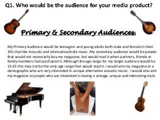
  • 1. Primary & Secondary Audiences. My Primary Audience would be teenagers and young adults both male and female in their 20’s that like Acoustic and alternative/indie music. My secondary audience would be people that would not necessarily buy my magazine, but would read it when partners, friends or family members had purchased it. Although the age range for my target audience would be 13-25 this may not be the only age range that would read it. I would aim my magazine at a demographic who are very interested In unique alternative acoustic music . I would also aim my magazine at people who are interested in having a vintage, unique and interesting style.
  • 2. Ideal Reader Although they would be unique they also would typically use social networking sites such as Twitter, Facebook and Instagram like most 13-25 year olds do. Not to mention my ideal reader would most probably have a blog where they post their interests particularly their love of music. The ideal reader for my magazine would be either males or females who have a unique style and want to stand out from the crowd. They would be people who are very up to date with their music taste and constantly are aware of new gig listings, festivals, acoustic sets and covers. My ideal reader may also play a musical instrument particularly the guitar or the ukulele.
  • 3. Audience Idols. Within my research, I have been looking at the artists and bands in the genres of Acoustic music and alternative/indie rock music which I have featured in my magazine. I decided to feature artists such as Ed Sheeran, Darwin Deez, Passenger and Ben Howard to reflect the Acoustic genre of my magazine. I also chose to feature bands such as A Day To Remember, Architects, Deaf Havana, Mayday Parade and Anavae to highlight the alternative/indie sub genre of my magazine. I chose this genre and sub genre for my magazine because I think a lot of alternative/indie artists perform acoustic sets/gigs and produce unplugged covers of their own songs as well as others music. Both these genres are unique and therefore combine perfectly together highlighting how individual the sound of stripped back simplistic acoustic music is. Each of the artists and bands that feature in my magazine have their own image and sound that makes them distinct and stand out to their fans.
  • 4.
  • 5. Similar Products. An example of products similar to my own on the market at the moment would be Acoustic magazine. I would want my magazine to be sold throughout the UK but differently from Acoustic magazine I would have indie and alternative artists in my magazine as well who are producing acoustic versions of their music or others. I believe there is a gap in the market to combine the Acoustic and alternative /indie rock genre as a lot of these types of alternative artists often strip down their music or do acoustic covers however this music isn’t publicised.
  • 6. Final Drafts. In order to perfect my magazines cover and include as many conventions as possible I added a brand statement above my mast head ‘the most unique magazine the world’s ever seen.’ I also added ‘acoustic covers from these bands/artists’ to make the genre of the magazine clear to the reader so they’re aware of what types of musicians will feature in the magazines issues. After doing further research of real media products I realised that they do not number the contents page with the number zero so I changed this to ensure every detail is perfected and accurate. From my research of real media products I also realised that the mast head of the magazine needs to be displayed on the majority of if not all the magazines content particularly its contents page.
  • 8. In order to interest my target audience and appeal to them, my cover star represents an idealised version of the reader. To do this I have chosen a cover star that is unique and has a vintage style that stands out and reflects the stripped back unique sound of the Acoustic genre she plays. In my magazine one of the main articles is about the cover star Emily and her collaboration with the well known star Ed Sheeran. On the following slides I will demonstrate how both Emily and Ed Sheeran who my target audience are interested in are known for both having a unique appearance as well as having their own trade mark, and how these qualities represent the acoustic genre and alternative/indie sub genre of ‘unplugged.’ I will also show how the star Ed Sheeran filters his performance when preforming duets with other artists that have a different genre to his.
  • 9. Emily. Her body language with her arms hugging her body further suggests she has a reserved personality and that she is not used to the sudden publicity. Emily is positioned on a sofa telling her audience that she isn’t a hard core artist. It further reflects how simple yet brilliant her music is and that she plays a relaxed genre. Emily is in the same age range as my ideal reader which makes her perfect for being my cover star
  • 10. Emily. Emily’s guitar is the key to all her music and is what my target audience know her for. Her vintage, unique style of outfit reflects what my magazines ideal reader may also dress like. It also reflects the unique qualities acoustic music has as it stands out from other genres just like Emily’s style. The fact Emily’s complexion is natural as she is barely wearing any makeup highlights how she is a good role model to her target audience (my ideal reader.) Emily’s casual pose propping her body against the wall suggests she has a relaxed personality and doesn’t let her fame make her overly confident. The minimalistic background of the brick wall represents how stripped back the acoustic music Emily plays is. It further highlights that her talent as an artist is so unique that she doesn’t need lots of technology and backing to make her sound good.
  • 11. Ed Sheeran. His bracelets highlight his individual style. Direct eye contact with audience. His casual pose and clothes reflect how his acoustic music is stripped back and laid back like his personality. The minimalistic café which he is at reflects who he is as an artist as he still wants to live an ordinary life despite his fame. His bright eye catching ginger hair is what he is well known for from his fans. The paw print on his guitar and on his arm as a tattoo is his trademark Ed Sheeran’s (travel) guitar is what he is known for preforming with and is the main feature In all his music.
  • 12. Ed Sheeran - Alternative/urban representation. Over the last year Ed Sheeran has gradually got more tattoo’s which are all detailed and extremely unique highlighting his individuality as an artist. His messy hair style reflects his laid back personality as an artist. Ed Sheeran often collaborates with different artists of different genres which shows how adaptable and unique He is as an artist. In the image to the right he is with artist Devlin. Both artists direct eye contact is purposely dominating to reflect the rebellious side of the rap Music Ed is preforming with rap artist Devlin. Also a change in the clothes Ed typically wears from a jumper, t-shirt and jeans to a denim jacket highlights the change in style of the genre rap compared to his usual acoustic music. The denim jacket also is an example of the type of style the target audience of the rap genre would typically have.
  • 13. Final Drafts. In order to perfect my magazines cover and include as many conventions as possible I added a brand statement above my mast head ‘the most unique magazine the world’s ever seen.’ I also added ‘acoustic covers from these bands/artists’ to make the genre of the magazine clear to the reader so they’re aware of what types of musicians will feature in the magazines issues. After doing further research of real media products I realised that they do not number the contents page with the number zero so I changed this to ensure every detail is perfected and accurate. From my research of real media products I also realised that the mast head of the magazine needs to be displayed on the majority of if not all the magazines content particularly its contents page.
  • 15. Q3: What kind of media institution might distribute your product? My magazine ‘Unplugged’ would be a sister publication of Kerrang magazine. Kerrang was first published on 6 June 1981 and in the early 2000s it became the best-selling British music magazine. Kerrang’s publisher is ‘Bauer Media’ and the magazines growing success leads me to conclude that I want ‘Bauer Media’ to publish my magazine. I believe ‘Unplugged’ would be successful as a sister publication with Kerrang as both magazines work with similar bands/artists but my magazine focuses on the acoustic, stripped back music of these musicians. Although working with similar musicians may create rivalry at times I believe there is a gap in the market for my magazine as it focuses on the unique, simplistic qualities of unplugged rock music whereas Kerrang does not do this. Both ‘Unplugged’ and ‘Kerrang’ have a similar target audience of teenagers and young adults both male and female and as Bauer Media are used to working with this audience this would be an advantage for my magazine.
  • 16. The price of a printed issue Kerrang magazine is £2.20, a subscription of Kerrang Magazine for 25 Issues for 6 Months oosts of £34.00 and for 51 issues for 12 months costs £68.00. Looking at Kerrang magazine, „Unplugged‟s‟ sister publication I can conclude that Unplugged will also release 51 issues a year. As my magazine will be a slightly larger magazine than Kerrang and will contain considerably more competitions I will price my magazine at £2.99 per issue. However if consumers subscribe to Unplugged either at their local newsagents or at Unplugged‟s website (www.Unpluggedmag.com) they can purchase all 51 issues for the year for £102.49 saving them £50. My magazines unique selling point is its brand statement „the most unique magazine the world‟s ever seen‟ this statement helps to sell the magazine as It tells the reader that they‟re getting a magazine that is different to the average music magazine. Another unique selling point my magazine has is that is offers the consumer the chance to win brand new Dr martens.
  • 17. Distribution. Like Kerrang my magazine also has a website (www.unpluggedmag.com) which is advertised to readers in the magazine at the end of each article. Similarly to Kerrang‟s website I would advertise Unplugged‟s radio station on its website which is called „Unplug FM.‟ I would use my magazines website to advertise the latest issues of „Unplugged‟ and what they include so that this entices more people to buy the magazine. I am aware that with technology increasing rapidly not as many people purchase magazines therefore on my website I will also advertise a E-issue of the magazine where online users can purchase the magazine as an internet copy to access on their Pc‟s, laptops, tablets and/or smart phones which will increase sales and profit. With more and more people becoming owners of smart phones apps are a great way of gaining a wider audience and making more sales and profit. All social networking sites now are easily accessible as they have their own apps. Kerrang have obviously seen the potential of connecting with their audience through these social network apps as on their website they advertise „getting in touch‟ with the magazine. Not only would Unplugged‟s website advertise its social network pages on Twitter, Facebook and Instagram but on the latest issues contents page there is an article called „Instagram Challenge.‟ The reader can take part In this challenge by uploading photos of themselves in any of the bands merchandise that featured in Unplugged‟s latest issue competing for a free subscription to the magazine and/or gig tickets.
  • 18. App & Blog. Not only can the consumers of my magazine get involved with the magazine through social networking apps but also through Unplugged‟s own app. Unplugged‟s app features news of the latest issues and what‟s coming up in the next. As well as news of the bands and artists that feature in Unplugged. The app will also provide its users with various music related games and quizzes to play. In order to make as much profit as possible the app costs £0.69 to install however, subscribers to Unplugged magazine get the app for free by typing in their subscription code when installing the app. Not only does Unplugged have an app which is advertised to its audience on its website (www.Unpluggedmag.com) but a blog is also currently being made which features pictures of the bands and artists that feature weekly in unplugged and behind the scenes pictures and gossip. Users will be able to access this blog on the site Pinterest as well as through Unplugged‟s website.
  • 19. Brand and Merchandise. The brand statement for Kerrang magazine is “the worlds biggest selling weekly rock magazine”. This statement helps sell the brand as it uses statistics to entice the reader as if it‟s the „world‟s biggest‟ it must be good; which results in an increase in sales and profit. My brand statement is „The most unique magazine the world‟s ever seen.‟ This entices the reader in a different way to Kerrang as it tells the audience that they will not find another magazine like this which therefore encourages them to buy it, increasing sales and profit. Unplugged sell some of their own merchandise but its focused on selling band and artists merchandise that feature in the magazine as this will overall be more popular and increase profit. Selling different bands and artists merchandise means Unplugged magazine has lots of business connections which is good for promotion and advertisement.
  • 20. Final Drafts. In order to perfect my magazines cover and include as many conventions as possible I added a brand statement above my mast head ‘the most unique magazine the world’s ever seen.’ I also added ‘acoustic covers from these bands/artists’ to make the genre of the magazine clear to the reader so they’re aware of what types of musicians will feature in the magazines issues. After doing further research of real media products I realised that they do not number the contents page with the number zero so I changed this to ensure every detail is perfected and accurate. From my research of real media products I also realised that the mast head of the magazine needs to be displayed on the majority of if not all the magazines content particularly its contents page.
  • 22. In what ways does your media product use, develop or challenge forms and conventions of real media products?
  • 23. I believe my magazine front cover has developed the forms and conventions of real media products as like acoustic magazine I have used a house style of black, white, orange and red consistently throughout my magazine. In order to develop forms and conventions of real media products as acoustic magazine have I have reflected the colour orange typically associated with the star Ed Sheeran on my cover to create a consistent house style. The connotations of orange symbolise happy, upbeat, relaxed music which suits ‘unplugged’ with its acoustic genre and alternative sub genre. When designing my magazine’s front cover I recognised the usual forms of real media products which include a bar code, issue date and the magazines price so I made sure I presented these on my front cover. From researching real media products such as acoustic magazine which reflects the main genre of my magazine ‘unplugged’ I noticed that the majority of effective magazine covers use a pull quote from one of the magazines main articles to entice the reader so I reflected this in my product. I further developed the forms and conventions of real media products by positioning a strap line at the bottom of my cover which tells the reader what other artists/bands will be featured in the magazine. As I had more space to fill on my front cover than acoustic magazine I made sure I filled the space of my strapline so that there is plenty to look at on the cover. The gaze of my main cover image is the acoustic guitar which reflects the magazines genre and the unique outfit the artist in my cover image is wearing also highlights the unique style of the magazines genre and sound.
  • 24. Front Cover. Kerrang magazine has the same alternative sub genre as ‘Unplugged’ and analysing Kerrang helped me to develop the forms and conventions of my magazine by highlighting to me how many real media products position their mast heads behind the main cover image in order to use the space effectively. Kerrang magazine also use a mast head for all their magazines that reflects both their house style and the alternative genre of the magazine, so I wanted to develop this form in Unplugged’s mast head. I chose a font for the mast head which compared to the font of the guitar company ‘fender.’ Using a similar font to fender’s font symbolises how most of my magazines genre is based around the acoustic guitar, not to mention the italic style of the mast head reminds me of an ‘unplugged’ guitar lead unwinding. Similarly to Kerrang I used a few secondary images to entice the reader by making the cover look eye catching. In order to develop forms and conventions I have used free poster offer which shows secondary images of what the posters will look like. In order to use all of my cover space effectively and develop forms of real media products I positioned a strap line at the bottom of my cover which reflects what other artists and bands feature in the magazine. The majority of real media products use clear, bold fonts on magazine covers to grab their target audience’s attention and in order to keep a consistent house style so I ensured I developed this form in my magazine.
  • 25. Contents Page. The magazine NME has a alternative/indie sub genre like my magazine unplugged and by analysing the forms of NME I developed ideas of the types of bands and artists that I wanted to feature in unplugged. In comparison to NME I believe my magazine also uses the cover space consistently by keeping the majority of the magazines features to one side of the cover. In order to use and develop forms and conventions of real media products i presented a few various competitions on my cover one in a circular pug to fill the space effectively. I developed conventions of real media products by recognising from my research of magazines with the same genre (acoustic) and sub genre (alternative/indie) as my magazine that a lot of magazines position the masthead behind the main cover image. Also a common convention of real media products is that the masthead always goes from the top left as this is the way in which we read. The artist in my main cover image intentionally looks casual and relaxed which is a symbol of the relaxed acoustic/unplugged genre of the magazine and the guitar which is where the artists gaze is focused further reflects one of the main instruments the magazines genre is based around. I also developed the forms and conventions of real media products by using a medium close up for my main cover image as the majority of magazine cover images are either medium close ups or close ups. Using a medium close up image focuses on the artist but also shows the background in the image which is simplistic to symbolise the simplicity of the magazines acoustic genre and the brick wall background also fits in with my magazines house style.
  • 26. Contents page When designing my magazines contents page I decided to challenge the forms and conventions of real media products by presenting my magazines contents on a type writer. I believe using a type writer makes my magazine unique and reflects its acoustic genre as type writers are old and simplistic. Unplugged/acoustic music is stripped back therefore I thought using an old type writer highlighted this simplicity. I chose an italic font for the ‘contents’ title as I believe it fits in with my magazines house style as its elegant and relaxed. As my main image of the type writer took up the majority of the space on the page I filled the rest of the page with small secondary images as I had recognised when researching real media products that a number of them do this to reflect some of the magazines features. Most real media products like Kerrang magazine below position the page numbers of the particular article on the secondary image hence why I included this idea on my contents page. I further developed the forms of real media products by using a bright colour for each of the sub headings within the contents to divide up the text so that it is more eye catching for my target audience to read. Presenting an editors letter on my contents develops the forms of real media products and the colloquial, casual and chatty language I used in it symbolises the relaxed genre of my magazine and is appropriate for my target audience who are males and females ages 13-25.
  • 27. Contents Page. When researching various media products that have a similar genre and/or sub genre that my magazine unplugged has I realised that the majority of contents pages are not ordered chronologically so I made sure I reflected this on my contents. I ensured that I perfected every little detail including the magazines issue date and the contents pages page number in order to develop forms of real media products. I created a consistent house style throughout my magazine by using similar colours on each product and similar fonts. Using a light blue colour for my editors letter not only fits in with my magazines house style but also reflects the delicate, soft sound of the magazines acoustic genre. Similarly to Q magazine I used a number of secondary images to show my target audience the types of articles that will appear in the magazine.
  • 28. Double Page Spread. In order to develop the forms and conventions of real media products I structured my double page spread in columns as all magazines do this. I recognise from researching magazines which have the same genre (acoustic)/sub genre (alternative/indie) as my magazine that real media products use a dropped cap to start double page articles. A lot of real media products position a pull quote somewhere on their articles as well as a stand first to introduce the article so I used a pull quote which also answered the articles tittle ‘everybody’s talking about.’ To develop the forms of real media products I chose a title for my double page spread that will entice my target audience as they will want to find out what ‘everybody is talking about.’ I wanted to make my article look professional by using all of the space therefore I chose a number of secondary images that linked to the article and provided a caption to explain the images. The main image is taken from a lower level angle to make the artist look more dominate which reflects how dominate she is in the article as she is the one being interviewed and the majority of the article is based around her.
  • 29. Double Page Spread. As the majority of my article was an interview I made sure I split the writing up using different colours so it was easy to read for my target audience. Similarly to Kerrang magazine I chose a main image that dominated both pages of the double page article which is very visual for the reader so I had to position the text over the image . I placed the text in a transparent box in order to not cover part of the image and fit the writing in with the image. I further developed forms and conventions of real media products by using a bold clear font for my articles tittle so it stands out and grabs the readers attention. Like Kerrang magazines main image my main image also reflects the genre (acoustic) and sub genre (alternative) through the clothing the artist is wearing in the image as she looks unique in a vintage, quirky outfit.
  • 30. Final Drafts. In order to perfect my magazines cover and include as many conventions as possible I added a brand statement above my mast head ‘the most unique magazine the world’s ever seen.’ I also added ‘acoustic covers from these bands/artists’ to make the genre of the magazine clear to the reader so they’re aware of what types of musicians will feature in the magazines issues. After doing further research of real media products I realised that they do not number the contents page with the number zero so I changed this to ensure every detail is perfected and accurate. From my research of real media products I also realised that the mast head of the magazine needs to be displayed on the majority of if not all the magazines content particularly its contents page.
  • 31. Final Draft. When observing my work I realised that in order to create a consistent house style and tie the page together making the stand first box transparent like the box that contains my articles text would look more effective then leaving it the colour black. Also from my research of real media products I realised that the vast majority of magazines display the magazines name throughout its pages hence why I wrote ‘Unplugged’ underneath my stand first.
  • 32. Question 5: How did you attract/address your audience? Before creating my magazine I had to decide how to both address who my target audience are and how to attract them. I decided the best way to do this would be to draw up a survey asking my potential audience a number of questions about what and who they would like to see feature in Unplugged magazine. The most popular result was winning acoustic gig tickets which helped me to address that the majority of the people who took part in survey were my audience as they’re interested in acoustic music. After addressing this I also took on board from these results that the more competitions that feature in my magazine the better.
  • 33. Question 5: How did you attract/address your audience? Asking what artists and bands people would like to see in Unplugged helped me to take on board who the magazines main article would feature. Ed Sheeran being the most popular helped me to decide that main magazines main focus would be on him collaborating with another artist. I also featured all the other artists that were chosen somewhere in Unplugged to attract my audience.
  • 34. The world ‘win’ is in capitals and is also an exclamation to grab the readers attention, as it’s a chance for them to get something back from buying the magazine and also a chance to enter a fun competition. After conducting a survey and analysing the results Ed Sheeran proved to be the most popular artist to be included in the magazine. in order to entice my ideal reader I presented a competition where the competitors have a chance to win Ed Sheeran prizes. Covering the space of the strapline completely ensures that as many artists and bands that feature in the magazine are mentioned as possible to entice the reader to purchase the magazine. The word ‘free’ attracts the reader to buy the magazine because it is something that they don't have to pay for and it Is most likely a band who they like which persuades them further.
  • 35. Masthead Indirect eye contact Pug, competition. Cover Star Main Image Free Giveaway Secondary images Features House Style Competition Feature Secondary image Pull Quote consistent fonts to create brand ID Competition Issue number Selling point Price Strapline Barcode
  • 36. Audience. Age & Gender. – The audience age range for my magazine is typically from age 13-25, It is a fairly wide age range because a lot of people enjoy acoustic, stripped back music. ‘Unplugged’ is aimed at both males and females as unlike certain genres such as Pop which is typically aimed at teenage girls due to cheesy boy bands, acoustic covers a wider range of musicians. Genre – The Genre of my magazine is acoustic and the sub genre is alternative/indie, this is portrayed through the cover stars clothes as she has a unique style just like how unique the sound of acoustic indie music is. The genre of the magazine is also reflected through its masthead ‘Unplugged’ not only does this highlight that the genre is acoustic but also the fact the mast head resembles the logo of the guitar company Fender. This resemblance underlines that one of the main instruments acoustic music is based around is the guitar.
  • 37. Final Drafts. In order to perfect my magazines cover and include as many conventions as possible I added a brand statement above my mast head ‘the most unique magazine the world’s ever seen.’ I also added ‘acoustic covers from these bands/artists’ to make the genre of the magazine clear to the reader so they’re aware of what types of musicians will feature in the magazines issues. After doing further research of real media products I realised that they do not number the contents page with the number zero so I changed this to ensure every detail is perfected and accurate. From my research of real media products I also realised that the mast head of the magazine needs to be displayed on the majority of if not all the magazines content particularly its contents page.
  • 39. Question 6 - What have you learnt about technologies Front from the process of constructing this product? coverI created a new layer and used I then put the new layer I selected the this tool to go round the head of over the top of the layer of ‘Magnetic Lasso Tool’ the cover star in my image. my mast head. Using these tools to position my magazines masthead exactly where I wanted it helped me to develop my Photoshop skills by using tools I have never used before. It also highlights how I have researched real media products and this has developed my knowledge of their conventions. One convention I realised that a lot of magazines use is positioning their masthead behind their cover star in their main cover image. Placing my masthead here also helped me to use the space I had effectively and learn about space coverage which has helped me in the construction of the rest of my magazine. Doing this positioned my masthead behind my cover stars head which was my aim.
  • 40. I researched the Fender logo and decided I wanted to use a similar font for the masthead of my magazine. I used the website ‘My Fonts’ to find this font and it was listed under the ‘best sellers’ list. This search brought up a list of 50 fonts displaying the name of my masthead (‘Unplugged.’) From the list I chose ‘Thirsty Rough’ font as I believe it looks similar to the fender logo therefore reflecting the main instrument my magazine genre is based around. This has developed my knowledge of the wide range of fonts there are and that researching different fonts rather than using the standard Microsoft ones makes my magazine look more professional and effective. I have also learnt how important it is to ensure all the text is inline with each other and positioned to the right size so that every detail is perfected. I typed in ‘Unplugged’ in the search bar of the ‘best sellers’ list.
  • 41. I selected the rectangle shape on publisher and made the shape. I then selected the shape fill tool and changed the shapes colour to black and changed the shapes outline to black as well. I used the resize tool on Photoshop to make the shape the correct size. I did the same steps to create this shape as well. (Explanation on next slide.) I then copied the shape and pasted it into Photoshop. Once I had pasted the shape into Photoshop I selected the ‘set foreground colour’ tool and changed the colour to orange. With the type tool I created text boxes. I positioned this text over the shapes. Front cover- I used the move tool to position the pentagon over the rectangle.
  • 42. Front cover Using different shapes to create a strapline for my magazines front cover helped me to learn how to use different layers effectively. Positioning text on these shapes also developed my knowledge of how important space coverage is in order to leave my magazine looking eye catching so the reader is enticed and wants to see what's inside. When creating this strapline I used both Publisher and Photoshop and I would most definitely say constructing my magazine has developed my knowledge of how to use different aspects of both these programmes that I had not used previously.
  • 43. I right clicked and selected ‘format auto shape.’ I selected the 3rd shade of maroon which I selected the rectangle shape and created a large changed the shape to this colour. rectangle. Double Page Spread - I then changed the transparency to 60% by dragging the transparency bar. This then allowed me to position the shape over my image without it covering the image as the transparency allows you to see the image through the shape even when I placed my text on it. I have never used the transparency tool before so creating my double page spread has definitely taught me new skills of how to use new tools. Using this tool enables everything to fit on two pages and look extremely eye catching without dividing the image from the text completely. Not to mention I have also realised whilst creating this article that building up different layers looks good and stands out.
  • 44. Contents Page- I then went to ‘insert’ and selected picture. I used the website ‘My Fonts’ to choose fonts for my contents page from the ‘best sellers list.’ I saved these fonts as images. Creating my contents page has taught me that choosing the correct fonts is vital and changes the full look of the page. I have learnt how to use the website my fonts. I used the ‘tight’ tool to drag and resize each text image onto my typewriter image. I then inserted each of the text images individually.
  • 45. Final Drafts. In order to perfect my magazines cover and include as many conventions as possible I added a brand statement above my mast head ‘the most unique magazine the world’s ever seen.’ I also added ‘acoustic covers from these bands/artists’ to make the genre of the magazine clear to the reader so they’re aware of what types of musicians will feature in the magazines issues. After doing further research of real media products I realised that they do not number the contents page with the number zero so I changed this to ensure every detail is perfected and accurate. From my research of real media products I also realised that the mast head of the magazine needs to be displayed on the majority of if not all the magazines content particularly its contents page.
  • 47. .
  • 48. .
  • 49.
  • 50.
  • 51.
  • 52.
  • 53. Final Drafts. In order to perfect my magazines cover and include as many conventions as possible I added a brand statement above my mast head ‘the most unique magazine the world’s ever seen.’ I also added ‘acoustic covers from these bands/artists’ to make the genre of the magazine clear to the reader so they’re aware of what types of musicians will feature in the magazines issues. After doing further research of real media products I realised that they do not number the contents page with the number zero so I changed this to ensure every detail is perfected and accurate. From my research of real media products I also realised that the mast head of the magazine needs to be displayed on the majority of if not all the magazines content particularly its contents page.