Who's winning the mobile web?
•Télécharger en tant que PPTX, PDF•
0 j'aime•348 vues

This presentation from the Online Information 2013 conference in London, uses the medium of Lolcat to present an overview of the various adaptation methods mobile websites use. Brand head-to-head comparisons include EasyJet vs Ryanair, and Apple vs Microsoft, and four way competitions in the news, charity, and retail sectors. The presentation makes a data-driven case that pure Responsive Design, while marketed as a silver bullet and undeniably attractive enough as a development method to get its own textbooks, slows sites down and results in a poor user experience. It also presents evidence that detection of a user's hardware type presents useful actionable intelligence about the user before a byte is served.

Recommandé
Recommandé
Contenu connexe
Tendances
Tendances (18)
Similaire à Who's winning the mobile web?
Similaire à Who's winning the mobile web? (20)
Dernier
Dernier (20)
Who's winning the mobile web?
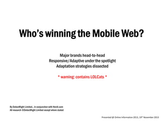
- 1. Who’s winning the Mobile Web? Major brands head-to-head Responsive/Adaptive under the spotlight Adaptation strategies dissected * warning: contains LOLCats * By DetectRight Limited., in conjunction with Herdl.com All research ©DetectRight Limited except where stated Presented @ Online Information 2013, 19th November 2013
- 2. About me • Chris Abbott • We improve online experiences using our device detection systems • Herdl = preferred deployment partners
- 3. Join in • Tweet your questions using #DetectRight • We’re all mobile here! • Fails. Want.
- 4. Why are we here?
- 5. Why are we here? • There is only one web. • We use many devices to view it. • It’s the Internet of Things
- 6. Why are we here? • Who uses a smartphone? • Hands up!
- 7. Why are we here? • Who uses a tablet? Hands up!
- 8. Why are we here? • How do we all feel when we can’t find what we need, when we need it?
- 9. Why are we here? • Online, information is available to users at any time and on any device.
- 10. Why are we here? • John Lewis - “mobile traffic will overtake desktop at 5pm on Christmas Day 2013” • What’s your tipping point? • Why not let us help you find out?
- 12. Who’s mobile aware? • Consumers are aware that mobile is important – but are you?
- 13. Who supports mobile? Which Magazine top 10 online retailers 2013 Cool cats Close, but no lolz Makes ceiling cat cry 1 (Responsive Design) 1. “Pure Responsive” means website is still bloated and zoomed out despite supporting touch
- 14. Who’s mobile aware? • Of the top 10 retailers 80% attempted mobile. They’ve seen the light.
- 15. Who supports mobile? Which Magazine bottom 10 online retailers 2013 Smart Cookiez Close, but no cheezburger Oh noez! 1 (Responsive Design) 1. “Pure Responsive” means website is bloated, glitchy and unresponsive, and not at all optimized for mobile.
- 16. Who’s mobile aware? • Of the bottom 10 retailers, only 60% have attempted mobile That’s not good.
- 17. Who supports mobile (generally?) Mobile Aware Sites 47.59 % Aware 52.41 % Unaware The long tail would almost certainly be worse.
- 18. How are sites doing it? 3.01% 3.01% 10.84% Responsive 39.16% Specific Mobile Nothing 43.98%
- 19. Responsive Design 1) send a full page to the device 2) ask the device how big the screen is 3) get the page to rearrange itself for the screen
- 20. Who is aware? Mobile Aware Sites (by sector, top sites) 100% 90% 80% 70% 60% 50% 100.00% 85.71% 40% 30% 89.47% 72.73% 70.00% 50.00% 53.33% 42.86% 20% 22.22% 10% 0% Unaware 78.57% 8.33% 18.75% 63.64% Aware
- 21. Social Media Sector Information Sector 100% Mobile Aware 22% Mobile Aware
- 22. Who’s mobile aware? • More than you might have expected – but not enough. • Is being “aware” enough?
- 23. Let’s talk about speed…
- 24. The need for speed. • After 10 seconds of waiting your users are bored and stressed. Source: http://www.strangeloopnetworks.com/resources/research/our-need-for-web-speed/
- 25. The need for speed Source: http://www.strangeloopnetworks.com/resources/research/our-need-for-web-speed/
- 26. The need for speed • 57% of users will abandon a slow loading page after 3 seconds Source: http://www.strangeloopnetworks.com/resources/research/our-need-for-web-speed/
- 27. The need for speed • 78% of users have felt stress or anger while using a slow website Source: http://www.strangeloopnetworks.com/resources/research/our-need-for-web-speed/
- 28. The need for speed • 4% of users have thrown their mobile phone while using a slow website Source: http://www.strangeloopnetworks.com/resources/research/our-need-for-web-speed/
- 29. Clash of the Titans
- 30. Clash of the Titans – Round 1 EasyJet vs RyanAir Friendly and considerate Snappy and App’y User-hostile 9 times slower than EasyJet Mobile Site
- 31. Clash of the Titans – Round 1 EasyJet vs RyanAir Verdict: A supersonic knockout for the Orange corner
- 32. The need for speed • Mobile page load time needs to be considered during website design and construction
- 33. The need for speed • “Responsive design” can look cool, but does not help page load time – in fact, it hinders it.
- 34. The need for speed • You’re loading assets when you don’t need them • Full responsive sites on mobile devices are too heavy
- 35. Mobile Data
- 36. Mobile data • Mobile data is a big money business
- 37. Mobile data • Mobile networks are cashing in on increased mobile activity with mobile data limited tariffs
- 38. Mobile data • Serving a desktop website or “pure responsive” version is costing your customers real money
- 39. Roaming Price List Single Visit • • • • • • • • Apple - £21.80 Pintrest - £27.39 Scholastic - £20.55 Google News – £0.05 Yahoo News - £0.07 Time - £18.49 Reuters - £1.48 BBC - £1.00 Based on O2 roaming charges @ £6 per mb outside Europe
- 40. Usability
- 41. Usability - Accessibility • Small screens demand different designs • Accessibility matters • Between 10% and 20% people with disabilities* * Source :W3C
- 43. Usability – Look and feel • Touch-swipe enhancements
- 44. Usability – Look and Feel • Bigger buttons and links for small screens
- 45. Usability – Look and Feel • Remote Control Friendly for Smart TV and Blu-Ray
- 46. Usability – Look and Feel • Target the Internet of Things. • Go that extra mile! • Customers will reward you, wherever they’re from.
- 47. Usability - Functionality • Offer unique attractions to the coolest tech • How will you serve wearables? • Give sophisticated devices something sexy.
- 48. BBC case study “Stacking” Desktop Mobile Much content is preserved: 1) As-is, or with less detail 2) Behind dynamic menus Access to all sections is preserved.
- 50. Desktop site directs to Mobile-first Responsive Website. Designed by UsableNet, in common with BA, M&S, LizEarle, Dell and Tesco. Better device detection needed on long tail, but that’s another story! Complete UI Rewrite
- 51. DEC – getting to the point Priority
- 52. Usability • How is everyone else doing out there? • Let’s look at the Good, the Bad and the Ugly
- 53. I need information about Cancer… Cancer Research (mobile friendly) Prostate Cancer UK (mobile friendly) Macmillan (mobile friendly) WRCF (not mobile friendly)
- 54. I need a 3D TV right now! Amazon (mobile friendly) Argos (mobile friendly) John Lewis (mobile friendly) Play.com (spot the TV)
- 55. What’s the latest? BBC News (mobile friendly) Google News (mobile friendly) Yahoo News (mobile friendly) Sky News (cram it all in)
- 56. Feeling Referential? British Library (mobile friendly) CIA (logo is mobile friendly, Since it’s the only thing visible on small phones!) Wiley Online Library (not mobile friendly) Library of Congress (I’m glad the library is bigger than this)
- 57. Feeling encyclopaedic?? Wikipedia (mobile friendly, responsive) Encyclopedia.com (mobile friendly) Britannica (mobile friendly with glitches caused by responsiveness) Encyclo (“Value” encyclopedia)
- 58. Quick, there’s been a disaster! DONATE NOW! American Red Cross (mobile friendly) DEC (mobile friendly) Oxfam (mobile friendly) International Red Cross (not mobile friendly)
- 59. Clash of the Titans – round 2!
- 60. Clash of the Titans Thomas Cook vs Thomson An app-like experience OK load speed More unreadable than a Travel Agent’s small print Slow to load
- 61. Clash of the Titans Thomas Cook vs Thomson Verdict: Thomas Cook takes home the breakfast buffet bacon
- 62. Basic device detection ? On the mobile web, errors like this happen all the time.
- 63. Basic Device Detection • To Detect and To Serve
- 64. Basic Device Detection • You need to know what your customer is using to serve content in the right way with the right controls.
- 65. Ryanair’s revenge What is this, 1996?
- 66. Keep taking the Tablets… (Wide browser does not mean tablet!) This is why you need proper Device Detection…
- 67. Recap
- 68. Recap Consumers want a good experience on all devices in the Internet of Things
- 69. Recap • Some websites have grasped mobile. • Some sites are still getting around to it • Some sites hate users.
- 70. Recap • Speed is crucial. Mobile data is still slow.
- 71. Recap • Usability is key • Full desktop websites on small screens does not work.
- 72. Recap • Data transfer– less is more! • Don’t abuse the user! • Customer first: developer second!
- 73. How to address this puzzle?
- 74. Weak 3G Connection Page Loading Time Averages Seconds Average first view page loading times (seconds) across 166 popular websites 25 20 Irony alert! 15 Above 10s, the visitor will probably give up. Total 10 5 0 Adaptive Mobile redirect None Responsive
- 75. The need for speed Percentage load time improvements (Mobile Sites) 300.0% 250.0% 200.0% 150.0% 100.0% 50.0% 0.0% Big performance increases for all sectors (between 25-300%) over their competitors
- 76. Mobile data • A faster website means a better user experience with less crashes
- 77. Mobile data • Device detection means you can serve optimised content to all sorts of devices…
- 78. Mobile data • Device detection means you can serve optimised content to all sorts of devices… including Windows!
- 79. Mobile data • Mobile optimised data = visitors browse without fear of huge data charges.
- 80. Usability • Device detection is at the heart of Adaptive Web Design (“AWD”). • AWD is in the sweet spot between pure mobile and pure responsive. • “Mobile First Responsive” is the best of both worlds.
- 81. Usability Detect > Adapt > Publish > Respond NOT JUST: Publish > Respond
- 82. Clash of the Titans – Round 3 Expedia vs Opodo Simple, and extremely usable. Twice as long to load as Opodo, but less navigating. Attractive and simple Faster than Expedia but with less functionality Verdict: ?
- 83. Clash of the Titans – Round 3 Expedia vs Opodo Aha! A tie-break! Alas, Opodo is a bit ‘Appless. Verdict: A technical last-round knockout for Expedia
- 84. Basic Device Detection • Know the device accessing your website and serve the right version to your guests – every time!
- 85. More Social than you thought? • Social Media interaction encourages mobile traffic • If you have these icons, you’re inviting mobile traffic! • Sixty percent of Twitter’s 200 million active users log in via a mobile device at least once every month.
- 87. Summary Engagement needs: • Speed – no one wants to wait • Style – no one wants ugly, but less can be more • Substance – no one wants restrictions • Size – don’t abuse your user
- 88. Summary • • • • All sites need proper device detection Free solutions – you get what you pay for Don’t DIY it Ask an expert!
- 89. Summary • Why not support Wearables, Tablets and Superphones? – Get way ahead of your competition – Get good PR – Accessibility brownie points
- 90. Summary • Testing is crucial • Lots of tools available • How’s your site? Test it @ http://www.webpagetest.org • What’s your tipping point? Why not ask us?
- 91. Clash of the Titans – Cage Match!
- 92. Clash of the Titans – supermatch! Apple Tiny menus
- 93. Clash of the Titans – supermatch! Microsoft For Android and iOS… For other mobiles… Flawed, but valiant attempt!
- 94. Clash of the Titans – supermatch! Apple vs Microsoft ? Verdict: Surprise win for Microsoft. (C’mon Apple! Give the mobile web some love!)
- 96. Contact Points • #DetectRight • Gareth Morgans (Herdl) - + 44 116 3400 442 gareth@herdl.com • Chris Abbott (DetectRight) - +44 208 464 2295 chris@detectright.com