5 Ecommerce Navigation Enhancements for Customer Experience & Sales
•
0 j'aime•771 vues

Why and how to take advantage of the shopping habits of your customers when organizing your ecommerce site navigation. Gives examples from 5 high-volume retailers and explanations of the ideas behind their decisions.

Recommandé
Recommandé
Contenu connexe
Tendances
Tendances (14)
Similaire à 5 Ecommerce Navigation Enhancements for Customer Experience & Sales
Similaire à 5 Ecommerce Navigation Enhancements for Customer Experience & Sales (20)
Dernier
Dernier (20)
5 Ecommerce Navigation Enhancements for Customer Experience & Sales
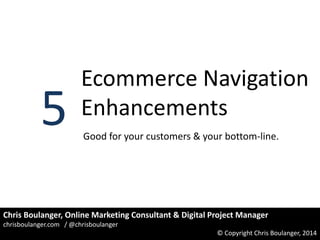
- 1. 5 Ecommerce Navigation Enhancements Good for your customers & your bottom-line. Chris Boulanger, Online Marketing Consultant & Digital Project Manager chrisboulanger.com / @chrisboulanger © Copyright Chris Boulanger, 2014
- 2. We Base Navigation on What We Carry… Most ecommerce navigation is designed to surface as many of your offerings as possible. Everything is about hierarchy and logically descending from general to specific. chrisboulanger.com / @chrisboulanger © Copyright Chris Boulanger, 2014
- 3. But This Ignores 2 Key Truths of Our Stores. 1. Some categories are more important than others (e.g. higher margins, higher conversion rates, larger order size) 2. Customers will spend the majority of their time and their money in a few categories (and maybe on a few products). chrisboulanger.com / @chrisboulanger © Copyright Chris Boulanger, 2014
- 4. What’s #2 About? I’ll wager that you thought “Duh” for #1, but #2 may be hard to swallow. To understand #2, it helps to be familiar with the Pareto Principle. “The Pareto principle (also known as the 80–20 rule, the law of the vital few, and the principle of factor sparsity) states that, for many events, roughly 80% of the effects come from 20% of the causes.” (Wikipedia) chrisboulanger.com / @chrisboulanger © Copyright Chris Boulanger, 2014
- 5. This Principle Applies to Your Site & Customers % of Ecommerce Sales Your numbers might not be that clean cut (maybe 65/35 or 75/25). But your data will still show something like the chart to right. Everythi ng Else, 20.30% Top 10 Cats, 79.70% There are Edge Cases: very small or very large catalogs, wide variation in product price that can throw off the distribution. – But you are probably not one of them. chrisboulanger.com / @chrisboulanger © Copyright Chris Boulanger, 2014
- 6. The Point of All This: “If the majority of your customers shop in a few categories and the majority of your revenue comes from those categories, then your navigation’s main purpose is getting customers to those categories. chrisboulanger.com / @chrisboulanger © Copyright Chris Boulanger, 2014
- 7. This Is a Sub-Optimal Way to Get Them There. Click 1: Is the right place? Click 2: Almost there. Click 3: I think this is it. Click 4: Finally arrived. chrisboulanger.com / @chrisboulanger © Copyright Chris Boulanger, 2014
- 8. We want to give customers simple cues, chrisboulanger.com / @chrisboulanger © Copyright Chris Boulanger, 2014
- 9. & Well-marked paths. chrisboulanger.com / @chrisboulanger © Copyright Chris Boulanger, 2014
- 10. 5 Ways that You Can Accomplish This chrisboulanger.com / @chrisboulanger © Copyright Chris Boulanger, 2014
- 11. 1. Order Navigation to give core customers priority. Old Navy puts links for women, it’s core customers, at the start of it’s top navigation. If you know who your core customer is and what they want, then why not make their life easier? bigger version on next slide. chrisboulanger.com / @chrisboulanger © Copyright Chris Boulanger, 2014
- 12. Old Navy Example: chrisboulanger.com / @chrisboulanger © Copyright Chris Boulanger, 2014
- 13. 2. Align Navigation Options with Product Attributes Williams-Sonoma uses labels to orient users toward more specific solutions based on the selling points for their audience. Notice the sections for Materials and Brands. bigger version on next slide. chrisboulanger.com / @chrisboulanger © Copyright Chris Boulanger, 2014
- 14. Williams-Sonoma Example: chrisboulanger.com / @chrisboulanger © Copyright Chris Boulanger, 2014
- 15. 3. Be Selective in What You Show (Curate Your Internal Links) Target has thousands of categories and sub-categories but focuses attention on sets of sub-categories rather than forcing you to click on a top-category. They still link to multiple levels of the site, but the stuff they really want to sell is most prominent. bigger version on next slide. chrisboulanger.com / @chrisboulanger © Copyright Chris Boulanger, 2014
- 16. Target Example: chrisboulanger.com / @chrisboulanger © Copyright Chris Boulanger, 2014
- 17. 4. Consolidate Secondary Options Zappos chose to group options in a separate dropdown rather than remove them completely. They focus on their main categories, but nothing is lost. Notice that they include the options from the main part of the top navigation as well as links to some deeper subcategories. bigger version on next slide. chrisboulanger.com / @chrisboulanger © Copyright Chris Boulanger, 2014
- 18. Zappos Example: chrisboulanger.com / @chrisboulanger © Copyright Chris Boulanger, 2014
- 19. 5. Use Eye-Candy to Pull Them In SurfStich carries the leading surf, snow and skateboard apparel brands. There audience trends younger and also wants to know what’s hot. Featuring merchandise in the navigation draws visitors to the merchandise they really want to move. bigger version on next slide. chrisboulanger.com / @chrisboulanger © Copyright Chris Boulanger, 2014
- 20. SurfStitch Example: chrisboulanger.com / @chrisboulanger © Copyright Chris Boulanger, 2014
- 21. Key Things to Think About: 1. Who is your core customer and will they want to go? 2. What attributes of your products are differentiators or shopping criteria? 3. What are you expecting to sell the most of? 4. Can you make lower-priority categories less intrusive? 5. What can you do to make the next click more obvious? chrisboulanger.com / @chrisboulanger © Copyright Chris Boulanger, 2014
- 22. Thanks for Coming This Far I hope you found this deck helpful. Remember that you can always make your site better. Nothing shown here is especially complex. In fact, a lot of it can be done with a small bit of editing to template files or a few clicks in your store admin. You can find many of these options in add-ons for Magento, ATG, WebSphere or WooCommerce. Custom platforms can find scripts to help you get started by searching phrases like “faceted navigation” , “sorted navigation” or “dynamic navigation”. chrisboulanger.com / @chrisboulanger © Copyright Chris Boulanger, 2014
- 23. A Bit About Me: I’m a marketing consultant and digital project manager that focuses on finding high-leverage solutions, and answers for the problems of ecommerce stores and niche publishers. I always try to improve on what you‘ve got rather before suggesting something new and shiny. I still believe that the web is for everyone. That means that small shops can beat Goliaths, and big gains can be made with small, smart moves. Visit My Website chrisboulanger.com / @chrisboulanger © Copyright Chris Boulanger, 2014