SlideShare a Scribd company logo
1 of 8
Preliminary Task College Magazine brief Name: ‘College Boulevard’ Frequency: Monthly Target audience: Generally college students - all interests and subjects Theme and Contents: Music and the Arts at Henley College, useful exam and revision tips, enrichment activities, sports events, amnesty meetings. Front page photo: Ellie (student, doing work at college) Puffs on the front page: “Inside – Amnesty International meetings!”                                      “Performing Arts at Henley”                                      “Plus! Weekly Canteen Menu”                                      “Latest notices, enrichment,                                                       tournaments...and much more!”                                       “Exam Tips!”   Contents:    on pg. 3 – Notices and college news                        pg. 4 – Performing arts at Henley College                         pg. 5 – Sports events at Henley College                        pg. 6 – Amnesty International  pg. 7 – Exam and revision tips & Food (college  canteen weekly menu)  
Research – College magazine Simple combination of colours: navy blue, yellow and white, but the yellow still makes the text stand out and grab attention. Easy to read, clear and organised structure.  Logo and college details for information Date of issue and college name Sub-headings help create a more formal structure The lay out is clear and the page isn’t overloaded with text/images, which sets the target audience well – young adults. As the newsletter is aimed at young people, text dominates the page, with just one image to illustrate the article. Text is well organised into paragraphs, and the font is big enough to read.  Space is filled and used appropriately (no large blank sections)  Sponsors name Professional footer in navy blue – dominant colour As this is typically a college newsletter, there are no contents listed, but it only consists of a few pages so it isn’t necessary No variety of text fonts and styles. Blunt graphics.
Research – Conventional magazine Masthead at the top of the page – following conventions Sell line above the masthead – important feature Masthead behind the artist, but enough is visible to read the name. The font size of the masthead is the largest out of all the cover lines and puffs on the page. Variety of font sizes, but one main style kept throughout as it’s aimed at an older audience One colour background – used so that the lighter coloured text is clear.  The magazine is aimed at women, therefore the colour scheme as well as the mis-en-scene follow a simple pattern of colours, which makes the cover look more elegant, fashionable and stylish.  (White, black and grey create a sophisticated tone) Good use of space, no excess text Main features of the magazine indicted through a number puffs and sell lines The lighting compliments the colour scheme, no harsh colours or tones The sell lines don’t address the audience
Masthead Selling Line Issue Date & Number Main  Image (mid shot) Price Barcode Puff Feature Headline Cover Line Cover Line Cover Line Cover Line
Evaluation    The key aim of this preliminary task was to produce the front page and the mock-up of the contents page of a college magazine, in preparation for the main task. Considering the purpose, I targeted the magazine cover at college students in general (no specific interests) , and so the audience I’m aiming at is much wider. My research consisted of looking at two magazine front covers (one typically aimed at students and one conventional fashion/gossip magazine). I analysed conventions and common features found on magazines, and used some of them for my front page. chose a combination of colours, fonts, as well as a variety of text sizes for the front cover in order to attract young adults and stands out against the main image. The bright colours are eye catching and the content will interest the potential buyer. According to the audience feedback (fellow students), I was fairly successful in the incorporation of text and colour with the main image, which is a significantly important part of the front page as it gives off a certain impression on the audience. I planned the production on my brief and through sketches and then drafts, which helped me visualise what my final product would look like. This type of planning worked for me very well, therefore I will use the same method in my main task, however I will make more drafts and take more photos so I have a wider choice of possibilities.  The layout is clear and I placed the puffs on the sides so that they are readable and don’t overlap with the student’s face on the main image. I followed the conventions of magazines and put the masthead on the top as this is the 1/3 of the page which is visible on newsstands. The main image is a mid-shot of a student doing work at college surrounded by a notice board, sitting at a college desk with a writing pad; looking straight at the audience - addressing it directly. I addressed the audience through the use of “YOUR” and highlighted words like “much” to emphasize on the content of the magazine. Another convention of magazines is the background and price at the bottom, which I used for my magazine too. From the audience feedback I can conclude that my layout was quite successful too, as the colours compliment each other. I was moderately successful in producing the main image as the access to advanced programs was limited to me, so I tried to make the best of PowerPoint, Paint, and online editing websites.
   In production, I mainly used Microsoft PowerPoint 07 and Paint to create the front page and the mock-up of the contents page. However, I used online photo editing programs like FotoFlexer.com and Picnik.com to improve the quality of the mis-shot main image. I found PowerPoint useful for making the different text fonts and colours, and the shapes underneath a number of puffs, which added to the overall quality. I used FotoFlexer to bring the focus of the main image onto the face and mildly reduced the focus around the edges. Picnik was helpful in sharpening the image. I used a digital camera for my main image as I wanted the quality to be as good as possible even before the editing as I wanted to keep the realism of the image, which editing somewhat hinders.    The final version of my college magazine cover is slightly different to what I had planned initially in my draft. Some of the cover lines and puffs are in different places as I tried incorporate the main image with the text appropriately. The slot for the issue number and date had to be moved (for the same reason)  to the other side of the page which took up the space for a selling line so I eliminated this feature.    Lastly, I created the mock-up draft of the contents page, clearly indicating where the images and text would be placed. I ensured not to ‘overload’ this page with puffs as contents should be clear and easy to read, so I structured and organised the page quite symmetrically.     Overall, I think the preliminary task was successful. I scored high marks in audience feedback on the important features of the magazine, including 5/5 for appropriateness.  I managed my time well and learnt new skills, such as trying out different font types in order to suit the target audience as well as skilfully compliment the main image, in preparation for the main task. Next time, In the main task I will use more advanced programs such as InDesign and PhotoShop to produce the pages of my music magazine to improve my skills further and familiarise myself with design technology.  			Vanessa Szymanska

More Related Content

What's hot

What's hot (18)

research and planning presentation 3
research and planning presentation 3research and planning presentation 3
research and planning presentation 3
 
School magazine prelimanary task
School magazine prelimanary taskSchool magazine prelimanary task
School magazine prelimanary task
 
research and planning presentation
research and planning presentationresearch and planning presentation
research and planning presentation
 
Evaluation of music magazine
Evaluation of music magazine Evaluation of music magazine
Evaluation of music magazine
 
Contents Page Analysis We Love Pop
Contents Page Analysis We Love PopContents Page Analysis We Love Pop
Contents Page Analysis We Love Pop
 
Textual analysis of magazine pages
Textual analysis of magazine pagesTextual analysis of magazine pages
Textual analysis of magazine pages
 
Research and planning
Research and planningResearch and planning
Research and planning
 
Research of My School Magazine
Research of My School MagazineResearch of My School Magazine
Research of My School Magazine
 
School magazine
School magazineSchool magazine
School magazine
 
Evaluation of my music magazine
Evaluation of my music magazineEvaluation of my music magazine
Evaluation of my music magazine
 
Contents
ContentsContents
Contents
 
Preliminary task evaluation
Preliminary task evaluationPreliminary task evaluation
Preliminary task evaluation
 
Evaluation task 7pp
Evaluation task 7ppEvaluation task 7pp
Evaluation task 7pp
 
Evaluation task 7pp
Evaluation task 7ppEvaluation task 7pp
Evaluation task 7pp
 
Evaluation 7
Evaluation 7Evaluation 7
Evaluation 7
 
Evaluation Question Seven
Evaluation Question Seven Evaluation Question Seven
Evaluation Question Seven
 
(Done) preliminary task
(Done) preliminary task(Done) preliminary task
(Done) preliminary task
 
AS Media Preliminary task
AS Media Preliminary taskAS Media Preliminary task
AS Media Preliminary task
 

Viewers also liked

Planning Double Page Spread
Planning Double Page SpreadPlanning Double Page Spread
Planning Double Page Spread
Vanessa S
 
Publishing Institutions
Publishing InstitutionsPublishing Institutions
Publishing Institutions
Vanessa S
 
General Planning
General PlanningGeneral Planning
General Planning
Vanessa S
 
General planning
General planningGeneral planning
General planning
Vanessa S
 
Codes and conventions of a magazine double page
Codes and conventions of a magazine double pageCodes and conventions of a magazine double page
Codes and conventions of a magazine double page
lauragoulding
 
Codes and conventions of a double page spread
Codes and conventions of a double page spreadCodes and conventions of a double page spread
Codes and conventions of a double page spread
Laurengibney
 

Viewers also liked (7)

Planning Double Page Spread
Planning Double Page SpreadPlanning Double Page Spread
Planning Double Page Spread
 
Publishing Institutions
Publishing InstitutionsPublishing Institutions
Publishing Institutions
 
General Planning
General PlanningGeneral Planning
General Planning
 
Front cover
Front coverFront cover
Front cover
 
General planning
General planningGeneral planning
General planning
 
Codes and conventions of a magazine double page
Codes and conventions of a magazine double pageCodes and conventions of a magazine double page
Codes and conventions of a magazine double page
 
Codes and conventions of a double page spread
Codes and conventions of a double page spreadCodes and conventions of a double page spread
Codes and conventions of a double page spread
 

Similar to Preliminary task vanessa szymanska (20)

As media studies
As media studiesAs media studies
As media studies
 
School magazine treatment & planning
School magazine   treatment & planningSchool magazine   treatment & planning
School magazine treatment & planning
 
School magazine treatment & planning
School magazine  treatment & planningSchool magazine  treatment & planning
School magazine treatment & planning
 
School Magazine - Preliminary Task
School Magazine - Preliminary TaskSchool Magazine - Preliminary Task
School Magazine - Preliminary Task
 
School magazine
School magazineSchool magazine
School magazine
 
Preliminary task
Preliminary task Preliminary task
Preliminary task
 
School magazine: treatment & planning
School magazine: treatment & planningSchool magazine: treatment & planning
School magazine: treatment & planning
 
Preliminary Tasks
Preliminary TasksPreliminary Tasks
Preliminary Tasks
 
School magazine
School magazineSchool magazine
School magazine
 
22
2222
22
 
Preliminary task
Preliminary taskPreliminary task
Preliminary task
 
My Preliminary Task x
My Preliminary Task xMy Preliminary Task x
My Preliminary Task x
 
Preliminary task.
Preliminary task.Preliminary task.
Preliminary task.
 
Preliminary task
Preliminary taskPreliminary task
Preliminary task
 
Preliminary task.
Preliminary task.Preliminary task.
Preliminary task.
 
anastasija preliminary task.pptx
anastasija preliminary task.pptxanastasija preliminary task.pptx
anastasija preliminary task.pptx
 
School magazine analysis
School magazine analysisSchool magazine analysis
School magazine analysis
 
Preliminary Task - Evaluation
Preliminary Task - EvaluationPreliminary Task - Evaluation
Preliminary Task - Evaluation
 
Liam Media Evaluation
Liam Media EvaluationLiam Media Evaluation
Liam Media Evaluation
 
Preliminary Tasks
Preliminary TasksPreliminary Tasks
Preliminary Tasks
 

Recently uploaded

Recently uploaded (20)

Partners Life - Insurer Innovation Award 2024
Partners Life - Insurer Innovation Award 2024Partners Life - Insurer Innovation Award 2024
Partners Life - Insurer Innovation Award 2024
 
Apidays New York 2024 - The value of a flexible API Management solution for O...
Apidays New York 2024 - The value of a flexible API Management solution for O...Apidays New York 2024 - The value of a flexible API Management solution for O...
Apidays New York 2024 - The value of a flexible API Management solution for O...
 
Polkadot JAM Slides - Token2049 - By Dr. Gavin Wood
Polkadot JAM Slides - Token2049 - By Dr. Gavin WoodPolkadot JAM Slides - Token2049 - By Dr. Gavin Wood
Polkadot JAM Slides - Token2049 - By Dr. Gavin Wood
 
HTML Injection Attacks: Impact and Mitigation Strategies
HTML Injection Attacks: Impact and Mitigation StrategiesHTML Injection Attacks: Impact and Mitigation Strategies
HTML Injection Attacks: Impact and Mitigation Strategies
 
The 7 Things I Know About Cyber Security After 25 Years | April 2024
The 7 Things I Know About Cyber Security After 25 Years | April 2024The 7 Things I Know About Cyber Security After 25 Years | April 2024
The 7 Things I Know About Cyber Security After 25 Years | April 2024
 
A Domino Admins Adventures (Engage 2024)
A Domino Admins Adventures (Engage 2024)A Domino Admins Adventures (Engage 2024)
A Domino Admins Adventures (Engage 2024)
 
Understanding Discord NSFW Servers A Guide for Responsible Users.pdf
Understanding Discord NSFW Servers A Guide for Responsible Users.pdfUnderstanding Discord NSFW Servers A Guide for Responsible Users.pdf
Understanding Discord NSFW Servers A Guide for Responsible Users.pdf
 
GenAI Risks & Security Meetup 01052024.pdf
GenAI Risks & Security Meetup 01052024.pdfGenAI Risks & Security Meetup 01052024.pdf
GenAI Risks & Security Meetup 01052024.pdf
 
From Event to Action: Accelerate Your Decision Making with Real-Time Automation
From Event to Action: Accelerate Your Decision Making with Real-Time AutomationFrom Event to Action: Accelerate Your Decision Making with Real-Time Automation
From Event to Action: Accelerate Your Decision Making with Real-Time Automation
 
ProductAnonymous-April2024-WinProductDiscovery-MelissaKlemke
ProductAnonymous-April2024-WinProductDiscovery-MelissaKlemkeProductAnonymous-April2024-WinProductDiscovery-MelissaKlemke
ProductAnonymous-April2024-WinProductDiscovery-MelissaKlemke
 
Deploy with confidence: VMware Cloud Foundation 5.1 on next gen Dell PowerEdg...
Deploy with confidence: VMware Cloud Foundation 5.1 on next gen Dell PowerEdg...Deploy with confidence: VMware Cloud Foundation 5.1 on next gen Dell PowerEdg...
Deploy with confidence: VMware Cloud Foundation 5.1 on next gen Dell PowerEdg...
 
Boost PC performance: How more available memory can improve productivity
Boost PC performance: How more available memory can improve productivityBoost PC performance: How more available memory can improve productivity
Boost PC performance: How more available memory can improve productivity
 
Bajaj Allianz Life Insurance Company - Insurer Innovation Award 2024
Bajaj Allianz Life Insurance Company - Insurer Innovation Award 2024Bajaj Allianz Life Insurance Company - Insurer Innovation Award 2024
Bajaj Allianz Life Insurance Company - Insurer Innovation Award 2024
 
A Year of the Servo Reboot: Where Are We Now?
A Year of the Servo Reboot: Where Are We Now?A Year of the Servo Reboot: Where Are We Now?
A Year of the Servo Reboot: Where Are We Now?
 
Automating Google Workspace (GWS) & more with Apps Script
Automating Google Workspace (GWS) & more with Apps ScriptAutomating Google Workspace (GWS) & more with Apps Script
Automating Google Workspace (GWS) & more with Apps Script
 
presentation ICT roal in 21st century education
presentation ICT roal in 21st century educationpresentation ICT roal in 21st century education
presentation ICT roal in 21st century education
 
Strategize a Smooth Tenant-to-tenant Migration and Copilot Takeoff
Strategize a Smooth Tenant-to-tenant Migration and Copilot TakeoffStrategize a Smooth Tenant-to-tenant Migration and Copilot Takeoff
Strategize a Smooth Tenant-to-tenant Migration and Copilot Takeoff
 
Bajaj Allianz Life Insurance Company - Insurer Innovation Award 2024
Bajaj Allianz Life Insurance Company - Insurer Innovation Award 2024Bajaj Allianz Life Insurance Company - Insurer Innovation Award 2024
Bajaj Allianz Life Insurance Company - Insurer Innovation Award 2024
 
Real Time Object Detection Using Open CV
Real Time Object Detection Using Open CVReal Time Object Detection Using Open CV
Real Time Object Detection Using Open CV
 
TrustArc Webinar - Unlock the Power of AI-Driven Data Discovery
TrustArc Webinar - Unlock the Power of AI-Driven Data DiscoveryTrustArc Webinar - Unlock the Power of AI-Driven Data Discovery
TrustArc Webinar - Unlock the Power of AI-Driven Data Discovery
 

Preliminary task vanessa szymanska

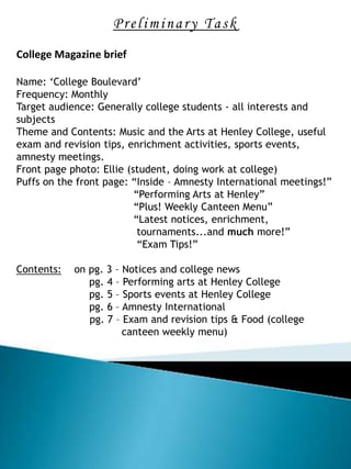
  • 1. Preliminary Task College Magazine brief Name: ‘College Boulevard’ Frequency: Monthly Target audience: Generally college students - all interests and subjects Theme and Contents: Music and the Arts at Henley College, useful exam and revision tips, enrichment activities, sports events, amnesty meetings. Front page photo: Ellie (student, doing work at college) Puffs on the front page: “Inside – Amnesty International meetings!” “Performing Arts at Henley” “Plus! Weekly Canteen Menu” “Latest notices, enrichment, tournaments...and much more!” “Exam Tips!”   Contents: on pg. 3 – Notices and college news pg. 4 – Performing arts at Henley College pg. 5 – Sports events at Henley College pg. 6 – Amnesty International pg. 7 – Exam and revision tips & Food (college canteen weekly menu)  
  • 2. Research – College magazine Simple combination of colours: navy blue, yellow and white, but the yellow still makes the text stand out and grab attention. Easy to read, clear and organised structure. Logo and college details for information Date of issue and college name Sub-headings help create a more formal structure The lay out is clear and the page isn’t overloaded with text/images, which sets the target audience well – young adults. As the newsletter is aimed at young people, text dominates the page, with just one image to illustrate the article. Text is well organised into paragraphs, and the font is big enough to read. Space is filled and used appropriately (no large blank sections) Sponsors name Professional footer in navy blue – dominant colour As this is typically a college newsletter, there are no contents listed, but it only consists of a few pages so it isn’t necessary No variety of text fonts and styles. Blunt graphics.
  • 3. Research – Conventional magazine Masthead at the top of the page – following conventions Sell line above the masthead – important feature Masthead behind the artist, but enough is visible to read the name. The font size of the masthead is the largest out of all the cover lines and puffs on the page. Variety of font sizes, but one main style kept throughout as it’s aimed at an older audience One colour background – used so that the lighter coloured text is clear. The magazine is aimed at women, therefore the colour scheme as well as the mis-en-scene follow a simple pattern of colours, which makes the cover look more elegant, fashionable and stylish. (White, black and grey create a sophisticated tone) Good use of space, no excess text Main features of the magazine indicted through a number puffs and sell lines The lighting compliments the colour scheme, no harsh colours or tones The sell lines don’t address the audience
  • 4. Masthead Selling Line Issue Date & Number Main Image (mid shot) Price Barcode Puff Feature Headline Cover Line Cover Line Cover Line Cover Line
  • 5.
  • 6.
  • 7. Evaluation The key aim of this preliminary task was to produce the front page and the mock-up of the contents page of a college magazine, in preparation for the main task. Considering the purpose, I targeted the magazine cover at college students in general (no specific interests) , and so the audience I’m aiming at is much wider. My research consisted of looking at two magazine front covers (one typically aimed at students and one conventional fashion/gossip magazine). I analysed conventions and common features found on magazines, and used some of them for my front page. chose a combination of colours, fonts, as well as a variety of text sizes for the front cover in order to attract young adults and stands out against the main image. The bright colours are eye catching and the content will interest the potential buyer. According to the audience feedback (fellow students), I was fairly successful in the incorporation of text and colour with the main image, which is a significantly important part of the front page as it gives off a certain impression on the audience. I planned the production on my brief and through sketches and then drafts, which helped me visualise what my final product would look like. This type of planning worked for me very well, therefore I will use the same method in my main task, however I will make more drafts and take more photos so I have a wider choice of possibilities. The layout is clear and I placed the puffs on the sides so that they are readable and don’t overlap with the student’s face on the main image. I followed the conventions of magazines and put the masthead on the top as this is the 1/3 of the page which is visible on newsstands. The main image is a mid-shot of a student doing work at college surrounded by a notice board, sitting at a college desk with a writing pad; looking straight at the audience - addressing it directly. I addressed the audience through the use of “YOUR” and highlighted words like “much” to emphasize on the content of the magazine. Another convention of magazines is the background and price at the bottom, which I used for my magazine too. From the audience feedback I can conclude that my layout was quite successful too, as the colours compliment each other. I was moderately successful in producing the main image as the access to advanced programs was limited to me, so I tried to make the best of PowerPoint, Paint, and online editing websites.
  • 8. In production, I mainly used Microsoft PowerPoint 07 and Paint to create the front page and the mock-up of the contents page. However, I used online photo editing programs like FotoFlexer.com and Picnik.com to improve the quality of the mis-shot main image. I found PowerPoint useful for making the different text fonts and colours, and the shapes underneath a number of puffs, which added to the overall quality. I used FotoFlexer to bring the focus of the main image onto the face and mildly reduced the focus around the edges. Picnik was helpful in sharpening the image. I used a digital camera for my main image as I wanted the quality to be as good as possible even before the editing as I wanted to keep the realism of the image, which editing somewhat hinders. The final version of my college magazine cover is slightly different to what I had planned initially in my draft. Some of the cover lines and puffs are in different places as I tried incorporate the main image with the text appropriately. The slot for the issue number and date had to be moved (for the same reason) to the other side of the page which took up the space for a selling line so I eliminated this feature. Lastly, I created the mock-up draft of the contents page, clearly indicating where the images and text would be placed. I ensured not to ‘overload’ this page with puffs as contents should be clear and easy to read, so I structured and organised the page quite symmetrically. Overall, I think the preliminary task was successful. I scored high marks in audience feedback on the important features of the magazine, including 5/5 for appropriateness. I managed my time well and learnt new skills, such as trying out different font types in order to suit the target audience as well as skilfully compliment the main image, in preparation for the main task. Next time, In the main task I will use more advanced programs such as InDesign and PhotoShop to produce the pages of my music magazine to improve my skills further and familiarise myself with design technology. Vanessa Szymanska

Editor's Notes

  1. Brief
  2. Research
  3. Development/draft
  4. Mock up of the contents page
  5. Evaluation