Beginners Guide to TikTok for Search - Rachel Pearson - We are Tilt __ Bright...
School magaizne research
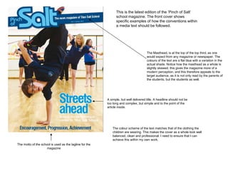
1. This is the latest edition of the ‘Pinch of Salt’ school magazine. The front cover shows specific examples of how the conventions within a media text should be followed. The Masthead, is at the top of the top third, as one would expect from any magazine or newspaper. The colours of the text are a flat blue with a variation in the actual shade. Notice how the masthead as a whole is slightly skewed, this gives the magazine more of a modern perception, and this therefore appeals to the target audience, as it is not only read by the parents of the students, but the students as well. The motto of the school is used as the tagline for the magazine A simple, but well delivered title. A headline should not be too long and complex, but simple and to the point of the article inside. The colour scheme of the text matches that of the clothing the children are wearing. This makes the cover as a whole look well balanced, clean and professional. I need to ensure that I can achieve this within my own work.
2. For my magazine, I will try and take all of the factors that make this magazine front cover successful and apply them to my work. By planning and designing first, I will give myself a clear indication of how I want the final piece to look, and if needed, I can adapt the plan to the images that I will take. I shall use Photoshop CS4 in order to create my school based magazine.