SlideShare une entreprise Scribd logo
1  sur  4
This magazine cover is effective        Strap line-A tag line is a variant of a
because all the colours                 branding slogan typically used in                                                                         Cover line
complement each other. The uses         marketing materials and advertising.                                                                      this is
of red, black white and a hint of       Here the strap line is used to advertise                                                                  aligned left
                                        the celebrities who will be included in                                                                   but placed
orange, is successful because it
                                        the magazine. It draws the audience to                                                                    on the right
doesn’t make the front cover look       buy the magazine, because will want to                                                                    of the page,
crowded and cramped. The image          know why the celebrities are strap lined.                                                                 to border
and text complement each other                                                                                                                    the central
and the text is used around the                                                                                                                   image and
                                        The masthead which is the name of the                                                                     complimen
main image which attracts the
                                        magazine is in bold red colour, along                                                                     t the
reader. The magazine doesn’t            with the picture it gives a seductive                                                                     central
really use any margins. The image       colour and will stand out in a line of                                                                    image
and spread across the margins.          competition magazines.
The magazine only uses one main
image, which could stand many
other genres of music. The image                                                                                                                  Advert, is
is giving full eye contact to build a                                                                                                             placed on
                                         The text is aligned to the left it is
degree of intimacy between you           placed like this to border the                                                                           the front
and the reader. The only in which        main image and not to distract                                                                           page to
we know the genre of the                 the reader too much from the                                                                             attract
magazine is because the celebrity        central image                                                                                            people to
is a recognised R&B star.                                                                                                                         buy into
                                                                                                     Main image which is foregrounded the         the station.
                                                                                                     picture is of the Beyoncé who is headlined
                                             This is the main cover line which takes up more than    in the main cover line. This picture has
                                             a quarter of the front page. The main cover line uses   been used because it is a very seductive
                                             bold font which is red and black and attracts the       picture of the celebrity and attracts male
                                             reader because the colours are quite alarming. It       and female readers. The picture is very
                                             brings the readers eyes straight to the magazine.       sexual and attractive.
This magazine uses
                                                                   four cover lines
                                                                   which are all aligned
                                                                   to the left


                                                          Main cover line- they want
                                                          the audience to read the
                                                          magazine, and understand
                                                          where the celebrities are
                                                          coming from.
                                                                                                                                       Advert for next
The layout revolves three columns in this magazine, the same in                                                                        issue
which VIBE has used three columns. This magazine has used one                    This magazine has used three columns, but this is more obvious than the
male on the right, one make on the left and a male in the centre, to             ‘Rolling Stones’ magazine. The bold text is placed behind the main
divide the magazine into three columns. All three men are giving                 celebrity who is brought in front. The way in which the main image is
the camera full eye contact with the camera to produce a degree                  symbolising the RnB genre. The celebrity is giving full eye contact with
                                                                                 camera, creating a degree of intimacy with the audience. The main image
of intimacy with the reader. They have dressed the main image to
                                                                                 overlaps the masthead because the image is meant to be the main item on
represent the genre of indie music, they are dressed typically in                the front cover. The main image is of a semi –nude man which creates
black leather jackets,. They have used a colour scheme of red,                   sensuality and lust between the reader and the artist. The cover lines
black and white; these colours attract the reader to the magazine                feature a lot of music topics from the UK and USA, there is a reference to
also to stand out on the top shelf. The colours are used much more               artists and their record label. The cover lines are aimed at fans and people
subtly than VIBE. The main cover line is left aligned, similar to VIBE.          who might be serious about the RnB genre of music. The barcode is placed
                                                                                 at the front of the magazine. The advert for next issue if placed at the
They have used four cover lines which are left aligned on the left
                                                                                 bottom right hand corner of the magazine to entice the reader to the next
side of the page. This magazine hasn’t used a barcode like the                   issue, it’s a preview. The main image is dominant but is complimented by
‘VIBE’ magazine. The cover line ‘Rock Band vs. Guitar Hero’ entices              the bold choices of font colour and font sizes, the use of red along with the
the audience to the indie theme, draws the audience into the                     sensuous main image, creates a high degree of sexual tension between the
magazine. ‘                                                                      reader and the artist.
This magazine has stuck to two column using the
                                              main image as a break up for the page.
                                              The magazine uses feature well, aligned to the right
                                              of the page. It has been broken up into two,
                                              “<features>” and “<fashion>”. The contents page is
                                              always set out in this particular style, because it
                                              creates a house style for VIBE music magazine.

                                              This magazine uses two grids, it is effective
                                              because it keeps the magazine very simple . The
                                              tone of this contents page is unisex, it appeals to
                                              both its female and male audience. The content is
                                              very simple and straight to the point. The image is
                                              married to the text which keeps it very simple.


                                            The main image in the contents page of VIBE magazine
                                            is normally of a celebrity.


The colours are grey, white and black, this is a very simple way of keeping the text
simple. Yet so elegant which is the normal house style in which VIBE goes for.
The magazine on the right,
                                 aligns the text to the right,
                                 which is not the typical
                                 house style for VIBE
                                 magazine. the magazine on
                                 the left ‘Boardwalk’, the text
                                 is aligned to the right. With
                                 the feature again to the left.
                                 This magazine marries the
                                 text to the images, with the
                                 use of numbers on the
                                 images. ‘Boardwalk’ sticks to
                                 a very simple colour scheme
                                 with only black and white
                                 and colour only seen in the
This contents page uses, three                                    The magazine is broken
                                 images. VIBE music magazine
columns. There is not a lot of                                    also similarly into three
                                 is an R&B magazine , which
white space in comparison to the                                  columns, it is broken up
                                 plays up to the genre by the
VIBE magazine. ‘CONTENTS’ is in                                   much neater than the
                                 use of seductive women. The
a much larger font also. This                                     Indie/Folk magazine.
                                 contents page uses a tint, on
contents page isn’t broken up                                     ‘CONTENTS’ is in much
                                 the left hand of the page,
into equal grids, which could be                                  smaller font, which
                                 which adds colour but
argued to be because of the                                       allows the images to be
                                 doesn’t over dramatize the
Indie/Folk genre of the                                           the forefront.
                                 contents page
magazine.

Contenu connexe

Plus de ElizabethAdeoye23

Plus de ElizabethAdeoye23 (20)

Film poster analysis
Film poster analysis Film poster analysis
Film poster analysis
 
Magazine analysis
Magazine analysisMagazine analysis
Magazine analysis
 
Locations
Locations Locations
Locations
 
Locations
Locations Locations
Locations
 
Shotno 121104113430-phpapp02
Shotno 121104113430-phpapp02Shotno 121104113430-phpapp02
Shotno 121104113430-phpapp02
 
Storyboard analysis
Storyboard analysis Storyboard analysis
Storyboard analysis
 
Storyboard analysis
Storyboard analysis Storyboard analysis
Storyboard analysis
 
Little red riding hood
Little red riding hoodLittle red riding hood
Little red riding hood
 
Audiences (taglines and inter titles) 2
Audiences (taglines and inter titles) 2Audiences (taglines and inter titles) 2
Audiences (taglines and inter titles) 2
 
Research and planning (week 2)
Research and planning (week 2)Research and planning (week 2)
Research and planning (week 2)
 
Research (week 1)
Research (week 1)Research (week 1)
Research (week 1)
 
Research and planning for production (week 3)
Research and planning for production (week 3)Research and planning for production (week 3)
Research and planning for production (week 3)
 
Research and planning (media week 1)
Research and planning (media week 1)Research and planning (media week 1)
Research and planning (media week 1)
 
Research
ResearchResearch
Research
 
Evaluation final draft
Evaluation final draftEvaluation final draft
Evaluation final draft
 
Presentation slides for_research_planning_evaluation. (final)
Presentation slides for_research_planning_evaluation. (final)Presentation slides for_research_planning_evaluation. (final)
Presentation slides for_research_planning_evaluation. (final)
 
Presentation1
Presentation1Presentation1
Presentation1
 
Double page spread analysis
Double page spread analysisDouble page spread analysis
Double page spread analysis
 
Describe the design of the title.docx
Describe the design of the title.docxDescribe the design of the title.docx
Describe the design of the title.docx
 
Music magazine analysis
Music magazine analysisMusic magazine analysis
Music magazine analysis
 

Dernier

BASLIQ CURRENT LOOKBOOK LOOKBOOK(1) (1).pdf
BASLIQ CURRENT LOOKBOOK  LOOKBOOK(1) (1).pdfBASLIQ CURRENT LOOKBOOK  LOOKBOOK(1) (1).pdf
BASLIQ CURRENT LOOKBOOK LOOKBOOK(1) (1).pdfSoniaTolstoy
 
Industrial Policy - 1948, 1956, 1973, 1977, 1980, 1991
Industrial Policy - 1948, 1956, 1973, 1977, 1980, 1991Industrial Policy - 1948, 1956, 1973, 1977, 1980, 1991
Industrial Policy - 1948, 1956, 1973, 1977, 1980, 1991RKavithamani
 
Call Girls in Dwarka Mor Delhi Contact Us 9654467111
Call Girls in Dwarka Mor Delhi Contact Us 9654467111Call Girls in Dwarka Mor Delhi Contact Us 9654467111
Call Girls in Dwarka Mor Delhi Contact Us 9654467111Sapana Sha
 
Solving Puzzles Benefits Everyone (English).pptx
Solving Puzzles Benefits Everyone (English).pptxSolving Puzzles Benefits Everyone (English).pptx
Solving Puzzles Benefits Everyone (English).pptxOH TEIK BIN
 
CARE OF CHILD IN INCUBATOR..........pptx
CARE OF CHILD IN INCUBATOR..........pptxCARE OF CHILD IN INCUBATOR..........pptx
CARE OF CHILD IN INCUBATOR..........pptxGaneshChakor2
 
MENTAL STATUS EXAMINATION format.docx
MENTAL     STATUS EXAMINATION format.docxMENTAL     STATUS EXAMINATION format.docx
MENTAL STATUS EXAMINATION format.docxPoojaSen20
 
Paris 2024 Olympic Geographies - an activity
Paris 2024 Olympic Geographies - an activityParis 2024 Olympic Geographies - an activity
Paris 2024 Olympic Geographies - an activityGeoBlogs
 
Arihant handbook biology for class 11 .pdf
Arihant handbook biology for class 11 .pdfArihant handbook biology for class 11 .pdf
Arihant handbook biology for class 11 .pdfchloefrazer622
 
Kisan Call Centre - To harness potential of ICT in Agriculture by answer farm...
Kisan Call Centre - To harness potential of ICT in Agriculture by answer farm...Kisan Call Centre - To harness potential of ICT in Agriculture by answer farm...
Kisan Call Centre - To harness potential of ICT in Agriculture by answer farm...Krashi Coaching
 
Organic Name Reactions for the students and aspirants of Chemistry12th.pptx
Organic Name Reactions  for the students and aspirants of Chemistry12th.pptxOrganic Name Reactions  for the students and aspirants of Chemistry12th.pptx
Organic Name Reactions for the students and aspirants of Chemistry12th.pptxVS Mahajan Coaching Centre
 
Software Engineering Methodologies (overview)
Software Engineering Methodologies (overview)Software Engineering Methodologies (overview)
Software Engineering Methodologies (overview)eniolaolutunde
 
Science 7 - LAND and SEA BREEZE and its Characteristics
Science 7 - LAND and SEA BREEZE and its CharacteristicsScience 7 - LAND and SEA BREEZE and its Characteristics
Science 7 - LAND and SEA BREEZE and its CharacteristicsKarinaGenton
 
Hybridoma Technology ( Production , Purification , and Application )
Hybridoma Technology  ( Production , Purification , and Application  ) Hybridoma Technology  ( Production , Purification , and Application  )
Hybridoma Technology ( Production , Purification , and Application ) Sakshi Ghasle
 
mini mental status format.docx
mini    mental       status     format.docxmini    mental       status     format.docx
mini mental status format.docxPoojaSen20
 
Q4-W6-Restating Informational Text Grade 3
Q4-W6-Restating Informational Text Grade 3Q4-W6-Restating Informational Text Grade 3
Q4-W6-Restating Informational Text Grade 3JemimahLaneBuaron
 
Mastering the Unannounced Regulatory Inspection
Mastering the Unannounced Regulatory InspectionMastering the Unannounced Regulatory Inspection
Mastering the Unannounced Regulatory InspectionSafetyChain Software
 
Introduction to ArtificiaI Intelligence in Higher Education
Introduction to ArtificiaI Intelligence in Higher EducationIntroduction to ArtificiaI Intelligence in Higher Education
Introduction to ArtificiaI Intelligence in Higher Educationpboyjonauth
 
Presiding Officer Training module 2024 lok sabha elections
Presiding Officer Training module 2024 lok sabha electionsPresiding Officer Training module 2024 lok sabha elections
Presiding Officer Training module 2024 lok sabha electionsanshu789521
 
How to Make a Pirate ship Primary Education.pptx
How to Make a Pirate ship Primary Education.pptxHow to Make a Pirate ship Primary Education.pptx
How to Make a Pirate ship Primary Education.pptxmanuelaromero2013
 

Dernier (20)

BASLIQ CURRENT LOOKBOOK LOOKBOOK(1) (1).pdf
BASLIQ CURRENT LOOKBOOK  LOOKBOOK(1) (1).pdfBASLIQ CURRENT LOOKBOOK  LOOKBOOK(1) (1).pdf
BASLIQ CURRENT LOOKBOOK LOOKBOOK(1) (1).pdf
 
Industrial Policy - 1948, 1956, 1973, 1977, 1980, 1991
Industrial Policy - 1948, 1956, 1973, 1977, 1980, 1991Industrial Policy - 1948, 1956, 1973, 1977, 1980, 1991
Industrial Policy - 1948, 1956, 1973, 1977, 1980, 1991
 
Call Girls in Dwarka Mor Delhi Contact Us 9654467111
Call Girls in Dwarka Mor Delhi Contact Us 9654467111Call Girls in Dwarka Mor Delhi Contact Us 9654467111
Call Girls in Dwarka Mor Delhi Contact Us 9654467111
 
Solving Puzzles Benefits Everyone (English).pptx
Solving Puzzles Benefits Everyone (English).pptxSolving Puzzles Benefits Everyone (English).pptx
Solving Puzzles Benefits Everyone (English).pptx
 
CARE OF CHILD IN INCUBATOR..........pptx
CARE OF CHILD IN INCUBATOR..........pptxCARE OF CHILD IN INCUBATOR..........pptx
CARE OF CHILD IN INCUBATOR..........pptx
 
MENTAL STATUS EXAMINATION format.docx
MENTAL     STATUS EXAMINATION format.docxMENTAL     STATUS EXAMINATION format.docx
MENTAL STATUS EXAMINATION format.docx
 
Paris 2024 Olympic Geographies - an activity
Paris 2024 Olympic Geographies - an activityParis 2024 Olympic Geographies - an activity
Paris 2024 Olympic Geographies - an activity
 
Arihant handbook biology for class 11 .pdf
Arihant handbook biology for class 11 .pdfArihant handbook biology for class 11 .pdf
Arihant handbook biology for class 11 .pdf
 
Kisan Call Centre - To harness potential of ICT in Agriculture by answer farm...
Kisan Call Centre - To harness potential of ICT in Agriculture by answer farm...Kisan Call Centre - To harness potential of ICT in Agriculture by answer farm...
Kisan Call Centre - To harness potential of ICT in Agriculture by answer farm...
 
Organic Name Reactions for the students and aspirants of Chemistry12th.pptx
Organic Name Reactions  for the students and aspirants of Chemistry12th.pptxOrganic Name Reactions  for the students and aspirants of Chemistry12th.pptx
Organic Name Reactions for the students and aspirants of Chemistry12th.pptx
 
Software Engineering Methodologies (overview)
Software Engineering Methodologies (overview)Software Engineering Methodologies (overview)
Software Engineering Methodologies (overview)
 
Staff of Color (SOC) Retention Efforts DDSD
Staff of Color (SOC) Retention Efforts DDSDStaff of Color (SOC) Retention Efforts DDSD
Staff of Color (SOC) Retention Efforts DDSD
 
Science 7 - LAND and SEA BREEZE and its Characteristics
Science 7 - LAND and SEA BREEZE and its CharacteristicsScience 7 - LAND and SEA BREEZE and its Characteristics
Science 7 - LAND and SEA BREEZE and its Characteristics
 
Hybridoma Technology ( Production , Purification , and Application )
Hybridoma Technology  ( Production , Purification , and Application  ) Hybridoma Technology  ( Production , Purification , and Application  )
Hybridoma Technology ( Production , Purification , and Application )
 
mini mental status format.docx
mini    mental       status     format.docxmini    mental       status     format.docx
mini mental status format.docx
 
Q4-W6-Restating Informational Text Grade 3
Q4-W6-Restating Informational Text Grade 3Q4-W6-Restating Informational Text Grade 3
Q4-W6-Restating Informational Text Grade 3
 
Mastering the Unannounced Regulatory Inspection
Mastering the Unannounced Regulatory InspectionMastering the Unannounced Regulatory Inspection
Mastering the Unannounced Regulatory Inspection
 
Introduction to ArtificiaI Intelligence in Higher Education
Introduction to ArtificiaI Intelligence in Higher EducationIntroduction to ArtificiaI Intelligence in Higher Education
Introduction to ArtificiaI Intelligence in Higher Education
 
Presiding Officer Training module 2024 lok sabha elections
Presiding Officer Training module 2024 lok sabha electionsPresiding Officer Training module 2024 lok sabha elections
Presiding Officer Training module 2024 lok sabha elections
 
How to Make a Pirate ship Primary Education.pptx
How to Make a Pirate ship Primary Education.pptxHow to Make a Pirate ship Primary Education.pptx
How to Make a Pirate ship Primary Education.pptx
 

Contents page and front cover analysis

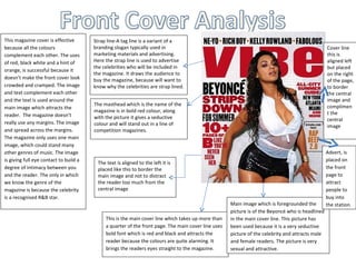
  • 1. This magazine cover is effective Strap line-A tag line is a variant of a because all the colours branding slogan typically used in Cover line complement each other. The uses marketing materials and advertising. this is of red, black white and a hint of Here the strap line is used to advertise aligned left the celebrities who will be included in but placed orange, is successful because it the magazine. It draws the audience to on the right doesn’t make the front cover look buy the magazine, because will want to of the page, crowded and cramped. The image know why the celebrities are strap lined. to border and text complement each other the central and the text is used around the image and The masthead which is the name of the complimen main image which attracts the magazine is in bold red colour, along t the reader. The magazine doesn’t with the picture it gives a seductive central really use any margins. The image colour and will stand out in a line of image and spread across the margins. competition magazines. The magazine only uses one main image, which could stand many other genres of music. The image Advert, is is giving full eye contact to build a placed on The text is aligned to the left it is degree of intimacy between you placed like this to border the the front and the reader. The only in which main image and not to distract page to we know the genre of the the reader too much from the attract magazine is because the celebrity central image people to is a recognised R&B star. buy into Main image which is foregrounded the the station. picture is of the Beyoncé who is headlined This is the main cover line which takes up more than in the main cover line. This picture has a quarter of the front page. The main cover line uses been used because it is a very seductive bold font which is red and black and attracts the picture of the celebrity and attracts male reader because the colours are quite alarming. It and female readers. The picture is very brings the readers eyes straight to the magazine. sexual and attractive.
  • 2. This magazine uses four cover lines which are all aligned to the left Main cover line- they want the audience to read the magazine, and understand where the celebrities are coming from. Advert for next The layout revolves three columns in this magazine, the same in issue which VIBE has used three columns. This magazine has used one This magazine has used three columns, but this is more obvious than the male on the right, one make on the left and a male in the centre, to ‘Rolling Stones’ magazine. The bold text is placed behind the main divide the magazine into three columns. All three men are giving celebrity who is brought in front. The way in which the main image is the camera full eye contact with the camera to produce a degree symbolising the RnB genre. The celebrity is giving full eye contact with camera, creating a degree of intimacy with the audience. The main image of intimacy with the reader. They have dressed the main image to overlaps the masthead because the image is meant to be the main item on represent the genre of indie music, they are dressed typically in the front cover. The main image is of a semi –nude man which creates black leather jackets,. They have used a colour scheme of red, sensuality and lust between the reader and the artist. The cover lines black and white; these colours attract the reader to the magazine feature a lot of music topics from the UK and USA, there is a reference to also to stand out on the top shelf. The colours are used much more artists and their record label. The cover lines are aimed at fans and people subtly than VIBE. The main cover line is left aligned, similar to VIBE. who might be serious about the RnB genre of music. The barcode is placed at the front of the magazine. The advert for next issue if placed at the They have used four cover lines which are left aligned on the left bottom right hand corner of the magazine to entice the reader to the next side of the page. This magazine hasn’t used a barcode like the issue, it’s a preview. The main image is dominant but is complimented by ‘VIBE’ magazine. The cover line ‘Rock Band vs. Guitar Hero’ entices the bold choices of font colour and font sizes, the use of red along with the the audience to the indie theme, draws the audience into the sensuous main image, creates a high degree of sexual tension between the magazine. ‘ reader and the artist.
  • 3. This magazine has stuck to two column using the main image as a break up for the page. The magazine uses feature well, aligned to the right of the page. It has been broken up into two, “<features>” and “<fashion>”. The contents page is always set out in this particular style, because it creates a house style for VIBE music magazine. This magazine uses two grids, it is effective because it keeps the magazine very simple . The tone of this contents page is unisex, it appeals to both its female and male audience. The content is very simple and straight to the point. The image is married to the text which keeps it very simple. The main image in the contents page of VIBE magazine is normally of a celebrity. The colours are grey, white and black, this is a very simple way of keeping the text simple. Yet so elegant which is the normal house style in which VIBE goes for.
  • 4. The magazine on the right, aligns the text to the right, which is not the typical house style for VIBE magazine. the magazine on the left ‘Boardwalk’, the text is aligned to the right. With the feature again to the left. This magazine marries the text to the images, with the use of numbers on the images. ‘Boardwalk’ sticks to a very simple colour scheme with only black and white and colour only seen in the This contents page uses, three The magazine is broken images. VIBE music magazine columns. There is not a lot of also similarly into three is an R&B magazine , which white space in comparison to the columns, it is broken up plays up to the genre by the VIBE magazine. ‘CONTENTS’ is in much neater than the use of seductive women. The a much larger font also. This Indie/Folk magazine. contents page uses a tint, on contents page isn’t broken up ‘CONTENTS’ is in much the left hand of the page, into equal grids, which could be smaller font, which which adds colour but argued to be because of the allows the images to be doesn’t over dramatize the Indie/Folk genre of the the forefront. contents page magazine.