Recommandé

Recommandé
Contenu connexe
Dernier
Dernier (20)
En vedette
En vedette (20)
Contents analysis
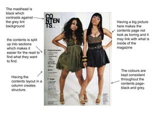
- 1. The masthead is black which contrasts against the grey tint Having a big picture background here makes the contents page not look as boring and it the contents is split may link with what is up into sections inside of the which makes it magazine easier for the read to find what they want to find. The colours are kept consistent Having the throughout the contents layout in a contents page- column creates black and grey. structure.