
Recommandé
Contenu connexe
Tendances
Tendances (20)
En vedette
En vedette (10)
Similaire à Evaluation
Similaire à Evaluation (20)
Plus de GregLatham96
Plus de GregLatham96 (20)
Evaluation
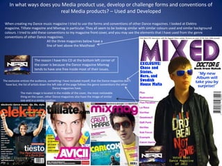
- 1. In what ways does you Media product use, develop or challenge forms and conventions of real Media products? – Used and Developed When creating my Dance music magazine I tried to use the forms and conventions of other Dance magazines. I looked at Elektro magazine, Tilllate magazine and Mixmag in particular. They all seem to be looking similar with similar colours used and similar background colours. I tried to add these conventions to my magazine front cover, and you may see the elements that I have used from the genre conventions of other Dance magazines. All the three magazines below have a line of text above the Masthead The reason I have this CD at the bottom left corner of the cover is because the Dance magazine Mixmag tends to have one free inside most of their issues. The exclusive entices the audience, something I have included myself, that the Dance magazines don't have but, the list of artists down the left side of the page follows the genre conventions the other Dance magazines have. The main image is located in the middle of the cover, the most noticeable thing on the cover, other Dance magazines also have the image of similar size and in a similar position.
- 2. In what ways does you Media product use, develop or challenge forms and conventions of real Media products? - Challenged You may notice some slight alterations I have made to my magazine that don't feature in the genre convention. However, I feel I have subverted the convention, and this will intrigue the potential buyer because of its difference. This slide discusses the differences I've made and why I’ve made them. Having a quote on the front cover is something I have done The Dance magazines deliberately . It may not completely I’ve researched don't follow the convention yet it is use this technique. useful as the reader will be However, just by wanting to read the article, simply having the especially says what it says on my word technique will front cover. entice the reader into the product, and will be determined to find out what is exclusive Just by moving the barcode is an in the magazine. act of subverting the convention. It doesn't seem too different by The ‘Voted best Dance just moving the barcode but, magazine of 2012’ is a good most Dance magazines have it use of convention located at the very bottom of the subversion. No other front cover. I have mine where it magazine has it and is for two reasons. because mine does, people 1. To make it seem slightly are more likely to chose different from typical genre mine over the others. It conventions. make the audience believe 2. Because it will be heard to that this is a good Dance find the black lines over my magazine. image, and look ugly with a white background behind the barcode.
- 3. How does you Media product represent particular social groups? The music genre I chose to base my magazine around is Dance music. I believe it was the right choice out of the other music genres, mostly because there aren’t many well known Dance magazines other than Mixmag. I also like Dance music myself so I feel it was a good genre for me to focus on, as I have some knowledge to go off when making my product. Dance music magazine typically aim their magazine at young adults, probably within 18-30 years old. The people who like Dance music and would go clubbing to Dance music. Likewise, I have aimed my magazine at young adults and teens, 16-32 years old. I have extended the audience so I don’t fall into a niche market. Then again, my magazine can also be aimed at anyone who enjoys listening to Dance music. My magazine would appeal to both genders. However, it would perhaps appeal to young women rather than men. The class of the audience isn’t too important for my audience. Neither is the race of people. It is aimed at any class and race. My magazine represents the audience of my magazine as of course Dance music lovers. The fact that the main image on the front cover is someone who is a young adult, which links to the target audience. The music artists I have mentioned down the left hand will also appeal to the target market not just for the music they produce, but also because of their age. The font colours used in my magazine are blue, pink and some purple. The use of these bright contrasting colour will make them stand out from the white background. These colours are also associated with Dance clubs. They tend to have bright neon lights in pink, or fluorescent yellow or green. That’s why the colours I have used will appeal to my target audience. The only problem with the colours I have used is that they’re not dyslexia friendly. A white background with pink and blue font colour wouldn’t make it easy for dyslexic people to read. On my contents page I have used stories that all associate with Dance music. Stories such as; ‘Doctor-G (Dance artist) The next level (His new album)’, ‘Swedish House Mafia-Why we had to break up’ and ‘’Can Rock merge with Dubstep?’. These stories will appeal to Dance music fans because they’re stories about their favourite Dance artist. Also the story ‘Can Rock merge with Dubstep’, will appeal to fans of Rock music as well as fans of Dubstep. The language I have used is informal. However, I’ve not used any slang. Their aren't any words though that the target audience wouldn’t use in day to day life.
- 4. What kind of media institution might distribute your media product and why? I believe my product could be distributed by a media institution. It could be published by music media publishers. I believe it will distribute well as it has an eye catching front cover, has stories that will entice the target market, and also because there are not many Dance music magazines on the market at the moment. Finally my product also involves articles that will appeal to Rock fans, because there is a segment in my magazine called ‘Can Rock merge with Dubstep?’. I found one music magazine publisher that may publish my magazine and they’re called music mags, they mostly publish rock and indie magazine and my magazine and its different genre could open an entirely new market for them. (www.musicmags.net). This print screen proves that they mostly offer Indie, Rock and Pop Magazines. The fact that mine is Completely different may either appeal to them, as it opens up a new market, or it may not impress them, because it doesn’t fit in with the other magazines that they currently distribute. Overall, this can be viewed as a make or break situation.
- 5. A possible alternative distributor. If Music Mags wouldn’t accept my magazine there is always IPC. IPC is a It is likely that IPC will accept distributor of magazines who distribute any genre of magazines. Anything my music magazine as a from car magazines to fishing magazines. You can see from the print screen product that they will that there are lots of genres that ICP provide. distribute, but personally I feel my product would be more suited for Music Mags. The reason I feel this way is because, Music Mags distribute nothing but music magazines so, my magazine would fit in with the magazines they distribute. Whereas, IPC only distributes one music magazine and that is NME magazine. On the other hand you could say that if my magazine was distributed by IPC it wouldn’t have a lot of competition from other music magazine. Whereas, if it were distributed by Music Mags there would be a lot of competition. However, I think my magazine would overcome the competition as it would be the only Dance magazine that Music Mags would provide.
- 6. Who would be the audience for your media product? Dance music has many sub-genres and each of these sub-genres have various audiences. My magazine covers Dance music in a whole, so I have a mass market. My magazine also provides information for fans of a specific genre of Dance music such as; Techno, Drum ‘n’ Bass, Dubstep and Electronic. My magazine will fend off competition from Dance Sub-Genre magazines with a niche market, because my magazine provides information about all sorts of Dance music. My colours are similar to Mixmag’s colour scheme with a white background and various colours featuring upon it. A Dubstep magazine colour scheme consists of a black background with green text featuring upon it and perhaps some red. All Dubstep magazines feature Dubstep artists upon the front cover, my magazine features a generic Dance artist upon it known as Doctor-G. The name sounds like a DJ name, and it is similar to the Dubstep artist Doctor-P’s name. Mixmag has inspired my magazine the most, I have the same audience as the magazine which is general Dance music lovers from the ages of 18-32. I have tried to use a similar colour scheme as them so my magazine will appeal to this audience. If you look at the two front covers below, I’m sure you can see the resemblance. By using these bright colours it will appeal to my target audience because these fluorescent colours give off the connotation of a Dance club, and perhaps will remind them of one. The fonts I have used will also appeal to my young audience because they’re modern looking and fit the magazine genre.
- 7. How did I attract/address my audience? I have spoke a little about how I attracted my audience in the previous slide but, I will go into more depth with how I attracted them in this slide. Firstly, the image of a young Dance artist relates to them as they’re of a similar age. Another way I attracted my audience is with the use of colours. The colours that feature in my magazine are bright and are the kind of colours you would see in a Dance club, they’re colours you relate to the Dance genre. The masthead also plays a big part in attracting an audience. It is the first thing they’ll notice and they will realise it’s a Dance magazine from its name. Words like ‘exclusive’ featuring on the magazine will make the reader want to buy the magazine, as it means only this magazine has this information about the topic which is classified as exclusive. The free CD will also interest Dance music fans and especially Nero fans. The audience will want to buy the magazine more as you get a free CD with it. Summary Font colours and Font style The word exclusive means only this magazine has this info Fans of the artists listed will be attracted. Image relates to audience Free CD
- 8. Making use of modern technology. To evaluate my Media product I have posted an my front cover to the social network site Facebook. Once it was posted people are able to comment on the front cover, and I had several comments on the front cover explaining the things that are good about the cover and the things that need improving. The positive comments about the cover included the words fluent, superb and great. This proves that the people who wrote the comments believe this could pass off as a Dance magazine, and they would find the front cover appealing. The only thing that they said needed improving was the background of the cover and they felt that the white background looks quite plain. Some comments from people suggested to change the background colour to a light blue, or perhaps a purple. I agree with them and, if I were to improve my magazine I would probably change the background to a light blue or maybe a silver chromic greyish colour, as I’ve seen some silver backgrounds on some Dance magazine. The fact that I have used Facebook to get other opinions on my product means that this counts as a use of modern technology, because Facebook is quite a modern site.
- 9. What have you learnt about technologies from the process of constructing this product? From this process I have gained and improved many of my camera skills, Fireworks skills, blogger and file share skills. One Firework feature I learnt was how to change my masthead from black and white to purple. I did this by using the levels effect function. By moving the Moving the levels You can levels bar at the bar has changed find the bottom and on the my Masthead levels graph I can change colour to a option on the masthead’s pink/red. adjust colour colour. However, I have not just learnt new techniques on fireworks. I have also learnt how to upload PowerPoint's to Another technique I used slide share, and to transfer the PowerPoint over to Blogger. I with the camera that I have did this by embedding the PowerPoint and copying the html improved through this address. I have also learnt about different camera angles, project is the use of lighting what effect it has if the person in the image is looking away on the photos I took. With or at the camera, if the person’s head is tilted, and if the the image on the front cover camera shot of the person is taking from below them so it you may be able to see the looks as if the person is taller. With my front cover I wanted left side of my face in ‘Doctor-G’ to look as if he didn’t notice the camera being shadow, and the right half in there, I feel that his stance gives him a ‘cutting edge’. I have light. This effect could learnt a lot about my genre convention, and by analysing my symbolise that ‘Doctor-G’ has genre convention it helped produce a magazine that fits in 2 sides to him. with the genre convention.
- 10. Looking back at your preliminary task, what do you feel you have learnt in the progression from it to the full product? Technology-Whilst making this product I have learnt many firework techniques, such as the lasso crop that helped me to crop out the background of my front cover image more precisely, and the colour changer which can be used on things that have been copied and pasted to fireworks. How to make an authentic magazine-I have learnt that I can make my magazine look authentic by not totally copying off the genre conventions of other Dance magazines and instead having a few ideas of my own that will surprise people. I moved my barcode, added quotes and used words like ‘exclusive’ to make my magazine original. Conventions of typical magazines-Looking back at my preliminary task I have learnt that Dance magazines have similar conventions. They’re quite spacious and uncluttered. They’re in juxtaposition of other magazine genres like Rock magazines as they’re quite cluttered and have totally different colour schemes. So, like how you can tell different genres of music apart you can tell different music magazine genres apart, as it is almost as if the music style appears on the magazine. How to target and attract an audience-I have learnt how to do this through genre conventions, images and fonts and colours, even the language I use can attract my target audience. The magazine must attract my target audience and it can do this by looking like a typical Dance magazine. However, some may find my magazine unoriginal so, to stop them thinking that I challenged the genre conventions and have added a few things different to my front cover. The image attracts the audience as it is someone who probably could fit in to the target audience. I have learnt that having fonts and colours that associate with Dance, like blue, neon pink and purple all associate with Dance music and will attract my target market.