
Recommandé
Contenu connexe
Tendances
Tendances (18)
En vedette
En vedette (10)
Similaire à Front cover essay
Similaire à Front cover essay (20)
Plus de Heidi94
Dernier
Dernier (20)
Front cover essay
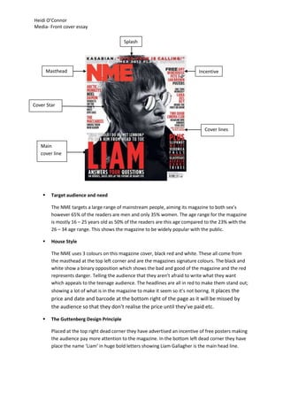
- 1. Heidi O’Connor Media- Front cover essay Splash Masthead Incentive Cover Star Cover lines Main cover line Target audience and need The NME targets a large range of mainstream people, aiming its magazine to both sex’s however 65% of the readers are men and only 35% women. The age range for the magazine is mostly 16 – 25 years old as 50% of the readers are this age compared to the 23% with the 26 – 34 age range. This shows the magazine to be widely popular with the public. House Style The NME uses 3 colours on this magazine cover, black red and white. These all come from the masthead at the top left corner and are the magazines signature colours. The black and white show a binary opposition which shows the bad and good of the magazine and the red represents danger. Telling the audience that they aren’t afraid to write what they want which appeals to the teenage audience. The headlines are all in red to make them stand out; showing a lot of what is in the magazine to make it seem so it’s not boring. It places the price and date and barcode at the bottom right of the page as it will be missed by the audience so that they don’t realise the price until they’ve paid etc. The Guttenberg Design Principle Placed at the top right dead corner they have advertised an incentive of free posters making the audience pay more attention to the magazine. In the bottom left dead corner they have place the name ‘Liam’ in huge bold letters showing Liam Gallagher is the main head line.
- 2. Heidi O’Connor Media- Front cover essay Main image/images They have placed Liam Gallagher a mainstream artist covering the front page of the magazine, this represents the importance of the band member from Oasis has on the music industry. The reason why it’s in black and white shows the classic genre of the artist Masthead The masthead is in a large bold sans serif font to make it easy for the customer to spot this is helped by the classic colour that is always used by NME, red standing out from the black and white background, the main headline also in this font to attract attention. The sans serif font shows the informality of the magazine which attracts the audience it is aimed at, which is a wide range. Lead article/Model Credit/Cover lines There are many cover lines all over NME’s front covers to show the disorganised style they go for to attract many audience’s as they are showing many genre’s of music. All using sans serif font to show the informality which backs up the disorganised look the magazine possesses. Masthead Splash Main cover line Cover lines
- 3. Heidi O’Connor Media- Front cover essay Target audience and need Mixmag is a specified magazine which targets and audience 16+ who are interested in dance and dance music. Also it only targets dance artists because there isn’t many articles within the magazine only short interviews and DJ careers. ‘Mixmag’ is a magazine all about dance music, dub step etc. This is shown in the title as DJ’s ‘mix’ their music. The reason they have ‘mag’ in the title is to show the laid back feel of the magazine advertising to the younger audience, also you can see this with the fact they use san serif font. House Style They have used the colours black gold and white all of these contrast each other to show the good (white) and the bad (black) type of dance music in the magazine. The Guttenberg Design Principle At the top of the magazine going right to top left it’s a splash saying the world biggest dance music and clubbing magazine. They have used the splash at the top of the magazine “The world’s biggest dance music and clubbing magazine”. At the bottom right of the magazine there are all of the cover lines so that the reader can see them straight away and with ease. Main image/images The magazine has no main image, instead they have used a silhouette of someone dance in the colour gold, this is keeping in with the genre of the audience and directly relates to them. Because they have no main image they have a Text box (splash) in the centre of the magazine to attract the audience’s attention. They do this by using a rhetorical question, “who is the greatest dance act of all time?” This will attract the target audience and make them feel they need to read the magazine. Masthead The magazine has chosen to use a large bold masthead which stretches across the top of the magazine using a sans serif font. The masthead stands out as the colour white contrasts with back ground of the back and gold making it easy to spot and read. The masthead is also a compound noun, for example (mix) could represent the use of mixers on a DJ deck or mixtures of sounds, and (mag) is a shorter version of magazine. Lead article/Model Credit/Cover lines The magazine has only a few cover stories making the magazine look formal instead of messy or cluttered. They have done this because the target audience is very specific so once the large masthead has got their attention they will most likely carry on reading the magazine. Also making the magazine look sophisticated which fits in with the target audience as it will help them in the future careers. They have put the cover line headings in
- 4. Heidi O’Connor Media- Front cover essay gold with the description below in white; this creates more contrast which makes the magazine stand out even more. Comparison In comparison NME and Mixmag have very different target audiences, NME is main stream so they have a wider range of genres however mixmag has a very specific genre as they only attract a certain target audience (dance).The cover lines are different in each magazine, NME has a lot more around the border of the front cover, this may be because they are more main stream they have a lot more storeys they put in the magazine. With mixmag there are only a few in the bottom left corner in the weak fallow area. This may be because they genre is limited to dance they might not have that much more to talk about in the magazine. Both have bold sans serif font which is informal but advertise the magazines well as they are large and bold and use contrasting colours red and white. A distinction between the magazines is that their backgrounds they have used are completely different. NME uses a very famous band members face to cover the whole background which will attract the audience as they see a very famous band member on the cover. However mixmag only has a gold silhouette of a dancer with the background black. This may be because it’s an exclusive magazine there may not be enough dancers that are famous enough to be recognised to go on the cover. Both magazines also use The Guttenberg Design Principle in the dead corners they have added an incentive and a splash so they both use the rule of thirds to advertise.