
Recommandé
Contenu connexe
Tendances
Tendances (20)
En vedette
Similaire à Analysis of music magazine covers
Similaire à Analysis of music magazine covers (20)
Plus de HollyHayne
Plus de HollyHayne (20)
Dernier
Dernier (20)
Analysis of music magazine covers
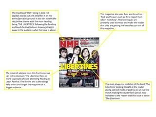
- 1. The masthead ‘NME’ being in bold red This magazine also uses Buzz words such as capitals stands out and amplifies it on the ‘first’ and Teasers such as ‘First report from white/grey background. It also ties in with the Albert Hall show’. This techniques are red/yellow theme with the main heading primarily used to entice and make the reader being ‘THE LIBERTINES’ following the Reading that they are getting the best they can out of and Leeds Festival colours showing straight this magazine. away to the audience what the issue is about. The mode of address from this front cover we can tell is obviously ‘The Libertines’ fans or more so people who are attending Reading or Leeds Festival. The skyline and subheadings help entice and target the magazine at a The main image is a mid shot of the band ‘The bigger audience. Libertines’ looking straight at the reader giving a direct mode of address or an eye line match making the reader feel special. Also indicates to the reader that this issue is about ‘The Libertines’ .
- 2. The masthead ‘KERRANG’ has been covered by the main image which takes up the majority of the page showing the importance and significance of the image to the reader. By covering up the masthead it indicates to us that it’s regular customers who buy ‘KERRANG’ so they The mode of address is quite obvious for this don’t have the importance to show the whole masthead. magazine issue. Firstly ‘My Chemical The main image is an eye line match or a direct mode of Romance’ fans have been particularly address to the reader, enticing the reader and making targeted along with any other music that fits them feel special. along with that genre. This magazine uses lots of techniques in attempt to draw in and grab the readers attention, they use techniques such as; Buzz words ‘PLUS!’, Teasers ‘THE INSIDE STORY’, slanting story to give the cover a quirky look, skyline to give extra exciting information, Graphic features such as smaller images to give an insight to the reader and finally puff and pull techniques.
- 3. The masthead on this magazine cover is ‘METAL HAMMER’ yet ‘ARCHITECTS’ could be mistaken for the masthead as it’s in the same font and a This magazine cover uses techniques to amplify very similar size. Moreover the masthead, main itself to the audience such as; Buzz words ‘WIN’, heading and main image all keep in touch with Pull quotes ‘The MORE PEOPLE HATE, THE this issues red/orange fire theme immediately STRONGER WE’LL BECOME!’, and Teasers such as grabbing the readers attention. ‘HOT LIST 2011’. The main image is a close up taking up the majority of the front cover. The man is looking straight out to the audience giving them a direct The mode of address for this magazine is obvious. mode of address and an eye line match grabbing It’s a regular niche target audience of heavy metal the readers attention. By putting the image and music lovers. The subheadings and skyline show text onto a black background it immediately to the niche market that they can exactly cater stands out to the reader jumping of the page at for there needs with what’s inside. them.
- 4. The bright red masthead stands out straight away to The mode of address is not completely specific with the audience indicating what magazine it is. With this magazine. Although we know it’s targeted at this being the only red on the front cover it music lovers, it targets a large range of music lovers immediately stands out and is one of the first things from indie rock such as ‘Florence and The Machine’ you look out. to X Factor mainstream Simon Cowell. Showing this magazine has to cater for a very large musical audience. The main image on this front cover is a very poignant image it’s an extreme close up, also giving This front cover uses techniques such as; Graphical the reader an eye line match and direct mode of features ‘ZANE LOWE’, Buzz words ‘NEW’, and Pull address. By Florence wearing blue eye shadow it ties Quotes ‘I FEEL SO ALONE’ all to grab and pull in the in with other subheadings etc. Going on around the readers attention. page drawing them to the readers attention.
- 5. The classic red ‘RollingStone’ masthead immediately grabs the reader. With this The mode of address is not extremely clear being pretty much the only red on the page with just Adele on the front as a range of it really jumps out to the reader straight music lovers like her. Yet as we look closer away. Also by giving the masthead at the magazine the Skyline say’s “BEST OF shadowing at the back it makes it look 3D it ROCK 2011” indicating to the audience that really does jump out at the reader. this weeks issue is directed at rock lovers. By using sub-headings, it gives an insight to the reader of what The main image on this page is a close up is inside the magazine, of Adele, who is a very popular artist and hopefully making them want to also very well known attracting the readers read on. This front cover also attention. By Adele looking straight out uses ‘Buzz words’ such as ‘PLUS’ through the page giving an eye line match and Teasers such as ‘THE MOST and direct mode of address it immediately HATED GIRL ON THE INTERNET’ connects with reader making them feel to entice the reader. significant.