
Recommandé
Contenu connexe
Tendances
Tendances (15)
En vedette
Similaire à Looking back at your preliminary task
Similaire à Looking back at your preliminary task (20)
Plus de HollyHayne
Plus de HollyHayne (20)
Looking back at your preliminary task
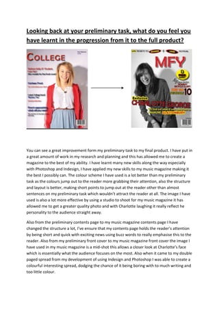
- 1. Looking back at your preliminary task, what do you feel you have learnt in the progression from it to the full product? You can see a great improvement form my preliminary task to my final product. I have put in a great amount of work in my research and planning and this has allowed me to create a magazine to the best of my ability. I have learnt many new skills along the way especially with Photoshop and Indesign, I have applied my new skills to my music magazine making it the best I possibly can. The colour scheme I have used is a lot better than my preliminary task as the colours jump out to the reader more grabbing their attention, also the structure and layout is better, making short points to jump out at the reader other than almost sentences on my preliminary task which wouldn’t attract the reader at all. The image I have used is also a lot more effective by using a studio to shoot for my music magazine it has allowed me to get a greater quality photo and with Charlotte laughing it really reflect he personality to the audience straight away. Also from the preliminary contents page to my music magazine contents page I have changed the structure a lot, I’ve ensure that my contents page holds the reader’s attention by being short and quick with exciting news using buzz words to really emphasise this to the reader. Also from my preliminary front cover to my music magazine front cover the image I have used in my music magazine is a mid-shot this allows a closer look at Charlotte’s face which is essentially what the audience focuses on the most. Also when it came to my double paged spread from my development of using Indesign and Photoshop I was able to create a colourful interesting spread, dodging the chance of it being boring with to much writing and too little colour.
- 2. After looking at a variety of magazines in my research, I found that NME best suited the style of magazine I wanted to produce. I really liked NME’s layout’s, colour scheme, artists and genre’s. I have created an alternative/ indie magazine which typically follows NME’s conventions. I researched into a variety of NME magazines finding that there colour scheme ran throughout which was red and yellow this highly influenced the colours I used for my music magazine. After looking at one NME magazine in particular it gave me the idea that in my double page spread the first letter of the first word should be so large that the rest of the text can fit inside it, making it interesting and very quirky for the reader, very much my audience would want. I also looked into the font NME used they used a few fonts to keep it interesting for the reader but not too many to allow it to be easily readable for the audience, I went for a very similar approach to NME.