
Recommandé
Contenu connexe
Tendances
Tendances (20)
En vedette
Similaire à Access3
Similaire à Access3 (20)
Dernier
Dernier (20)
Access3
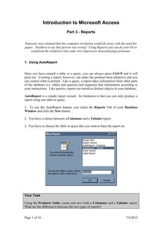
- 1. Introduction to Microsoft Access Part 3 - Reports Someone once claimed that the computer revolution would do away with the need for paper. Needless to say that person was wrong! Using Reports you can do your bit to transform the rainforest into some very impressive thousand-page printouts. 1. Using AutoReport Once you have created a table or a query, you can always press Ctrl+P and it will print out. Creating a report, however, can make the printout more attractive and you can control what is printed. Like a query, a report takes information from other parts of the database (i.e. tables and queries) and organises that information according to your instructions. Like queries, reports are stored as distinct objects in your database. AutoReport is a simple report wizard. Its limitation is that you can only produce a report using one table or query. 1. To use the AutoReport feature, you select the Reports Tab of your Database Window and click the New button. 2. You have a choice between a Columnar and a Tabular report. 3. You have to choose the table or query that you want to base the report on. Your Task Using the Products Table, create and save both a Columnar and a Tabular report. What are the differences between the two types of reports? Page 1 of 16 7/4/2012
- 2. 2. Your First Report Now you have created your first report, let us see what you can do with it. When the report is first created, it will be opened for you in Print Preview. You get the following buttons on your toolbar: Your Task Experiment with the buttons and see what they do. 1. View more than one page at a time. Why is it sometimes useful to do this before printing? 2. Export your report to Word. Alter the layout, as desired and print it Other options are hidden away in the Page Setup. Get there via the File Menu. There are three tabs for Margin, Page and Column settings. Margin Settings are displayed in metric or Imperial measure, depending on how Access is set up. Print Data Only will only print out the data, not the field headings. Page Settings is where you choose Portrait or Landscape orientation. You can also choose your paper size (usually A4) and your printer. Column Settings controls how many columns you will have and the width between columns. For Discussion 1. What difference does changing the Column Layout settings make? 2. Why should you avoid Landscape mode for columnar reports? Page 2 of 16 7/4/2012
- 3. 3. Creating Labels Access can help you generate labels for mailing lists and other purposes. 1. Start the Label Wizard and choose a table or query. 2. If you are using Avery Labels, you can choose your labels by product number. Otherwise, click the Customise button and set your label dimensions. You can name a custom label and save it for future use. 3. Once you have the correct label type, you can modify the appearance of the labels. You can make the text bold, italic or underlined and you can select a font. The formatting you choose affects the whole label. Unfortunately, you cannot choose, for example, to have one field italic and the rest normal. 4. Next, choose which fields to have on the label. Usually this will be the fields that make up the customer's address. If you want the fields on separate lines, press the Enter key. If you want to add characters to the label (for example a comma at the end of each address line), enter this character in the place where you want it to appear. 5. You then decide how you want to sort the labels (mailing lists are usually sorted by postal code). Your Task Create a set of mailing lists for Northwind customers. Add a comma at the end of each line and sort the labels by postal code. Your labels should look like this: Name and Save your Report Page 3 of 16 7/4/2012
- 4. 4. Creating a Chart If a table or query has a numeric field, you can produce a graph using the Chart Wizard. 1. Select the Chart Wizard from the New Report list. 2. Choose a table or query on which to base the graph. 3. Decide what type of chart you want. Click each chart type to see a description of how that chart is used. 4. Decide which fields you want in your chart. At least one field must be numeric. 5. Preview how you want your chart to appear. 6. Decide whether or not you want a Legend (a key). Name and save the report. 7. If your chart does not appear as you wanted, switch to Design View and alter the chart's dimensions. Double click the Chart to open the chart in Microsoft Graph. Your Task In the Northwind Database create a chart based on the Category Sales for 1995 query. Your chart should look something like this: Page 4 of 16 7/4/2012
- 5. 5. Advanced Reports Use the Report Wizard if you want to include fields from more than one table or query. 1. Select Report Wizard from the New Report list. There is no need to select a table or query. Click OK. 2. Now you can choose various fields from more than one table or query. The screen is almost identical to the Simple Query Wizard. 3. Access then guesses how you want your data to appear by looking at the relationships between the fields you have selected. You can change the layout of the information and you see an on-screen preview. 4. You can then arrange your information into groups. The grouping will insert a series of headers in your report. Page 5 of 16 7/4/2012
- 6. 5. You can the Sort the ungrouped information. Click the Summary Options button if you want calculations made: 6. Choose a layout style for your report Your Task Create a report that lists products by category. Consider your grouping carefully. Get the wizard to calculate the average price for each product in each category. Your report should end up looking something like this: Page 6 of 16 7/4/2012
- 7. 6. Formatting a Report Very often the wizards do not produce a perfect layout and creative types find the finished products rather uninspiring. This is where you need to switch to Design View and customise the layout. Sections Text label Data Box You will notice that you have two kinds of text markers. Data Boxes are boxes, which display a field's data in the final report. Labels are simple text markers to describe the corresponding data box. You will also notice markers that organise the report into Sections. These Sections represent the different parts of your report. The sections you will always see are: Report Header Prints at the very start of the first page of the report. Page Header Prints at the start of each page, except on the first page of the report where it will print immediately after the Report Header. Detail This is the main body of the report. The Detail section will be repeated for every record in the report. Page Footer When each page is nearly full, Access will finish it off by printing the Page Footer at the bottom of the page. Report Footer This section is printed at the very end of the last page of the report, immediately following the Page Footer. Your Task Select a text box. You should notice that the following toolbar appears: 1. Experiment with these tools and beautify a report. 2. Locate the Format Painter and work out what it does. Page 7 of 16 7/4/2012
- 8. 7. Moving Things Around When you click on a text box, the selection handles appear. These are black squares that you can click on to move or re-size the box. To move a text box, follow the following steps: 1. Click the item you want to move. 2. Move the mouse pointer to any edge of the selected item. 3. Click and hold the Left Mouse Button and drag the item to a new position. 4. Release the mouse button when the item is properly placed. 5. Press CTRL+Z (undo) if you want to start again. If you try to move an object in a Columnar Report, you will notice that the data boxes and labels are stuck together. When you select one, selection handles appear around both, as below: You will notice that there are two handles that are larger than the others. Click and drag one on the left to move the label. Click the large handle between the two boxes to move the data box. If you click on the smaller handles, you can move both the label and the data box together. To re-size an object, move the mouse over the selection handles again until the cursor changes to a double-headed arrow. Click and drag to re-size the box. Your Task 1. Create a Columnar Report using AutoReport. 2. Change to Design View. 3. Use the Format Painter to turn all the labels red. 4. Increase the space between the labels and the data boxes. 5. Align both the labels and the data boxes, so the columns are straight. Align objects by selecting Align from the Format menu Page 8 of 16 7/4/2012
- 9. 8. Lines and Borders 1. You should remember that your report is divided into Sections. It is sometimes a good idea to divide these sections by adding lines to the report. If the Wizard hasn't added any lines in your report, add one by clicking the Line Button, which is in the Toolbox. Practice moving and re-sizing the line If you can't see the Toolbox, select Toolbox from the View menu. 2. Select your line and change its colour by clicking the arrow next to the Line/Border Colour button. You are presented with a rainbow of colours to choose from. 3. Change the width of the line by clicking the arrow next to the Line/Border Width button. You have seven widths to choose from. 4. Add special effects to a line by clicking the down arrow next to the Special Effects button. Experiment with these special effects and see what they do. Holding the mouse over each, will identify the six different effects, which are Shadowed, Sunken, Flat, Etched, Raised and Chiselled. The Special Effects The Line/Border button The Line/Border Colour button Width button Your Task You can change the borders of both labels and data boxes in exactly the same way as you can change lines. Change the borders of your text boxes and look at the result in Print Preview mode. Page 9 of 16 7/4/2012
- 10. 9. Lining Everything Up When you move things around in a report, you can easily end up with objects that are out of alignment. The background grid can help you line things up. By selecting Snap to Grid from the Format Menu, all objects that are moved will always align with the dots on the grid. If you want to align objects with each other, select a group of objects and then choose an Align option from the Format Menu. If you select Size from the Format Menu, you can change the size of objects, as follows: Size To Fit makes the boxes large enough to display all the information they contain. Size To Shortest resizes all the boxes to the same size as the smallest box. Size To Tallest resizes all the boxes to the same size as the tallest box. Increase or decrease Horizontal Spacing or Vertical Spacing to change the spacing between objects. Make Equal ensures that the spacing between all objects is the same. Your Task 1. Open a report and align the objects in the Detail section of the report. 2. Increase the horizontal and vertical spacing between the objects and make sure all objects are equally spaced. 3. Export your report to an Excel Spreadsheet and save the new document. Page 10 of 16 7/4/2012
- 11. 10. OLE Objects OLE stands for Object Linking and Embedding. This allows you to create a file in another application (e.g. a picture or an Excel spreadsheet) and import it into Publisher. If you want to edit the object, you can do so in the application that originally created it. You can add a picture to the report by clicking the Unbound Object Frame button in the Toolbox. Click on the section of the report where you want the picture to appear. Then select Create From File and click the Browse button to locate your picture. You can insert all sorts of other objects such as sound files or entire Spreadsheets. For Discussion Why should objects be put in headers and footers but not into the Detail section? Try entering a picture into the Detail section and see what happens when you go to Print Preview. If you insert an image in a header or footer, you may find that the section needs to be heightened in order to display the whole object. Move the mouse pointer over the top of the grey bars that separate sections until the pointer changes to a double-headed arrow. Hold down the Left Mouse Button and drag to resize the section. Your Task 1. Insert an Excel Spreadsheet into your report. 2. Edit the spreadsheet in Excel by clicking the Right Mouse Button on the object and selecting Worksheet Object ► Open: 3. When you have finished editing the spreadsheet, select Update from the File Menu and then exit from Excel. The spreadsheet should now be updated in Access. Page 11 of 16 7/4/2012
- 12. 11. Headers and Footers If you remember, data in tables can be grouped (see section 5). If you want to change the sorting and grouping, select View ► Sorting and Grouping. To add a grouping level, click on a blank line under Field/Expression and choose the field that you want to use for the group. Decide between an Ascending Sort and a Descending Sort. Turn the Group Header property to Yes to ensure that you have a properly labelled header. To remove a group, select the line by clicking on the grey button to the left of the line and press the Delete key on the keyboard. What can you put in each section of your Report? Report Header Here you put general information about the report e.g. title, date, version etc. You might also like to insert the company logo. Page Header Any information you want to appear at the top of every page. Header for Each Group Summary information such as group and field names. Footer for Each Group Summary information such as counts and calculations. Page Footer The page footer appears at the bottom of every page, so you might like to insert page numbers. Report Footer This appears at the very end of the report, so you might like to print information about the report, such as contact details. Your Task 1. Open a report with several grouping levels and switch to Design View. 2. Open the Sorting and Grouping dialog box. Try changing the order of the grouping by dragging the groups to new positions. Select Print Preview and note how your report has been altered. 3. What does the Keep Together property do? Page 12 of 16 7/4/2012
- 13. 12. Formatting Individual Sections of the Report When in Design View you will find that, if you Double Click on just about anything, you will get a Properties dialog box. This is because Access regards almost everything as an Object that can be controlled individually. If you Double Click on a blank space in a report section, you will get the Properties that control the appearance of the entire section. For example, if you click on the Report Header you get the Report Header Properties: Your Task 1. Open the Report Header Properties and change the background colour. 2. What does Force New Page do? 3. Switch to Print Preview and check the results. Each field and each label is also an object that has its own Properties box. Double click on a data box or a label and you will be able to control that object. Your Task 1. Double click on a number field and alter the number of decimal places that will be displayed. Make sure you click on the data box and not on the label. 2. Change the background colour of the data box 3. Alter the border colour. 4. Experiment with some of the other properties and switch to Print Preview to see the results when you've finished. Page 13 of 16 7/4/2012
- 14. 13. Customising Footers To insert the current date and/or time, select Date and Time from the Insert Menu. To insert Page Numbers, select Page Numbers from the Insert Menu. Your Task 1. Create a blank report. 2. Add the Date (but not the time) to the Report Footer. 3. Add a page number to the top of each page. You want the Page Header to say "Page 1 of 3", "Page 2 of 3", and so on. Preview the results in Print Preview You will notice that, in Design View, page numbers and date/time are displayed as Expressions: You have encountered Expressions before in Queries and Tables. You may remember that the Expression Builder can help you build expressions, or you can write your own. Expressions enable you to have counts and calculations in your report. For example, you might want summary information in a footer to provide a total. Common functions are: =Sum([FieldName]) Adds up all the values in a field =Max([FieldName]) Finds the largest value =Min([FieldName]) Finds the lowest value =Avg([FieldName]) Finds the average value =Count([FieldName] Counts up how many values there are ) Things to remember about expressions: • Field names must be put in squared brackets • Expressions must be put in the same report section as the figures they are calculating • To write an expression, first add a Data Box to the report from the Toolbox Your Task 1. Open any report with sales figures and create a new Text Box in the Report Footer and label it Total Sales. 3. Open the Properties for the data box and write an expression that will find the total of the sales figures in the report. 4. Format the box as currency, so that the figure will be displayed with a £ sign. Page 14 of 16 7/4/2012
- 15. Preview the results 14. Keyboard Shortcuts F2 Select an entire field Ctrl+; Insert the Current Date Ctrl+: Insert the Current Time Ctrl+Enter Insert a Line Break (use it in a memo or large text field) Ctrl++ Add New Record Ctrl+- Delete the Current Record Shift+Enter Save the Record Ctrl+Z Undo the last change you made (don't rely on this) Ctrl+Enter Open the selected object in Design View Alt+F4 Quit Access 15. Summary (from the Access Help file) Page 15 of 16 7/4/2012
- 16. Page 16 of 16 7/4/2012