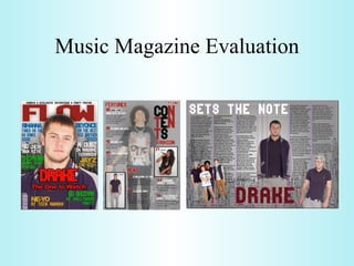
SlideShare une entreprise Scribd logo
1  sur  10
Music Magazine Evaluation
On my Front cover I used the conventions of the majority of RnB magazines when I was researching, these include the Big, bold title, the single person in the middle of the page looking directly at the camera (I did not see any using bands), and the very brief summary of what's in the magazines at the top of the cover. My model is dressed in urban fashion (polo shirt and baseball jacket) which is very popular in the stereotypical ‘badman’ gangster style that usually listen to RnB/ hip-hop music, to get rid of the hip-hop audience I made it slightly less aggressive, the models pose is more relaxed. The Vibe magazine below will have a very similar audience to my magazine as it is an American mixed genre magazine mainly including  RnB but it also has stuff to do with Hip-Hop and lifestyle. My colour scheme is the same as this but I decided to used other colours for the headlines, Vibe uses a different a font from the title for the headlines, whereas I kept it the same. I did this because nothing linked them (not even the colour) and I had to make them link so I used the font. I put the name of my artist in a very large bold and stroked font 1/3 up the page of my cover, this was to attract my audience using the artist’s name. In Vibe, the model’s name is much smaller than mine (but is still the most noticeable font except the title) and is closer to the top. Due to there reputation they use the name of their magazine to attract their audience. Both covers also have the brief summary at the top but in mine I put topics of what they will see (party photo’s) whereas Vibe has this in the main headlines so they put what artist’s will be seen (Usher) up the top. I don’t think I needed to put anymore artist names on the page as for all but one of my headlines I have an artist’s name in large font. Vibe’s model looks more aggressive which makes gap between him and the audience but then he looks at the camera which fills this gap but makes you look up to him, whereas mine as he is relaxed and also looking directly at the camera its more friendly but you still look up to him because of the juxtaposition between the model and the title, showing he’s important. In what ways does your media product use, develop or challenge forms and conventions of real media products?
To create my contents page I used conventions like a large picture which covers the majority of the page, most were full body shots. Having the logo/name of the magazine in a small section of the page, doing little caption for the pictures (names) and most I noticed had the title of the contents page (which usually was not “contents” and some did not have titles) and then a sub-heading (usually “features”).The page numbers for each article always stood out a bit more even if it was just a bold font. It was half and half to whether they included the date or not, so I chose not to. All of my model’s suit the genre of music very well as Beyonce is holding a microphone so we know she is a singer and she is dressed appropriately (fashionable, long hair so its not rocky) and my main model in the center is wearing a Lil Wayne top who is very big in my genre of music and he has his bling up with a chain. The model on the left is a photo linked with my cover story and he is wearing chinos and a Ralph Lauren (becoming popular in urban cultures) polo shirt. My magazine compared to the Vibe contents on the left look very different in almost everyway but contain nearly all the same elements, the large picture in the middle, the main title (nearly same layout as both goes over 3 lines, except Vibes is also tilted which looks good but as mine is not as wide, its portrait, when tilted, it did not look good), they both have “Fashion” and “Features” sub-headings, Vibe has there logo of a big “V” and mine has “FLOW” as a logo. On Vibe the background is more plain but the logo being in the background adds depth, just like the brushes I used at the bottom of the page. Vibe only juxtaposes the title “contents”, the logo and the picture, everything appears in front of the logo, this is because if the reader is on the contents page they probably own the magazine and know what magazine it is so the information (headlines) given by Vibe becomes more important, I also used a similar juxtaposition with all the font being over the images, the brushes and the title. Unlike Vibe instead of having one huge picture, I had a large picture and two small ones, these small pictures relate to the headlines on the front cover and the large picture relates to the genre. I did very small brief captions for the small pictures whereas Vibe did a little paragraph for there large picture.
My Double page spread uses forms to make it known to my audience that it is a 2 page spread and the pages are linked, these conventions are using the same colour scheme and font on each page, having objects which cross the middle but are still readable (pictures, article, any other font or patterns) and making the layout visible as a whole instead of separate pages (symmetrical or very similar pages, having writing in a diagonal line so the readers eyes flow into the other page, whatever it is it has to feel right). The conventions I used were the amount of columns per a page after my research I decided 3 looked the best and made it visually more of a light read, there had to be a page number on at least one page even if it was not that noticeable and the pages have to look full of writing so wrap the text around the pictures so there a fewer empty spaces. Others forms I used one model 3 times on this page so it will connotate that this model is of great significance to the article and that he is popular and famous (this is also why there is a group photo). All my models are dressed in urban fashion (caps, chinos, gilets, short shorts and casual tops). My 2 page spread and Vibe’s, again look different but use some of the same elements, the large picture, Vibe uses a line pattern to help link the pages I use a line pattern (brush) to link the pages, multiple pictures of the main model and 3 columns per a page. Strangely Vibe does not have a title that stands out, it is tucked up in the top left corner, this could be because they made a big thing of it throughout the rest of the magazine and expect the audience to know it, they also don’t have the model’s/artists name that noticeable either it is just in a different colour font in the introduction. But this does work as you have to read the introduction and its only 1 line in, as our eyes read from left to right the title does not go unnoticed either. My title is in the same position but it’s a lot bigger and I have used this along with the artist’s name to link the pages together, both fonts the same and using the original colour scheme (Black, white and red). But Vibe also use the black and white picture banner to link the pages. The photos on the banner look very energetic and active but mine looked normal so I tilted them which made them more lively. Vibe did not use text wrap but instead filled the empty space with a quote from the artist which was put in bold, this is a good feature as it’s the only quote in the article.
How does your media product represent particular social groups and  How did you attract/address your audience?  Front Cover In my front cover, I used a slightly low angle picture even though it looks like a eye level shot and it was a medium close up, which makes all viewers involved with the model, but only my target audience should like that they are involved and the models clothing and facial expression helps them decide this, by having him with a relaxed expression it makes it more friendly and he is in the age group of my target audience which is 16-25 so these people should feel comfortable with their involvement. My model is also male and they are more aggressive this is also enhanced by his small beard as it adds a feel of roughness, like the RnB stereotype. But to narrow it down to the genre of music, his clothes can do this, the clothes he is wearing fits him into the stereotype of a more casual wannabe gangster mixed with the facial expression and the sharp focus of the image which gives less emotion it implies a ‘couldn’t care less’ look which captures my audience, as RnB is related to youth’s who are supposed to be lazy. The well lit photo shows he is not hiding anything and there is no mystery, it’s a ‘what you see, is what you get’ image which makes it more honest. The RnB genre has a lot to do with respect for the artists and not so much popularity so juxtaposing the model in front of the masthead shows he is important and well respected by the magazine, which is what my audience want. The Font is like my audience should be, big, bold, sharp, and confident, the font alone speaks very loudly and as there are no gaps between each character on the important text (title, artists etc.) they are all tight and together, which represents the gangs/groups which are known to be in the culture of my target audience. With framing, I use the rule of thirds as my model’s eye are on the top horizontal and the main artist’s name “DRAKE” lies on the bottom horizontal when dived into the rule thirds. The “drake” text is the 2nd thing I notice when looking at the cover behind the title of the magazine, which is what I want and the headline below it is direct to the audience which draws there attention in closer to the surround headings and the although know the title of the magazine. Contents My contents page uses three models, all looking like there into a slightly different type of RnB, Beyonce (middle right, female) is into the singing and more musical part as she is singing into a microphone, Main model (center, male) is into the rougher stuff like rapping which is found in the RnB genre along with beats as he looks more powerful and Drake (bottom left, male) is into more male vocals as
he looks relaxed, this represents the variety I should have in my audience and of the genre of music. The models age from 16-20 which should again catch a young audience of about 16-25, There is no mystery conveyed in these pictures as they are all well lit and the background is plain so the DoF becomes very small and its left to the imagination of the viewer, this is like RnB as it is a mainstream genre. All my font is like the front cover and therefore gives the same effect, I also use alliteration to make catchy headlines “Welcome Wiz”, colloquialism “A new thang in town” “bowls” “bombed” the target audience will understand all of these words and probably use the majority of them frequently. The main photo and Beyonce are shot at the same slightly high angle, but Beyonce was a  medium shot and as she is kneeling down we get her full body, this means you can relate to her but your also looking down on her, this works because at this moment in time she is singing for you, and doing a service for you so you would be looking down on her but she is famous and it is a great service you would still respect and appreciate her. The main photo is a Medium long shot but as it has been edited and there is no background, there is no sense of isolation or establishment as to where and what's going on in the photo, instead you feel like you know everything about him but nothing about his surroundings. As your looking down on him and he seems to be below you, he looks as if he is praying because he is looking above you but at the same time its like he is saying ‘this is what its all about’ due to his stance. Drake has been shot in medium long shot as well but its eye level, this makes him look more powerful and confident than the main photo but as it is a smaller image it looks like he is more alone and because he is in the corner of the page. I used the rule of thirds in all the images with the top third of the photo being headspace and all the model are in the middle column of there individual frames, so they are all noticeable and look like what we are used the too seeing in a photo.  Double Page Spread The font is the same for the headings, but as the font is capitals only I could not use it for my article so I had to change it to a more basic and readable font, its not great to represent the social group but not entirely boring to make them stop reading. The Brushes on my 3 products suit the social group very well as it looks freehand like graffiti and looks like a skyline which are often seen in graffiti and therefore has a very young and urban feel. All the models are 16-18 which is young again and they are all confident with their stances, even the female. The photo on the left shows female dominance which does happen in the RnB genre of music. In my article I also use a lot of slang like “Dropping tunes” “player” “blazzin” “slammed” which my audience will understand. As you need to be able the reltae to the images so that you can link the images with the article all the photos are eye level shots and you can see most of or all the pf the model’s bodies (Medium shot to long shot). I decided to juxtapose Drake’s name in front of his photo because to people who may not know who he is they are going to want to and in music its more about the fame of the name not their appearance. The tile of the article “sets the note” was chosen because the article is about how he has inspired young people and that he is at the top of his game (genre). Al the photos have a sharp focus, this mens they are crisp and gives them a more aggressive and upfront look.
What kind of media institution might distribute your media product and why?   This screenshot is from  http://www.intermediaadvisors.com/main.cfm?actionId=globalShowStaticContent&screenKey=cmpPortfolio&s=interMedia  a publisher named, InterMedia who have managed to capture one of the biggest audiences for a RnB magazine. I think my magazine would fit nicely in WHSmiths as when I went in there store they only had two hip hop magazines (The Source and XXL) even though these do not appear on there website. But as they only have two similar, mine would be another product to give this audience a wider selection and it would benefit my magazine as there would be a small competition while giving WHSmiths something different. In Asda they have a large group of magazines but not many music magazines, only 1 or 2 rock and a few Indie which are next to gun magazines so my magazine could go inbetween and the stereotype would be a great bridge between music and violence. Overall I would use Facebook pages and Twitter to advertise my magazine as this way I can keep my audience (who use social networking a lot as its so accessible to young people now) interested and up to date, while your making the next issue of the magazine. I would do this with a daily status update which does not take long. In the updates I would also put link to articles on my magazine website as I would have a online version, this is because my target audience is the right age to understand technology enough to do this and even poorer families still have access to the internet because of phones with cheap deals. The price of my magazine is £2.50 which is cheap for a music magazine as most are around £4 but this will suit my audience because stereotypically people into this genre of music come from rougher and poorer areas.
Who would be the audience for your media product?   This is Tyron, he is 17 years old, and would be a typical reader of my magazine. He would have a low income probably works in retail, his hobbies would be football, and rapping. His interests would be music, football and chilling with mates.He would have about 3 -7 GCSE’s but no other qualification’s as he would have left school as soon as possible. He would live in the rougher parts of the UK, London (Croydon, Peckham has lots of gangs and Hackney) or Reading (Whitley, Cemetery Junction or Tilehurst). His ambition is to become a rapper or music artist and will release many songs on Youtube trying to get noticed. He spends all of his money on branded clothes (Nike, Adidas and sometimes more expensive brands like Ralph Lauren), softer drugs (cannabis) and alcohol for parties. When he watches TV, he would watch channels for teens like MTV (cribs and jersey shore) and in his DVD collection he has criminal and violent DVD’s (Greenstreet, Fight Club and Shank). What have you learnt about technologies from the process of constructing this product?   From the process of constructing this magazine I have learnt the most about Photoshop especially the basics (masks, tools, windows) like in this video http://www.youtube.com/watch?v=SafSh_u1FF0 . The general interface of Photoshop is a toolbar on the left, tool options on the top with a menu bar and the pallets/windows down the right. The thing your working on in the middle, the windows I used were Layers, characters and history, the main tools I used were selection, text and colour/gradient fill and the main menu I used was Image to edit the photo shoot images.
This is the exact setup for the bottom left photo on the double page spread, but the photos had the same lighting setup just different camera and model positioning. I learnt a bit about a camera while doing this shoot, like how to zoom in and out (twist the lens), but mainly it was about the amount of preparation a photo shoot takes. The next main software I used was InDesign that is very similar to Photoshop but a bit more complex, it still uses layers and has the same general interface but it has the ability to do text wrap,  which is very effective and comes in handy. Although as it does not have any photo manipulation tools you have to create the photo’s, background’s and any brush’s you want in Photoshop then link them to the InDesign document. To do a lot of my research into professional magazines, their layouts and the conventions of RnB magazines I used Google search, which has a very simple layout and is easy to use, you select what type of results you want (web, video, images etc.), type in what you want to find out or find pictures of and it shows thousands of results.  If your on videos you get more options like to choose the source and if your on images you can decide the size of the image etc. Youtube is similar to this but it only search for videos, there are lot more tutorial and guide on Youtube though, Below on the left is the Google interface and on the right is the Youtube interface.
Looking back at your preliminary task, what do you feel you have learnt in the progression from it to the full product?   In my preliminary task I noticed at the evaluation of it that I had gone wrong in many areas, although I still completed it and I still think it captures its audience it could be much better and more informative, a big thing I did not do enough of was research, but this time I corrected that and I think it shows in the standard of the magazine, I did this by changing my method of audience research and using a social network survey instead of handouts, which got me many more results. As making the college magazine meant I had used both programs I was able to experiment with the basics to improve my knowledge of the program which had some cool results and showed in the my music magazine. I also put a lot more thought into the details of the music magazine (font, colour, headlines, photos) and received more feedback from the class while making it. I also knew about the amount of preparation I had to do for the photo shoot so I did a lot more this time which helped and got me the results I wanted, and as I had drafted all the products I had an idea of what type of photos I needed. For my music magazine cover and contents I made sure I made at least 2 drafts for each one so I had a draft to fall back on if one just did not work at all, this especially helped on the contents as I struggled to start this. In my music magazine as I had a better knowledge of my audience I was more acceptable to change as I always had the audience in mind whereas with my college magazine I was thinking more about what was on other college magazines that I had seen instead of the audience. I also spotted where the fonts were which would suit my music magazine while making my college magazine, so I had a rough idea of what categories to look under which saved time for other stuff.

Contenu connexe

Tendances (19)

Double page spread progression
Double page spread progressionDouble page spread progression
Double page spread progression
 
Final evaluation
Final evaluationFinal evaluation
Final evaluation
 
Final evaluation
Final evaluationFinal evaluation
Final evaluation
 
Final evaluation
Final evaluationFinal evaluation
Final evaluation
 
The evaluation
The evaluationThe evaluation
The evaluation
 
Question 1 evaluation
Question 1 evaluationQuestion 1 evaluation
Question 1 evaluation
 
1. In what ways does your media product use, develop or challenge forms and c...
1. In what ways does your media product use, develop or challenge forms and c...1. In what ways does your media product use, develop or challenge forms and c...
1. In what ways does your media product use, develop or challenge forms and c...
 
Media music magazine evaluation
Media music magazine evaluationMedia music magazine evaluation
Media music magazine evaluation
 
Presentation1
Presentation1Presentation1
Presentation1
 
Evaluation question 1
Evaluation question 1Evaluation question 1
Evaluation question 1
 
Drafting the evaluation answers
Drafting the evaluation answersDrafting the evaluation answers
Drafting the evaluation answers
 
Evaluation new
Evaluation newEvaluation new
Evaluation new
 
Evaluation
EvaluationEvaluation
Evaluation
 
Question 1- Laurelle Duah-Nantwi
Question 1- Laurelle Duah-NantwiQuestion 1- Laurelle Duah-Nantwi
Question 1- Laurelle Duah-Nantwi
 
Conventions of my magazine
Conventions of my magazineConventions of my magazine
Conventions of my magazine
 
Billboard music magazine
Billboard music magazineBillboard music magazine
Billboard music magazine
 
Question 1
Question 1Question 1
Question 1
 
Question 1
Question 1Question 1
Question 1
 
Question 1
Question 1Question 1
Question 1
 

En vedette

ტაო–კლარჯეთი
ტაო–კლარჯეთიტაო–კლარჯეთი
ტაო–კლარჯეთი
mziaegiashvili
 

En vedette (6)

Part 1 to disclose or not to disclose
Part 1 to disclose or not to disclosePart 1 to disclose or not to disclose
Part 1 to disclose or not to disclose
 
M-libraries on the hype cycle
M-libraries on the hype cycleM-libraries on the hype cycle
M-libraries on the hype cycle
 
Introducing BookMyne at Birkbeck
Introducing BookMyne at BirkbeckIntroducing BookMyne at Birkbeck
Introducing BookMyne at Birkbeck
 
The professional development cycle
The professional development cycleThe professional development cycle
The professional development cycle
 
ტაო–კლარჯეთი
ტაო–კლარჯეთიტაო–კლარჯეთი
ტაო–კლარჯეთი
 
Planning and facilitating focus groups - University of Cambridge
Planning and facilitating focus groups - University of CambridgePlanning and facilitating focus groups - University of Cambridge
Planning and facilitating focus groups - University of Cambridge
 

Similaire à Music magazine evaluation

Evaluation Of My Music Magazine
Evaluation Of My Music MagazineEvaluation Of My Music Magazine
Evaluation Of My Music Magazine
hargravee1
 
Evaluation of my magazine final
Evaluation of my magazine finalEvaluation of my magazine final
Evaluation of my magazine final
natalieboylan
 
R&b magazine evaluation
R&b magazine evaluationR&b magazine evaluation
R&b magazine evaluation
Miz_A
 
1. In what ways does your media product use, develop or challenge forms and c...
1. In what ways does your media product use, develop or challenge forms and c...1. In what ways does your media product use, develop or challenge forms and c...
1. In what ways does your media product use, develop or challenge forms and c...
caitlinhulse
 
Uptown evaluation
Uptown   evaluationUptown   evaluation
Uptown evaluation
fitton92
 
Media Evaluation
Media EvaluationMedia Evaluation
Media Evaluation
fitton92
 

Similaire à Music magazine evaluation (20)

Evaluation Of My Music Magazine
Evaluation Of My Music MagazineEvaluation Of My Music Magazine
Evaluation Of My Music Magazine
 
Evaluation of my magazine final
Evaluation of my magazine finalEvaluation of my magazine final
Evaluation of my magazine final
 
Question 1
Question 1 Question 1
Question 1
 
Question 1 evaluation
Question 1 evaluationQuestion 1 evaluation
Question 1 evaluation
 
My evaluation rach
My evaluation rachMy evaluation rach
My evaluation rach
 
Question1 evaluation Chris
Question1 evaluation ChrisQuestion1 evaluation Chris
Question1 evaluation Chris
 
Evaluation, 1
Evaluation, 1Evaluation, 1
Evaluation, 1
 
R&b magazine evaluation
R&b magazine evaluationR&b magazine evaluation
R&b magazine evaluation
 
media one
media onemedia one
media one
 
Magazine evaluations presentation
Magazine evaluations presentationMagazine evaluations presentation
Magazine evaluations presentation
 
Evaluation question 1
Evaluation question 1Evaluation question 1
Evaluation question 1
 
House style & mode of address
House style & mode of addressHouse style & mode of address
House style & mode of address
 
AS Media Evaluation
AS Media EvaluationAS Media Evaluation
AS Media Evaluation
 
Question one 1 presentation
 Question one 1 presentation Question one 1 presentation
Question one 1 presentation
 
Evaluation question 1
Evaluation question 1Evaluation question 1
Evaluation question 1
 
Evaluation question 1
Evaluation question 1Evaluation question 1
Evaluation question 1
 
1. In what ways does your media product use, develop or challenge forms and c...
1. In what ways does your media product use, develop or challenge forms and c...1. In what ways does your media product use, develop or challenge forms and c...
1. In what ways does your media product use, develop or challenge forms and c...
 
AS level Media Studies Evaluation
AS level Media Studies EvaluationAS level Media Studies Evaluation
AS level Media Studies Evaluation
 
Uptown evaluation
Uptown   evaluationUptown   evaluation
Uptown evaluation
 
Media Evaluation
Media EvaluationMedia Evaluation
Media Evaluation
 

Dernier

Desi Bhabhi Call Girls In Goa 💃 730 02 72 001💃desi Bhabhi Escort Goa
Desi Bhabhi Call Girls  In Goa  💃 730 02 72 001💃desi Bhabhi Escort GoaDesi Bhabhi Call Girls  In Goa  💃 730 02 72 001💃desi Bhabhi Escort Goa
Desi Bhabhi Call Girls In Goa 💃 730 02 72 001💃desi Bhabhi Escort Goa
russian goa call girl and escorts service
 
Low Rate Young Call Girls in Surajpur Greater Noida ✔️☆9289244007✔️☆ Female E...
Low Rate Young Call Girls in Surajpur Greater Noida ✔️☆9289244007✔️☆ Female E...Low Rate Young Call Girls in Surajpur Greater Noida ✔️☆9289244007✔️☆ Female E...
Low Rate Young Call Girls in Surajpur Greater Noida ✔️☆9289244007✔️☆ Female E...
SofiyaSharma5
 
Call Girls New Ashok Nagar Delhi WhatsApp Number 9711199171
Call Girls New Ashok Nagar Delhi WhatsApp Number 9711199171Call Girls New Ashok Nagar Delhi WhatsApp Number 9711199171
Call Girls New Ashok Nagar Delhi WhatsApp Number 9711199171
Delhi Call Girls 📞9899900591 ✔️ High Profile Service 100% Safe
 
Russian Escorts Agency In Goa 💚 9316020077 💚 Russian Call Girl Goa
Russian Escorts Agency In Goa  💚 9316020077 💚 Russian Call Girl GoaRussian Escorts Agency In Goa  💚 9316020077 💚 Russian Call Girl Goa
Russian Escorts Agency In Goa 💚 9316020077 💚 Russian Call Girl Goa
sexy call girls service in goa
 

Dernier (20)

𓀤Call On 6297143586 𓀤 Sonagachi Call Girls In All Kolkata 24/7 Provide Call W...
𓀤Call On 6297143586 𓀤 Sonagachi Call Girls In All Kolkata 24/7 Provide Call W...𓀤Call On 6297143586 𓀤 Sonagachi Call Girls In All Kolkata 24/7 Provide Call W...
𓀤Call On 6297143586 𓀤 Sonagachi Call Girls In All Kolkata 24/7 Provide Call W...
 
Science City Kolkata ( Call Girls ) Kolkata ✔ 6297143586 ✔ Hot Model With Sex...
Science City Kolkata ( Call Girls ) Kolkata ✔ 6297143586 ✔ Hot Model With Sex...Science City Kolkata ( Call Girls ) Kolkata ✔ 6297143586 ✔ Hot Model With Sex...
Science City Kolkata ( Call Girls ) Kolkata ✔ 6297143586 ✔ Hot Model With Sex...
 
Desi Bhabhi Call Girls In Goa 💃 730 02 72 001💃desi Bhabhi Escort Goa
Desi Bhabhi Call Girls  In Goa  💃 730 02 72 001💃desi Bhabhi Escort GoaDesi Bhabhi Call Girls  In Goa  💃 730 02 72 001💃desi Bhabhi Escort Goa
Desi Bhabhi Call Girls In Goa 💃 730 02 72 001💃desi Bhabhi Escort Goa
 
Top Rated Kolkata Call Girls Khardah ⟟ 6297143586 ⟟ Call Me For Genuine Sex S...
Top Rated Kolkata Call Girls Khardah ⟟ 6297143586 ⟟ Call Me For Genuine Sex S...Top Rated Kolkata Call Girls Khardah ⟟ 6297143586 ⟟ Call Me For Genuine Sex S...
Top Rated Kolkata Call Girls Khardah ⟟ 6297143586 ⟟ Call Me For Genuine Sex S...
 
Call Girls Nashik Gayatri 7001305949 Independent Escort Service Nashik
Call Girls Nashik Gayatri 7001305949 Independent Escort Service NashikCall Girls Nashik Gayatri 7001305949 Independent Escort Service Nashik
Call Girls Nashik Gayatri 7001305949 Independent Escort Service Nashik
 
𓀤Call On 6297143586 𓀤 Ultadanga Call Girls In All Kolkata 24/7 Provide Call W...
𓀤Call On 6297143586 𓀤 Ultadanga Call Girls In All Kolkata 24/7 Provide Call W...𓀤Call On 6297143586 𓀤 Ultadanga Call Girls In All Kolkata 24/7 Provide Call W...
𓀤Call On 6297143586 𓀤 Ultadanga Call Girls In All Kolkata 24/7 Provide Call W...
 
College Call Girls New Alipore - For 7001035870 Cheap & Best with original Ph...
College Call Girls New Alipore - For 7001035870 Cheap & Best with original Ph...College Call Girls New Alipore - For 7001035870 Cheap & Best with original Ph...
College Call Girls New Alipore - For 7001035870 Cheap & Best with original Ph...
 
Book Sex Workers Available Kolkata Call Girls Service Airport Kolkata ✔ 62971...
Book Sex Workers Available Kolkata Call Girls Service Airport Kolkata ✔ 62971...Book Sex Workers Available Kolkata Call Girls Service Airport Kolkata ✔ 62971...
Book Sex Workers Available Kolkata Call Girls Service Airport Kolkata ✔ 62971...
 
Low Rate Young Call Girls in Surajpur Greater Noida ✔️☆9289244007✔️☆ Female E...
Low Rate Young Call Girls in Surajpur Greater Noida ✔️☆9289244007✔️☆ Female E...Low Rate Young Call Girls in Surajpur Greater Noida ✔️☆9289244007✔️☆ Female E...
Low Rate Young Call Girls in Surajpur Greater Noida ✔️☆9289244007✔️☆ Female E...
 
Call Girl Service Belur - 7001035870 with real photos and phone numbers
Call Girl Service Belur - 7001035870 with real photos and phone numbersCall Girl Service Belur - 7001035870 with real photos and phone numbers
Call Girl Service Belur - 7001035870 with real photos and phone numbers
 
Model Call Girls In Velappanchavadi WhatsApp Booking 7427069034 call girl ser...
Model Call Girls In Velappanchavadi WhatsApp Booking 7427069034 call girl ser...Model Call Girls In Velappanchavadi WhatsApp Booking 7427069034 call girl ser...
Model Call Girls In Velappanchavadi WhatsApp Booking 7427069034 call girl ser...
 
↑Top Model (Kolkata) Call Girls Behala ⟟ 8250192130 ⟟ High Class Call Girl In...
↑Top Model (Kolkata) Call Girls Behala ⟟ 8250192130 ⟟ High Class Call Girl In...↑Top Model (Kolkata) Call Girls Behala ⟟ 8250192130 ⟟ High Class Call Girl In...
↑Top Model (Kolkata) Call Girls Behala ⟟ 8250192130 ⟟ High Class Call Girl In...
 
Call Girl Nashik Amaira 7001305949 Independent Escort Service Nashik
Call Girl Nashik Amaira 7001305949 Independent Escort Service NashikCall Girl Nashik Amaira 7001305949 Independent Escort Service Nashik
Call Girl Nashik Amaira 7001305949 Independent Escort Service Nashik
 
Book Paid Sonagachi Call Girls Kolkata 𖠋 8250192130 𖠋Low Budget Full Independ...
Book Paid Sonagachi Call Girls Kolkata 𖠋 8250192130 𖠋Low Budget Full Independ...Book Paid Sonagachi Call Girls Kolkata 𖠋 8250192130 𖠋Low Budget Full Independ...
Book Paid Sonagachi Call Girls Kolkata 𖠋 8250192130 𖠋Low Budget Full Independ...
 
↑Top Model (Kolkata) Call Girls Rajpur ⟟ 8250192130 ⟟ High Class Call Girl In...
↑Top Model (Kolkata) Call Girls Rajpur ⟟ 8250192130 ⟟ High Class Call Girl In...↑Top Model (Kolkata) Call Girls Rajpur ⟟ 8250192130 ⟟ High Class Call Girl In...
↑Top Model (Kolkata) Call Girls Rajpur ⟟ 8250192130 ⟟ High Class Call Girl In...
 
Call Girls New Ashok Nagar Delhi WhatsApp Number 9711199171
Call Girls New Ashok Nagar Delhi WhatsApp Number 9711199171Call Girls New Ashok Nagar Delhi WhatsApp Number 9711199171
Call Girls New Ashok Nagar Delhi WhatsApp Number 9711199171
 
Call Girl Nagpur Roshni Call 7001035870 Meet With Nagpur Escorts
Call Girl Nagpur Roshni Call 7001035870 Meet With Nagpur EscortsCall Girl Nagpur Roshni Call 7001035870 Meet With Nagpur Escorts
Call Girl Nagpur Roshni Call 7001035870 Meet With Nagpur Escorts
 
Russian Escorts Agency In Goa 💚 9316020077 💚 Russian Call Girl Goa
Russian Escorts Agency In Goa  💚 9316020077 💚 Russian Call Girl GoaRussian Escorts Agency In Goa  💚 9316020077 💚 Russian Call Girl Goa
Russian Escorts Agency In Goa 💚 9316020077 💚 Russian Call Girl Goa
 
Model Call Girls In Pazhavanthangal WhatsApp Booking 7427069034 call girl ser...
Model Call Girls In Pazhavanthangal WhatsApp Booking 7427069034 call girl ser...Model Call Girls In Pazhavanthangal WhatsApp Booking 7427069034 call girl ser...
Model Call Girls In Pazhavanthangal WhatsApp Booking 7427069034 call girl ser...
 
VIP Call Girls Nagpur Megha Call 7001035870 Meet With Nagpur Escorts
VIP Call Girls Nagpur Megha Call 7001035870 Meet With Nagpur EscortsVIP Call Girls Nagpur Megha Call 7001035870 Meet With Nagpur Escorts
VIP Call Girls Nagpur Megha Call 7001035870 Meet With Nagpur Escorts
 

Music magazine evaluation

  • 2. On my Front cover I used the conventions of the majority of RnB magazines when I was researching, these include the Big, bold title, the single person in the middle of the page looking directly at the camera (I did not see any using bands), and the very brief summary of what's in the magazines at the top of the cover. My model is dressed in urban fashion (polo shirt and baseball jacket) which is very popular in the stereotypical ‘badman’ gangster style that usually listen to RnB/ hip-hop music, to get rid of the hip-hop audience I made it slightly less aggressive, the models pose is more relaxed. The Vibe magazine below will have a very similar audience to my magazine as it is an American mixed genre magazine mainly including RnB but it also has stuff to do with Hip-Hop and lifestyle. My colour scheme is the same as this but I decided to used other colours for the headlines, Vibe uses a different a font from the title for the headlines, whereas I kept it the same. I did this because nothing linked them (not even the colour) and I had to make them link so I used the font. I put the name of my artist in a very large bold and stroked font 1/3 up the page of my cover, this was to attract my audience using the artist’s name. In Vibe, the model’s name is much smaller than mine (but is still the most noticeable font except the title) and is closer to the top. Due to there reputation they use the name of their magazine to attract their audience. Both covers also have the brief summary at the top but in mine I put topics of what they will see (party photo’s) whereas Vibe has this in the main headlines so they put what artist’s will be seen (Usher) up the top. I don’t think I needed to put anymore artist names on the page as for all but one of my headlines I have an artist’s name in large font. Vibe’s model looks more aggressive which makes gap between him and the audience but then he looks at the camera which fills this gap but makes you look up to him, whereas mine as he is relaxed and also looking directly at the camera its more friendly but you still look up to him because of the juxtaposition between the model and the title, showing he’s important. In what ways does your media product use, develop or challenge forms and conventions of real media products?
  • 3. To create my contents page I used conventions like a large picture which covers the majority of the page, most were full body shots. Having the logo/name of the magazine in a small section of the page, doing little caption for the pictures (names) and most I noticed had the title of the contents page (which usually was not “contents” and some did not have titles) and then a sub-heading (usually “features”).The page numbers for each article always stood out a bit more even if it was just a bold font. It was half and half to whether they included the date or not, so I chose not to. All of my model’s suit the genre of music very well as Beyonce is holding a microphone so we know she is a singer and she is dressed appropriately (fashionable, long hair so its not rocky) and my main model in the center is wearing a Lil Wayne top who is very big in my genre of music and he has his bling up with a chain. The model on the left is a photo linked with my cover story and he is wearing chinos and a Ralph Lauren (becoming popular in urban cultures) polo shirt. My magazine compared to the Vibe contents on the left look very different in almost everyway but contain nearly all the same elements, the large picture in the middle, the main title (nearly same layout as both goes over 3 lines, except Vibes is also tilted which looks good but as mine is not as wide, its portrait, when tilted, it did not look good), they both have “Fashion” and “Features” sub-headings, Vibe has there logo of a big “V” and mine has “FLOW” as a logo. On Vibe the background is more plain but the logo being in the background adds depth, just like the brushes I used at the bottom of the page. Vibe only juxtaposes the title “contents”, the logo and the picture, everything appears in front of the logo, this is because if the reader is on the contents page they probably own the magazine and know what magazine it is so the information (headlines) given by Vibe becomes more important, I also used a similar juxtaposition with all the font being over the images, the brushes and the title. Unlike Vibe instead of having one huge picture, I had a large picture and two small ones, these small pictures relate to the headlines on the front cover and the large picture relates to the genre. I did very small brief captions for the small pictures whereas Vibe did a little paragraph for there large picture.
  • 4. My Double page spread uses forms to make it known to my audience that it is a 2 page spread and the pages are linked, these conventions are using the same colour scheme and font on each page, having objects which cross the middle but are still readable (pictures, article, any other font or patterns) and making the layout visible as a whole instead of separate pages (symmetrical or very similar pages, having writing in a diagonal line so the readers eyes flow into the other page, whatever it is it has to feel right). The conventions I used were the amount of columns per a page after my research I decided 3 looked the best and made it visually more of a light read, there had to be a page number on at least one page even if it was not that noticeable and the pages have to look full of writing so wrap the text around the pictures so there a fewer empty spaces. Others forms I used one model 3 times on this page so it will connotate that this model is of great significance to the article and that he is popular and famous (this is also why there is a group photo). All my models are dressed in urban fashion (caps, chinos, gilets, short shorts and casual tops). My 2 page spread and Vibe’s, again look different but use some of the same elements, the large picture, Vibe uses a line pattern to help link the pages I use a line pattern (brush) to link the pages, multiple pictures of the main model and 3 columns per a page. Strangely Vibe does not have a title that stands out, it is tucked up in the top left corner, this could be because they made a big thing of it throughout the rest of the magazine and expect the audience to know it, they also don’t have the model’s/artists name that noticeable either it is just in a different colour font in the introduction. But this does work as you have to read the introduction and its only 1 line in, as our eyes read from left to right the title does not go unnoticed either. My title is in the same position but it’s a lot bigger and I have used this along with the artist’s name to link the pages together, both fonts the same and using the original colour scheme (Black, white and red). But Vibe also use the black and white picture banner to link the pages. The photos on the banner look very energetic and active but mine looked normal so I tilted them which made them more lively. Vibe did not use text wrap but instead filled the empty space with a quote from the artist which was put in bold, this is a good feature as it’s the only quote in the article.
  • 5. How does your media product represent particular social groups and How did you attract/address your audience? Front Cover In my front cover, I used a slightly low angle picture even though it looks like a eye level shot and it was a medium close up, which makes all viewers involved with the model, but only my target audience should like that they are involved and the models clothing and facial expression helps them decide this, by having him with a relaxed expression it makes it more friendly and he is in the age group of my target audience which is 16-25 so these people should feel comfortable with their involvement. My model is also male and they are more aggressive this is also enhanced by his small beard as it adds a feel of roughness, like the RnB stereotype. But to narrow it down to the genre of music, his clothes can do this, the clothes he is wearing fits him into the stereotype of a more casual wannabe gangster mixed with the facial expression and the sharp focus of the image which gives less emotion it implies a ‘couldn’t care less’ look which captures my audience, as RnB is related to youth’s who are supposed to be lazy. The well lit photo shows he is not hiding anything and there is no mystery, it’s a ‘what you see, is what you get’ image which makes it more honest. The RnB genre has a lot to do with respect for the artists and not so much popularity so juxtaposing the model in front of the masthead shows he is important and well respected by the magazine, which is what my audience want. The Font is like my audience should be, big, bold, sharp, and confident, the font alone speaks very loudly and as there are no gaps between each character on the important text (title, artists etc.) they are all tight and together, which represents the gangs/groups which are known to be in the culture of my target audience. With framing, I use the rule of thirds as my model’s eye are on the top horizontal and the main artist’s name “DRAKE” lies on the bottom horizontal when dived into the rule thirds. The “drake” text is the 2nd thing I notice when looking at the cover behind the title of the magazine, which is what I want and the headline below it is direct to the audience which draws there attention in closer to the surround headings and the although know the title of the magazine. Contents My contents page uses three models, all looking like there into a slightly different type of RnB, Beyonce (middle right, female) is into the singing and more musical part as she is singing into a microphone, Main model (center, male) is into the rougher stuff like rapping which is found in the RnB genre along with beats as he looks more powerful and Drake (bottom left, male) is into more male vocals as
  • 6. he looks relaxed, this represents the variety I should have in my audience and of the genre of music. The models age from 16-20 which should again catch a young audience of about 16-25, There is no mystery conveyed in these pictures as they are all well lit and the background is plain so the DoF becomes very small and its left to the imagination of the viewer, this is like RnB as it is a mainstream genre. All my font is like the front cover and therefore gives the same effect, I also use alliteration to make catchy headlines “Welcome Wiz”, colloquialism “A new thang in town” “bowls” “bombed” the target audience will understand all of these words and probably use the majority of them frequently. The main photo and Beyonce are shot at the same slightly high angle, but Beyonce was a medium shot and as she is kneeling down we get her full body, this means you can relate to her but your also looking down on her, this works because at this moment in time she is singing for you, and doing a service for you so you would be looking down on her but she is famous and it is a great service you would still respect and appreciate her. The main photo is a Medium long shot but as it has been edited and there is no background, there is no sense of isolation or establishment as to where and what's going on in the photo, instead you feel like you know everything about him but nothing about his surroundings. As your looking down on him and he seems to be below you, he looks as if he is praying because he is looking above you but at the same time its like he is saying ‘this is what its all about’ due to his stance. Drake has been shot in medium long shot as well but its eye level, this makes him look more powerful and confident than the main photo but as it is a smaller image it looks like he is more alone and because he is in the corner of the page. I used the rule of thirds in all the images with the top third of the photo being headspace and all the model are in the middle column of there individual frames, so they are all noticeable and look like what we are used the too seeing in a photo. Double Page Spread The font is the same for the headings, but as the font is capitals only I could not use it for my article so I had to change it to a more basic and readable font, its not great to represent the social group but not entirely boring to make them stop reading. The Brushes on my 3 products suit the social group very well as it looks freehand like graffiti and looks like a skyline which are often seen in graffiti and therefore has a very young and urban feel. All the models are 16-18 which is young again and they are all confident with their stances, even the female. The photo on the left shows female dominance which does happen in the RnB genre of music. In my article I also use a lot of slang like “Dropping tunes” “player” “blazzin” “slammed” which my audience will understand. As you need to be able the reltae to the images so that you can link the images with the article all the photos are eye level shots and you can see most of or all the pf the model’s bodies (Medium shot to long shot). I decided to juxtapose Drake’s name in front of his photo because to people who may not know who he is they are going to want to and in music its more about the fame of the name not their appearance. The tile of the article “sets the note” was chosen because the article is about how he has inspired young people and that he is at the top of his game (genre). Al the photos have a sharp focus, this mens they are crisp and gives them a more aggressive and upfront look.
  • 7. What kind of media institution might distribute your media product and why? This screenshot is from http://www.intermediaadvisors.com/main.cfm?actionId=globalShowStaticContent&screenKey=cmpPortfolio&s=interMedia a publisher named, InterMedia who have managed to capture one of the biggest audiences for a RnB magazine. I think my magazine would fit nicely in WHSmiths as when I went in there store they only had two hip hop magazines (The Source and XXL) even though these do not appear on there website. But as they only have two similar, mine would be another product to give this audience a wider selection and it would benefit my magazine as there would be a small competition while giving WHSmiths something different. In Asda they have a large group of magazines but not many music magazines, only 1 or 2 rock and a few Indie which are next to gun magazines so my magazine could go inbetween and the stereotype would be a great bridge between music and violence. Overall I would use Facebook pages and Twitter to advertise my magazine as this way I can keep my audience (who use social networking a lot as its so accessible to young people now) interested and up to date, while your making the next issue of the magazine. I would do this with a daily status update which does not take long. In the updates I would also put link to articles on my magazine website as I would have a online version, this is because my target audience is the right age to understand technology enough to do this and even poorer families still have access to the internet because of phones with cheap deals. The price of my magazine is £2.50 which is cheap for a music magazine as most are around £4 but this will suit my audience because stereotypically people into this genre of music come from rougher and poorer areas.
  • 8. Who would be the audience for your media product? This is Tyron, he is 17 years old, and would be a typical reader of my magazine. He would have a low income probably works in retail, his hobbies would be football, and rapping. His interests would be music, football and chilling with mates.He would have about 3 -7 GCSE’s but no other qualification’s as he would have left school as soon as possible. He would live in the rougher parts of the UK, London (Croydon, Peckham has lots of gangs and Hackney) or Reading (Whitley, Cemetery Junction or Tilehurst). His ambition is to become a rapper or music artist and will release many songs on Youtube trying to get noticed. He spends all of his money on branded clothes (Nike, Adidas and sometimes more expensive brands like Ralph Lauren), softer drugs (cannabis) and alcohol for parties. When he watches TV, he would watch channels for teens like MTV (cribs and jersey shore) and in his DVD collection he has criminal and violent DVD’s (Greenstreet, Fight Club and Shank). What have you learnt about technologies from the process of constructing this product? From the process of constructing this magazine I have learnt the most about Photoshop especially the basics (masks, tools, windows) like in this video http://www.youtube.com/watch?v=SafSh_u1FF0 . The general interface of Photoshop is a toolbar on the left, tool options on the top with a menu bar and the pallets/windows down the right. The thing your working on in the middle, the windows I used were Layers, characters and history, the main tools I used were selection, text and colour/gradient fill and the main menu I used was Image to edit the photo shoot images.
  • 9. This is the exact setup for the bottom left photo on the double page spread, but the photos had the same lighting setup just different camera and model positioning. I learnt a bit about a camera while doing this shoot, like how to zoom in and out (twist the lens), but mainly it was about the amount of preparation a photo shoot takes. The next main software I used was InDesign that is very similar to Photoshop but a bit more complex, it still uses layers and has the same general interface but it has the ability to do text wrap, which is very effective and comes in handy. Although as it does not have any photo manipulation tools you have to create the photo’s, background’s and any brush’s you want in Photoshop then link them to the InDesign document. To do a lot of my research into professional magazines, their layouts and the conventions of RnB magazines I used Google search, which has a very simple layout and is easy to use, you select what type of results you want (web, video, images etc.), type in what you want to find out or find pictures of and it shows thousands of results. If your on videos you get more options like to choose the source and if your on images you can decide the size of the image etc. Youtube is similar to this but it only search for videos, there are lot more tutorial and guide on Youtube though, Below on the left is the Google interface and on the right is the Youtube interface.
  • 10. Looking back at your preliminary task, what do you feel you have learnt in the progression from it to the full product? In my preliminary task I noticed at the evaluation of it that I had gone wrong in many areas, although I still completed it and I still think it captures its audience it could be much better and more informative, a big thing I did not do enough of was research, but this time I corrected that and I think it shows in the standard of the magazine, I did this by changing my method of audience research and using a social network survey instead of handouts, which got me many more results. As making the college magazine meant I had used both programs I was able to experiment with the basics to improve my knowledge of the program which had some cool results and showed in the my music magazine. I also put a lot more thought into the details of the music magazine (font, colour, headlines, photos) and received more feedback from the class while making it. I also knew about the amount of preparation I had to do for the photo shoot so I did a lot more this time which helped and got me the results I wanted, and as I had drafted all the products I had an idea of what type of photos I needed. For my music magazine cover and contents I made sure I made at least 2 drafts for each one so I had a draft to fall back on if one just did not work at all, this especially helped on the contents as I struggled to start this. In my music magazine as I had a better knowledge of my audience I was more acceptable to change as I always had the audience in mind whereas with my college magazine I was thinking more about what was on other college magazines that I had seen instead of the audience. I also spotted where the fonts were which would suit my music magazine while making my college magazine, so I had a rough idea of what categories to look under which saved time for other stuff.