SlideShare une entreprise Scribd logo
1  sur  4
In what ways does your media product use, develop or challenge forms and
conventions of real media products?
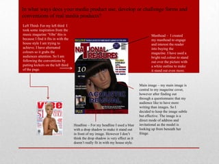
Left Third- For my left third I
took some inspiration from the
music magazine ‘Vibe’ this is                                                             Masthead – I created
because I find it fits in with the                                                        my masthead to engage
house style I am trying to                                                                and interest the reader
achieve. I have alternated                                                                into buying the
colours so it grabs the                                                                   magazine. I have used a
audiences attention. So I am                                                              bright red colour to stand
following the conventions by                                                              out over the picture with
putting kickers on the left third                                                         a white outline to make
of the page.                                                                              it stand out even more.


                                                                                  Main image – my main image is
                                                                                  central to my magazine cover,
                                                                                  however after finding out
                                                                                  through a questionnaire that my
                                                                                  audience like to have more
                                                                                  writing than images. So I
                                                                                  decided to keep the image subtle
                                                                                  but effective. The image is a
                                                                                  direct mode of address and
                                     Headline – For my headline I used a blue     invitational as the model is
                                     with a drop shadow to make it stand out      looking up from beneath her
                                     in front of my image. However I don’t        fringe.
                                     think the drop shadow is very effect as it
                                     doesn’t really fit in with my house style.
The top and bottom lines
                                  of my magazine is where
                                  I choose to advertise my
                                  exclusives and extra
                                  articles an reviews. These
                                  lines are very effective at
                                  grabbing the audiences
                                  attention because of the
                                  bright colours that I have
                                  used.


                                     I have used the colours red white, blue and
                                     black as my house style colours and have used
                                     them through out my magazine. However I used
                                     a bright yellow for exclusive and plus words as
My front cover has kept to
                                     it draws peoples eyes to it.
magazine conventions as I
have used the rule of thirds
well and kept everything in
an organised position. Also
horizontally I have used the
rule of thirds again as clearly
shown.
For my double page spread I
   used a introductory text to
   give the reader a brief
   introduction to what the article
   is about.


I have used insert shots of the artist and their
album cover which is what the main article
feature is about. I also did this to make use of
all the space available and so that there was
no white spaces on the page.


          I have used a pull quote to entice the
          reader to want to read the story when
          they first look at the page, I think I
          have used this effectively as I have
          used a bold colour to draw peoples
          eyes in.

This example is also very similar to
my article as they have used the large
main photo on one page and the
article on the other. I did this because
the photograph is very powerful and I
wanted the photo to have an impact
and not to have much writing
differing from the actual picture.
I used this text for my double page spread because it stands out really
well and is different to all the texts I used through out my magazine. I
have used it for the headline convention and I feel that it works well as a
headline because it stands out and makes the reader want to find out what
was lost.


                                                                              For my contents page I have tried
                                                                              to used the rule of thirds
                                                                              convention to create my page in
                                                                              an organised way. However I
                                                                              haven't kept to the standard rule of
                                                                              thirds but I have kept everything
                                                                              organised in threes.

Contenu connexe

Tendances

Preliminary evaluation
Preliminary evaluationPreliminary evaluation
Preliminary evaluationasmediag12
 
Magazine design
Magazine designMagazine design
Magazine designbhussain07
 
Production log for my front cover
Production log for my  front cover Production log for my  front cover
Production log for my front cover twinklez
 
Magazine cover evaluation
Magazine cover evaluationMagazine cover evaluation
Magazine cover evaluationjemsjems61
 
Final Draft Double Page Spread Powerpoint
Final Draft Double Page Spread PowerpointFinal Draft Double Page Spread Powerpoint
Final Draft Double Page Spread Powerpointkittylantos
 
Magazine inspiration
Magazine inspirationMagazine inspiration
Magazine inspirationsheneka96
 
Double page spread analysis
Double page spread analysisDouble page spread analysis
Double page spread analysisOliviaLyons
 
Final Draft Contents Page Breakdown
Final Draft Contents Page BreakdownFinal Draft Contents Page Breakdown
Final Draft Contents Page Breakdownkittylantos
 

Tendances (18)

Evaluation q5
Evaluation q5Evaluation q5
Evaluation q5
 
conventions
conventionsconventions
conventions
 
Preliminary evaluation
Preliminary evaluationPreliminary evaluation
Preliminary evaluation
 
Question1
Question1Question1
Question1
 
diary of make
diary of makediary of make
diary of make
 
Magazine design
Magazine designMagazine design
Magazine design
 
Production log for my front cover
Production log for my  front cover Production log for my  front cover
Production log for my front cover
 
Contents as
Contents asContents as
Contents as
 
Evaluation q1
Evaluation q1Evaluation q1
Evaluation q1
 
Magazine cover evaluation
Magazine cover evaluationMagazine cover evaluation
Magazine cover evaluation
 
Final Draft Double Page Spread Powerpoint
Final Draft Double Page Spread PowerpointFinal Draft Double Page Spread Powerpoint
Final Draft Double Page Spread Powerpoint
 
Question 7
Question 7Question 7
Question 7
 
Magazine inspiration
Magazine inspirationMagazine inspiration
Magazine inspiration
 
Flat plans
Flat plansFlat plans
Flat plans
 
Double page spread analysis
Double page spread analysisDouble page spread analysis
Double page spread analysis
 
Final Draft Contents Page Breakdown
Final Draft Contents Page BreakdownFinal Draft Contents Page Breakdown
Final Draft Contents Page Breakdown
 
Photo Edits
Photo Edits Photo Edits
Photo Edits
 
Production of front cover
Production of front coverProduction of front cover
Production of front cover
 

En vedette

I'm Here Presentation
I'm Here PresentationI'm Here Presentation
I'm Here PresentationJessicaa1894
 
Official film pitch
Official film pitchOfficial film pitch
Official film pitchJessicaa1894
 
Film storyboard
Film storyboardFilm storyboard
Film storyboardcclarkson
 
Blog Task Two Presentation
Blog Task Two PresentationBlog Task Two Presentation
Blog Task Two PresentationJessicaa1894
 

En vedette (6)

I'm Here Presentation
I'm Here PresentationI'm Here Presentation
I'm Here Presentation
 
Film Pitch
Film PitchFilm Pitch
Film Pitch
 
Official film pitch
Official film pitchOfficial film pitch
Official film pitch
 
Film poster
Film posterFilm poster
Film poster
 
Film storyboard
Film storyboardFilm storyboard
Film storyboard
 
Blog Task Two Presentation
Blog Task Two PresentationBlog Task Two Presentation
Blog Task Two Presentation
 

Similaire à Evaluation Question One

Similaire à Evaluation Question One (20)

Formated media question 1
Formated media question 1Formated media question 1
Formated media question 1
 
Question 7 evaluation
Question 7 evaluationQuestion 7 evaluation
Question 7 evaluation
 
Question 7
Question 7Question 7
Question 7
 
Eval 1
Eval 1Eval 1
Eval 1
 
Question 1
Question 1Question 1
Question 1
 
Front cover
Front coverFront cover
Front cover
 
Evaluationnnnn
EvaluationnnnnEvaluationnnnn
Evaluationnnnn
 
Question one evaluation
Question one evaluationQuestion one evaluation
Question one evaluation
 
Evaluation Complete
Evaluation CompleteEvaluation Complete
Evaluation Complete
 
Question 1.
Question 1.Question 1.
Question 1.
 
Q1
Q1Q1
Q1
 
Question 7
Question 7 Question 7
Question 7
 
Media progresion
Media progresionMedia progresion
Media progresion
 
Making it
Making itMaking it
Making it
 
Evaluation
EvaluationEvaluation
Evaluation
 
Main task evaluation
Main task evaluationMain task evaluation
Main task evaluation
 
Question 1
Question 1Question 1
Question 1
 
Photographs (unaltered and permission)
Photographs (unaltered and permission)Photographs (unaltered and permission)
Photographs (unaltered and permission)
 
Photographs (unaltered and permission)
Photographs (unaltered and permission)Photographs (unaltered and permission)
Photographs (unaltered and permission)
 
Question 1
Question 1Question 1
Question 1
 

Evaluation Question One

  • 1. In what ways does your media product use, develop or challenge forms and conventions of real media products? Left Third- For my left third I took some inspiration from the music magazine ‘Vibe’ this is Masthead – I created because I find it fits in with the my masthead to engage house style I am trying to and interest the reader achieve. I have alternated into buying the colours so it grabs the magazine. I have used a audiences attention. So I am bright red colour to stand following the conventions by out over the picture with putting kickers on the left third a white outline to make of the page. it stand out even more. Main image – my main image is central to my magazine cover, however after finding out through a questionnaire that my audience like to have more writing than images. So I decided to keep the image subtle but effective. The image is a direct mode of address and Headline – For my headline I used a blue invitational as the model is with a drop shadow to make it stand out looking up from beneath her in front of my image. However I don’t fringe. think the drop shadow is very effect as it doesn’t really fit in with my house style.
  • 2. The top and bottom lines of my magazine is where I choose to advertise my exclusives and extra articles an reviews. These lines are very effective at grabbing the audiences attention because of the bright colours that I have used. I have used the colours red white, blue and black as my house style colours and have used them through out my magazine. However I used a bright yellow for exclusive and plus words as My front cover has kept to it draws peoples eyes to it. magazine conventions as I have used the rule of thirds well and kept everything in an organised position. Also horizontally I have used the rule of thirds again as clearly shown.
  • 3. For my double page spread I used a introductory text to give the reader a brief introduction to what the article is about. I have used insert shots of the artist and their album cover which is what the main article feature is about. I also did this to make use of all the space available and so that there was no white spaces on the page. I have used a pull quote to entice the reader to want to read the story when they first look at the page, I think I have used this effectively as I have used a bold colour to draw peoples eyes in. This example is also very similar to my article as they have used the large main photo on one page and the article on the other. I did this because the photograph is very powerful and I wanted the photo to have an impact and not to have much writing differing from the actual picture.
  • 4. I used this text for my double page spread because it stands out really well and is different to all the texts I used through out my magazine. I have used it for the headline convention and I feel that it works well as a headline because it stands out and makes the reader want to find out what was lost. For my contents page I have tried to used the rule of thirds convention to create my page in an organised way. However I haven't kept to the standard rule of thirds but I have kept everything organised in threes.