
Recommandé
Contenu connexe
Tendances
Tendances (19)
En vedette
En vedette (14)
Similaire à Nme analysis
Similaire à Nme analysis (20)
Dernier
Dernier (20)
Nme analysis
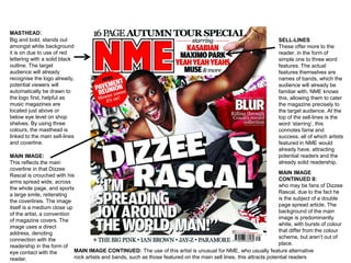
- 1. MASTHEAD: Big and bold, stands out amongst white background it is on due to use of red lettering with a solid black outline. The target audience will already recognise the logo already, potential viewers will automatically be drawn to the logo first, helpful as music magazines are located just above or below eye level on shop shelves. By using three colours, the masthead is linked to the main sell-lines and coverline. SELL-LINES These offer more to the reader, in the form of simple one to three word features. The actual features themselves are names of bands, which the audience will already be familiar with, NME knows this, allowing them to cater the magazine precisely to the target audience. At the top of the sell-lines is the word ‘starring’, this connotes fame and success, all of which artists featured in NME would already have, attracting potential readers and the already solid readership. MAIN IMAGE: This reflects the main coverline in that Dizzee Rascal is crouched with his arms spread wide, across the whole page, and sports a large smile, reiterating the coverlines. The image itself is a medium close up of the artist, a convention of magazine covers. The image uses a direct address, denoting connection with the readership in the form of eye contact with the reader. MAIN IMAGE CONTINUED II: who may be fans of Dizzee Rascal, due to the fact he is the subject of a double page spread article. The background of the main image is predominantly white, with bursts of colour that differ from the colour scheme, but aren’t out of place. MAIN IMAGE CONTINUED: The use of this artist is unusual for NME, who usually feature alternative rock artists and bands, such as those featured on the main sell lines, this attracts potential readers
- 2. Skyline: Includes a key feature of the magazine, offering exclusivity in the form of theword “special”, denoting an unusual issue of the magazine, and connoting rareness. The use of the word “Autumn” connotes a time frame in which to buy the issue, as well as showing how up-to-date the magazine is amongst music news, something well respected in musical circles. This intrigues the reader, making it far more likely they will buy it before it goes out of print or becomes irrelevant. Main Coverline: Anchors main image, showing who main image is of.The is text is bold and makes use of strokes in order to create a 3- D shadow effect from the text. The text Is the biggest feature other than the masthead, showing the artist is one of the biggest, being reported on by the biggest magazine. Strapline: The strapline is an important feature of the magazine, its minimalistic typeface fits the colour scheme of the rest of the issue, and matches the skyline. It breaks conventions of the music magazine genre in that it isn’t brightly coloured, rather the opposite, but this makes it stand out more than colour would. Barcode: Digital information about the magazine, allowing it to be scanned, and NME to see how many copies were sold. Place in the bottom right hand corner of the magazine, this is done so as to not distract from the rest of the magazine, but still fits the colour scheme and is not out of place. Quote: This is a direct address too, spoken like an everyday conversation, effective in creating interaction between reader and magazine.
- 3. Editorial/Main Image: The main image is of an NME editor clinging to a tour bus, fitting the issue being a touring special through use of the mise-en-scene which includes an image of a tour bus. The text underneath the image contains the words “Touring Special” so the copy anchors the image. The image itself is edited to look worn, giving a ‘road worn’ effect common in rock music that fits the theme of touring. The editorial introduces readers in an informal manner, creating a direct address with the readership who will be used to the brand of language. The editorial is bordered by a road cased, used for transporting musical equipment, again fitting the tour theme. The uneven placement connotes unconformity, a staple of rock music. Masthead: The same as on the front, anchoring the cover and contents page. Also helps establish the brand, through use of repeated imagery. Contents: The contents of the magazine are clearly laid out using the colour scheme of the magazine, anchoring cover and contents page again. Subscription: The only deviation of the colour scheme is in the subscription box, this is done to attract attention, as NME is likely to make more money off subscriptions from an individual due to them not having to repeatedly buy the issue in stores, where it could sell out, or not be bought, but subscriptions are delivered. Band Index: A key feature of NME, no other music magazine has an index quite like NME’s. It shows the focus is on the bands and music, which readers will appreciate.
- 4. Mise-en-scene: Use of graffiti and how Dizzee is spraypainting a wall gives rise to a convention of hip-hop music, unusual for NME to be reporting on. Also alludes to rebellion, a major theme of the magazine.His facial expression connotes mischief and being up to no good, these themes are reflected in his music. Masthead: Shown again on the bottom left hand corner, very small, but a constant reminder of the brand and magazine, also connotes NME being omnipresent in music, always on the scene, as it is shown literally in the picture Header: Makes use of a play on words of ‘from rags to riches’ in order to create a catchy header. The typeface is uneven and unaligned, making it look like it could be graffiti on a wall. The word ‘tags’ relates to the culture of hip hop and what it’s about, also giving a reason for the grafiitied backgrounds featured throughout the cover and double page. Secondary Image: Shows images of empty bottles and glasses and a boom-box, showing a street scene one might find in a hip hop music video, again alluding to the music of Dizzee Rascal and what it represents. Article: Emphasis is put on the article by the use of drop capitals on the letter ‘Y’ which draws the eye towards the article as it is the focal point of the double page. The text is split into four columns, allowing easier reading, it also wraps around the secondary image allowing more space for the main body of the article. The subheading above features the artists’ name in bold, showing once again emphasis is put on the artist, as he is the main focus that will sell copies.