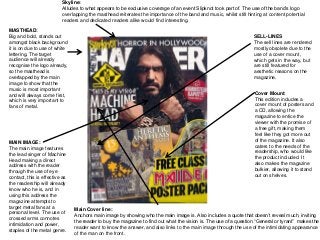
1. Skyline:
Alludes to what appears to be exclusive coverage of an event Slipknot took part of. The use of the band’s logo
overlapping the masthead reiterates the importance of the band and music, whilst still hinting at content potential
readers and dedicated readers alike would find interesting.
MASTHEAD:
Big and bold, stands out
amongst black background
it is on due to use of white
lettering. The target
audience will already
recognise the logo already,
so the masthead is
overlapped by the main
image to show that the
music is most important
and will always come first,
which is very important to
fans of metal.
SELL-LINES
The sell lines are rendered
mostly obsolete due to the
use of a cover mount,
which gets in the way, but
are still featured for
aesthetic reasons on the
magazine.
MAIN IMAGE:
The main image features
the lead singer of Machine
Head making a direct
address with the reader
through the use of eye
contact, this is effective as
the readership will already
know who he is, and in
using this address the
magazine attempts to
target metal fans at a
personal level. The use of
crossed arms connotes
intimidation and power,
staples of the metal genre.
Cover Mount:
This edition includes a
cover mount of posters and
a CD, allowing the
magazine to entice the
viewer with the promise of
a free gift, making them
feel like they got more out
of the magazine. It also
caters to the needs of the
readership, who would like
the product included. It
also makes the magazine
bulkier, allowing it to stand
out on shelves.
Main Cover line:
Anchors main image by showing who the main image is. Also includes a quote that doesn’t reveal much, inviting
the reader to buy the magazine to find out what the vision is. The use of a question “General or tyrant” makes the
reader want to know the answer, and also links to the main image through the use of the intimidating appearance
of the man on the front.
2. Main Article:
Made the biggest
as it anchors the
front page and
contents, but also
provides a look at
the main piece of
the magazine, for
easy access, as
many of the
readership would
have bought the
magazine purely
for the article, so it
is important that it
is easy to locate.
Secondary
Articles:
Made bigger for
the same reasons
as main article,
these are the main
features of the
magazine that
readership would
look out for, so
they feature the
biggest up and
coming bands and
news.
Contents:
The actual content is
presented in a
straightforward way
that is easy to read,
increasing
accessibility and
allowing readership
to know what page
each article is. This
is complemented by
the use of pictures,
which are placed for
aesthetic reasons.
3. Image:
Anchors the cover and
contents, features the
same person on the
cover in the same
settings. Connotes
power, as he sits on
what looks like a
throne. Conforms to
convention as he has
long hair, a denim vest
and dark jeans, all
staples of the metal
fashion. The use of
spikes and thorns on
the chair show a dark
side to the image,
almost evil, this will
attract fans of metal, as
well as fitting the
subtitle on the front
cover “General or
tyrant?”
Text: Starts with the letter ‘N’ in drop capitals, drawing the eye, before being
split up into 3 main columns, meandering around the quote. This is an
effective layout as it allows the reader to be able to read the magazine easily
without the hassle of having to find where the next column is, as they are
easily marked.
Headline:
Uses two bold words,
both denoting power and
conquest, two features of
what many metal songs
are about. The power and
stature denoted by the
headline complements
the main image, of the
lead singer of Machine
Head sitting on what
appears to be a throne,
another symbol of power.
The typography used also
shows a regal theme to
the article.
Quote:
Appeals to fans of Machine
Head who would already
have heard of the album “The
Blackening”, which it
italicised. This would not only
appeal to fans of Machine
Head, but anybody with a
passing interest of the album
or band.
Quote:
The quote featured is an
extension of the
paraphrased quote on the
front cover, allowing the
reader some context on
what the article is about
and why it was written. It
also allows the reader to
feel more connected with
the person in the image in
that he speaks informally.