VIP Call Girl Kolhapur Aashi 8250192130 Independent Escort Service Kolhapur
Douple Page Spread Analysis
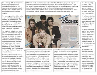
1. The main image of ‘The Vaccines’ covers NME continues with its simple sans serif for the articles title of ‘The Vaccines’ to give the magazine a The subheading telling
three quarters of the double page more informal feel and appeal to the teenage audience. The heading for ‘The Vaccines’ uses a large the readers a little
spread which implies that the ‘The font so that it stands out and captures the audience’s attention. Due to this being the only large writing information about the
Vaccines’ themselves are such a popular within the double page spread it is clear that the name ‘The Vaccines’ themselves can sell the band and article is
band that there is no article needed to magazine whereas other bands may need to use other persuading techniques to promote the article important as it will pull in
encourage the audience to buy the and themselves. The sans serif font featured in the heading contributes to NME’s house style. the readers making them
magazine. want to read the article.
The band are giving direct address to the The subheading describes
readers so that it looks like the singer is the band as ‘the biggest
looking at the reader personally. The guitar band of 2011’
main singer is featured at the front of which is why in the image
the image as he is the most likely person of ‘The Vaccines’ guitars
from the band to be recognized. It have been added to
makes the article more known that it is reinforce this.
about ‘The Vaccines’ themselves.
The feature editor ‘Jamie
The image itself uses pale, gritty colours Fullerton’ name has been
giving the impression that the image is written in blue to make it
old and from another era which ties in stand out and catch the
with how ‘The Vaccines’ are dressed. reader’s eye. Nme’s
‘The Vaccines’ have been dressed in regular readers will be
clothes that people would have worn in aware of this name and
previous generations such as the 80s articles that he writes so
and 90’s rather than more modern will be more likely to read
clothes. The clothes from previous the article just because
generations are starting to become he has wrote it.
more fashionable again so dressing them
in these types of clothes will appeal to a The colour blue is the
The article uses large letters at the beginning of A quote from the article saying “we are a pop main colour featured in
selected audience.
the article which are similar to those that you band and we want to be a pop band” has been this particular article. This
Even though the image itself uses dull, would find in a book. This gives the article more taken from the article and enlargened so that it colour is a neutral colour
gritty colours such as coffee and browns of a story/gossipy feel which would appeal to grabs the reader’s attention making them want which means it will
the colour red is also used. The colour NME’s target audience. The large blue letters to read the article more. The editor has also appeal to both male and
red is used on the lead guitarists guitar would stand out by contrasting with the black chosen to use the colour blue for the quote so females. Due to the rest
and top of one of the can be used for coloured text from the rest of the article. The that it stands out even more. The Vaccines singer of the article featuring
love and passion which can band large letters would grab the audience’s attention and songwriter ‘Justin Young’ name has been either the colour black or
members. Red represents love for the making them read the first sentence so that they placed underneath the pull quote and bolded to dark colours the bright
band and songs in which they sing. It continue to read the whole article. The article make it stand out more. This is so that the blue stands out making
also gives the impression that the band itself isn’t very long as NME’s audience would audience know who the quote is from and who our eyes drawn to it.
are passionate about their music. rather look at pictures than read. the article is about.