
Recommandé
Contenu connexe
Tendances
Tendances (20)
Similaire à Britney Spears Cover Grabs Attention
Similaire à Britney Spears Cover Grabs Attention (20)
Plus de JoeRobert
Plus de JoeRobert (20)
Britney Spears Cover Grabs Attention
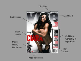
- 1. Sky Line Masthead Main Image Main article Cell Lines Generally in right third Model credit/ Quotation Bar Code Page Reference
- 2. Masthead Cell Lines Conventions are followed by placing the cell lines all down one side of the page. Generally text is featured on the left, but rarely in the centre. The Masthead, whilst large and using its usual font is very much in the background. Being a similar shade to the predominantly grey colour scheme helps it blend further into the background and become less obvious. The purpose of this is to accentuate the very provocative and bold main image. The masthead is part covered by the main image, this is following a fairly traditional convention with front covers. Headline The headline “CIARA” is the second largest on the page. Its in a very contrasting colour to the background, and uses the main celebrities name to catch attention. Main Image The main image of Ciara appeals to the target audience by using a well known R&B artist. Controversy and word of mouth promotion are easily generated by the provocative front cover. Others may be enticed to the magazine due to the sex appeal of the image. Barcode Term Of Address Vibe magazine follows the conventions of most magazines by placing the barcode in the bottom – right hand corner. The term of address is fairly formal with the occasional use of slang (Gonna). It uses declaratives to foreshadow the tone of the interview.
- 3. Main Image Masthead The mast head is following its usual conventions and uses its usual colour scheme and layout. Quite unconventionally for a magazine, it is placed in front of the main image making it more prominent for the reader. The main image is a medium close up of pop star Ke$ha. The close up quickly establishes to potential buyers who is on the front cover, it will entice Ke$ha fans easily. Headline Colour Scheme The headline is a bold font, and in plain white. Whilst not an eye-catching colour, the white is used here to contrast with its background and help the headline stand out more The colour scheme is fairly simple but bright with the predominant text colours consisting of yellow and white. The two colours accentuate the text by contrasting with the background. Barcode As with all of Billboard’s magazines the barcode is featured on the bottom-left side. Whilst fitting in with its usual conventions, it goes against those of most magazines that feature it to the bottom-right.
- 4. Colour Scheme Hook(s) The colour scheme consists predominantly of different shades of pink and purple. This fits in with the colour scheme their main image, whilst also appealing to its target audience of young/teenage girls. The use of rhetorical questions within the cell lines is used as a “hook” to help entice the reader. As are the many free gifts and competitions advertised on the front cover. Term Of Address Barcode The term of address is fairly casual and informal. The main headline uses a light-hearted quote referencing her role in the Austin Powers movie. Whilst the free gift section refers to this issue as the Craig poster “mag”. The barcode follows codes and conventions of most magazines by placing it in the bottom right-hand corner.
- 5. Main Image Masthead The main image will draw its target audience in and more, at the time Britney was in the midst of a breakdown and garnering much media attention. She is looking very lost and exposed, this will entice people to read about what has happened next. The masthead follows codes and conventions of a stereotypical magazine. It follows the general colour scheme, and is its usual logo. The masthead is also put to the background to put more emphasis on the main image in the foreground Term Of Address List of Artists The term of address is fairly formal lacking the conventional slang of other magazines. However other use of language such as underwear and chicks give a less formal tone. Barcode The list of artist/band names down the side follows the codes and conventions of most music magazines by luring in potential buyers with well known names that attract the target audience. The barcode also follows stereotypical magazine codes and conventions by placing it in the bottom right-hand corner.
- 6. Main Image Masthead The masthead sticks to the usual “billboard” logo, and follows codes and conventions by being placed in the background behind the main image in the foreground. The main image is a low shot, this makes her look powerful and intimidating. The image reflects the sub-heading’s message about her being in control. Term Of Address List Of Artists The term of address is fairly formal, little slang is used on the cover. its very informative and direct speaking to the reader about what is featured in the magazine. Following usual codes and conventions of magazines Billboard features a list of artists mentioned in articles within the magazine, down the left side of the cover.