

Recommandé
Contenu connexe
Tendances
Tendances (19)
Similaire à Q7
Similaire à Q7 (20)
Dernier
Dernier (20)
Q7
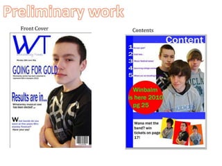
- 1. Preliminary work Front Cover Contents
- 2. The finished edition From my video and Facebook audience feedback I then put together the finished product which evidently achieved what i was aiming to do. Front Cover Contents
- 3. The finished edition Double-Page Spread
- 4. No indication of genre. Captivating top banner. Boring unattractive fonts. Information linking to the banner but aesthetically attractive. No ideology to a target audience. Image/text cohesion- gives information through two different ways. Lots of gaps and empty space. More stylised model, gives indication of the target audience. Use of different colours gives magazine more depth. No sense of Mis-ene-scene. No variation of features. E.g. Buttons, pictures, style. A more styled name and logo to the genre of magazine. No gaps which gives the reader more information to be attracted by. Better layout and user-friendly. The developments I made after I created the first one is clearly demonstrated in my audience and magazine research. After my first one I studied all the possible faults with my preliminary work and what I needed to take into consideration for the magazine I was creating to work. From this comparison I think the changes are significant. I have a lot more variation of font and style, the layout looks more professional and ordered. And most importantly my final edition has more indication of genre and target audience than my preliminary work. More information for the reader to be attracted by. The use of less extravagant colours makes it look more sophisticated. A better sense of genre and target audience by the pictures. Easier to follow by the use of signposting (Numbers and headlines) Smaller text and an array of fonts to make it attractive.