Analysis of front covers and film posters
•Télécharger en tant que PPTX, PDF•
1 j'aime•266 vues


Recommandé
Contenu connexe
Plus de Julia Crouch
Analysis of front covers and film posters
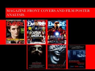
- 1. MAGAZINE FRONT COVERS AND FILM POSTER ANALYSIS.
- 2. The Banner Links “Free Posters” is to help sell – people like free items. The banner also advertises other features such as Avatar Putting the magazines (which was new out at the time) as well as another vampire flick Dracula and monster movie Frankenstein – official website this compliments the main feature and will appeal to monster movie lovers. address makes the magazine more modern./ The Masthead The Main Image This is the classic Empire Looking directly at the camera this suggest magazine font and colour strength and power over the audience. though with a white outline to This is also shows this is probably the/one stand out yet compliment the of the main characters in the movie being pale complexity of Edward (the featured. The pale complex and golden main image). eyes suggest something inhuman. The golden eyes also match with the main + cover line. The plus sign signifies that there is more to offer from the magazine. From films The Plug to information on A special on a popular classic horror film actresses/actors. “Alien” this is to help sell and entice the reader, this will appeal to a broader range. Twilight is generally for teens but Alien dates Tag Line back to late 70’s so people 30 and over will “Fangtastic” is a play on words to also like the features in the magazine. Also relate to the film which is about the plug is in a vibrant colour which relates to vampires. The “Exclusive” is to draw the Alien movie poster. people in to think they’re getting something new and exciting that can only be found in this magazine. The Main Cover Line This shows the main feature and in this issue its Twilight New Moon. The golden colour chosen can symbolise the Twilight/New Moon and also matches Edwards golden Other Images eyes. Its capitalised to grab the These show the readers attention as well as its other two bright colour. Its based on the same characters in the colour as the Twilight:New Moon feature film. movie poster.
- 3. Masthead Keeping the classic Empire font The Banner but colouring white to stand out “Magazine of the Year” is against the blue and red capitalised and is also in the background. As well as keep white font to match the patriotic within the theme of the flag. colouring of red, white and red (USA). This is placed here to The Plug entice the audience by Though Captain America does suggesting this is the best have his own film, the plug magazine compared to all others. announces that he will be apart of the upcoming film The Avengers by MARVEL. The Avengers is a collective group of Plus superheroes who come This is to show the other features together to “save the world”. inside the magazine. This is in The Plug is in a bright yellow white, to keep within the theme as with black writing to contrast well as bright yellow to contrast and stand out against the image against the theme to stand out and entice the readers to get more. the exclusive. Main Image Main Cover Line Captain America is staring ferociously Capitalised and down the camera lenses to show power in white to and he has his fists clenched to show match the strength and power. His holding the masthead shield away from his body so his isn’t suggesting the hiding behind it this again shows power. feature is just Another Plug This supports the fact that Captain as important as A special which will America is a superhero. The background the empire also appeal to older is the American flag and this name. It’s white movie fans of sci-fi compliments what he is wearing to coincide with films but also attract showing his is patriotic and heroic for the theme. new readers as its his country. The clothes his wearing is about new sci-fi his costume that is what he wears in the films. Place below the 2011 Captain American film and the feature as its less 2012 Avengers film. important.
- 4. The Banner Masthead “Oscars Special” entices all types of The effect used on the masthead shows it movie lovers to read this magazine. like a lightening/electrical storm this blends Though the feature (Iron man) attracts well with the lighting source coming from action/comic book lovers the Oscars is iron mans chest. It shows and suggest the a prestigious event for all types of film electrical power is used in the film/by iron and honours other jobs in film other man. than just actors/actresses. The Plug “All hail the king of 2010” is a strong execution for the plug. It suggests that (in 2010) Iron Man was the most iconic and the most awaited movie of the year. Its also place in the light blue and white to blend in but contrast with iron mans red suit. Main Cover Line & Extra Cover line The main cover line is capitalised and the same colour as the masthead and also syncs with Iron Mans light. Though its not as bright and large as Main Image the masthead showing us that the Iron Man is striking a dominant strong Empire name is far more important pose, though his head is positioned down and dominant on the feature though the fact he’s wearing an iron amour and compared to the image which is place the bright light extending from his chest in front it takes some of the power is the vantage point that draws your eye, away making it more balanced. the eyes/eye holes are also lit up much The Extra cover line is to show Iron like his chest. The eyes seem to extend Mans fans that though he has gone into the masthead. The background is through changed he still has his dry Exclusives dark and shadowy , it looks almost like sense of humour which he is famous This ensures the reader that they’re getting something not seen clouds which would blend nicely into the for and appeals widely to his audience. in other magazines (value for money). It also is showing films that lightening/electrical effect used on the would be popular amongst comic book/action lovers with masthead. This Image is extremely similar exclusives on film such as Avatar, Kick-Ass and Robin Hood. They to the one used for the movie poster. are place at the bottom make them less important and being unseen on a shop shield though are wide enough to attract more readership.
- 5. The Image The Tag Line The majority of the image is engulfed in The Hills Have Eyes is another black/darkness, even the woman's mouth major big budget horror film is being engulfed into the darkness. This which was widely accepted. This shows us the film is very dark and that evil will promote and draw more is surrounding its victims. The shock on the attention to this movie . woman’s face, from her wide eyes, dilated pupils and open mouth suggest she has seen great horror or that her attacker is The Title coming towards her. Though her eyes are “Mirrors” suggest a parallel directly at the camera its to show fear, her reality that everything isn’t head is tiled slightly back to show her exactly as it seems. People are looking down on the viewer. This could not what they seem. Since it is in suggest she is about to die or is about to the horror genre this suggests die. There is a crack going across her left that the prop of a mirror will be eye which shows there is a crack in the used. The font is simple and the “mirror” suggesting to us she has become red conotates danger. Its unlucky/ the victim (crack a mirror = 7 effective how the “R’s” are years bad luck). She seems terrified be the positioned mirrored to each thought of being unlucky. This will confuse other relating back to the name the audience and create mystery onto who of the title. The conecpt of the the villain is. Mirror can be frightful for anyone as there are mirrors every, in your own home, at work, in your The Credits car etc. This shows the information of the producers, cast and everyone involved in making the film. The certificate shows the The Actor audience what to expect from the film. An Kiefer Sutherland is a well known “R” rated movie are generally the scariest actor whos’ been making moves and most goriest films. The 20th Century since the early 80’s. He has also Fox logo ensures loyal audience members stared in the vampire flick “The will go see this film. 20th Century films has Lost Boys” and is currently staring produced Jennifer's Body and Predators, the world renowned TV series both where successful. “24”. This ensures the movie that he’s fan base will go watch the movie. The Date August is the perfect time to released a big budget film such as this, though a lot of competition will be out there as the summer is when most of the biggest films or the year is also released.
- 6. The Image On the extreme close up the tiara clearly demonstrates the victim is female and at an event of importance because she’s dressed up. The Title This coincides with the idea of Prom, the image This is capitalised and is in a clearly shows that there has been some kind of sharp red font. This immediately distress not only from the slanted tiara across gives away the plot, location and her face but also the fact her mouth is open in a characters. The title suggests it scream like position and the image itself seems will take place at a prom/ the to be gritty and scratched. Her hair is also evening of the prom. So the matted across her face. The tiara shows us she audience will also now know the is blinded and weakened, the scream shows us characters in their late teens. terror and the fact she is fearful and the matted Though this has given a lot away hair shows that she has lost control. Unlike the they still haven't mentioned the “Mirror” Poster you cannot see the fear in her villain which is effective leaving eyes, by not seeing her eyes at all and barely all an open question on “who/what of her face it suggests that maybe she is is the villain?”. unimportant to the plot and she just is one of many victims. The Tagline Distributor Logo “A night to die for” is an enticing Screen Gems are known for doing successful line for the an audience which horror films such as “Underworld” and “The can be taken two ways. The verb Exorcism of Emily Rose” as well as other “die” can mean to stop living, so successful high budget films like Dear John this a invitation for the audiences and Friends with Benefits. This will entice own death but in slang terms “to loyal members to go watch this film. die for” means its amazing, its something everybody wants. So this shows us (the audience) that the tag line has double meaning. It’s also in white and in capitals to stand out against the red title The Date and date above and below it. The date is in red which proposes danger to the audience, though most horror films are released during autumn, when Halloween is. Spring might entice the audience to go watch this film as no other horror movies will be out.
- 7. Reviews Main Image Reviews from known horror blogs The main Image is taken from a clip of the such as “bloody-disgusting” with movie as the concept of Paranormal Activity it is give the film credit as well as make suppose to be “real/re-acted footage” so stills the audience want to watch the and photographs wouldn’t of been taken for a film even more if they know its promotional poster of film magazines etc. worth the money/viewing time. The poster shows a still from the film when the This is in white to contrast and two characters Kate and Mika in bed pointing stand out from the black towards a shadow. The shadow is in the shape background. of a tall man, though their clearly isn’t anyone standing there to cast a shadow. Shadows are The tagline mysterious and dark and often represent evil. The tagline is directing the The shadow is placed higher suggesting that it audience using the word “you” has more control and power over Kate and puts the audience in the victims Mika. There is also a huge gap between the footsteps making it more fearing characters and the shadow suggesting that the for the audience. Also “What characters are fearful and want to be far away Happens when you sleep” is a from whatever the shadow represents. The time terrifying thought as your not in the bottom right corner also makes it look conscious when you sleep so more authentic to the plot suggesting it was anything can be happening. Also taken from a hand held camera. The night vision “Don’t see it alone” is a sort of a also makes the footage look darker and sinister. warning to the audience that this film is terrifying. These are in Distributor Logo white capitals against a black Paramount Pictures is one of the highest ranked background making it contrast and film distributors and top grossing studios– this stand out against the background. will give this film high credibility and Paramount loyal members will want to go view this movie The Title so this will engage an even larger audience. The title is capitalised and in a dark They have distributed and produced horror red font, its in the same font as on films such as Friday the 13th, Sleepy Hollow and a camera when it says “REC” …this all of the Paranormal Activity franchise. blends well with the fact this is supposed to be a handheld camera movie. The blur on the letters and glow that something is not. Extra Information Information such as the website is a greater way to advertise and promote the film this will gain interest with a larger audience. The “demand it” button also suggest that they are desperate for the film to be shown everywhere.