
Recommandé
Contenu connexe
Tendances
Tendances (20)
En vedette
En vedette (20)
Similaire à Inspired Album Cover Design for Fire Drive Tiger
Similaire à Inspired Album Cover Design for Fire Drive Tiger (20)
Plus de Katherine Brittain
Dernier
Dernier (20)
Inspired Album Cover Design for Fire Drive Tiger
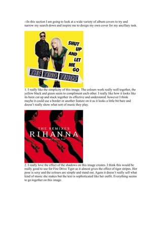
- 1. -1In this section I am going to look at a wide variety of album covers to try and narrow my search down and inspire me to design my own cover for my ancillary task. 1. I really like the simplicity of this image. The colours work really well together, the yellow black and green seem to compliment each other. I really like how it looks like its been cut up and stuck together its effective and understated. however I think maybe it could use a border or another feature on it as it looks a little bit bare and doesn’t really show what sort of music they play. 2. I really love the effect of the shadows on this image creates. I think this would be really good to use for Fire Drive Tiger as it almost gives the effect of tiger stripes. Her pose is sexy and the colours are simple and stand out. Again it doesn’t really sell what kind of music she makes but the text is sophisticated like her outfit. Everything seems to go together on this image.
- 2. 3. The blues in this cover are the first thing that catches your eye. In Fire Drive Tiger the most prominent colour is orange so we could use this technique too. This image seems to sell her music more than the others. It looks futuristic and techno. She looks very modern and contemporary. I like the layout of the image too. The fact the name is the first thing you see followed by the song. 4.I like the colours in this image, I think these warm fiery colours would work well for our ancillary task. I also really like the way the people are cut out, they look cartoon like yet you can see the detail. its really effective. I like the idea of a border around the outside too.
- 3. 5. This image is very busy, there is lots to look at and is quite unique. I don’t really like the cold colours used yet the idea is interesting. I like the swirl font used here, its feminine yet rock and roll. I also like the border used on this one too. 6. I like the simplicity of this image. You do not know the kind of music you will receive however it is effective and memorable. I think we will need to use bolder colours for Fire Drive Tiger however due to the song type and name. I also like the font used here. It looks sophisticated.
- 4. 7. This image is definitely memorable and I really like the cartoon effect. I don’t like the use of lines used but the colours of her dress stand out well against the background. I like how the name of the album is featured on her dress in the clouds and behind her. 8. The colours of this image are very Jamaican which i feel is wrong for Fire Drive Tiger. However i like the use of cut out tool here. It lets the audience use their imagination and also looks effective.
- 5. 9. I think this is cover a lot. I think its so memorable and iconic I love how the band is split into squares and the way it is cut out so it looks like a cartoon. I think an image like this would work for Fire Drive Tiger because there are four members and the image looks quite edgey. I already had a vague idea of the style I wanted to go for with the ancillary task when I searched for these image. I wanted a arty cartoon still that was fun but also rock and roll. I think although these images are very different I can draw different qualities from each of them to create my ancillary task. I think the main images I have found here that I will use with be The Ting Tings image, Rihanna and Blur.