
Recommended
More Related Content
What's hot
What's hot (19)
Similar to Digipack Deconstruction, Anxiety by Ladyhawke
Similar to Digipack Deconstruction, Anxiety by Ladyhawke (20)
More from KathrynLeechASMedia
More from KathrynLeechASMedia (13)
Recently uploaded
Recently uploaded (20)
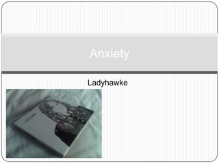
Digipack Deconstruction, Anxiety by Ladyhawke
- 2. Front The album title itself Anxiety came from Ladyhawke feeling anxious about writing the album; “Definitely all the stress of being on tour and then having to write and record new music helped me with Anxiety.” Her name is in bigger font than the title and also written above it, showing the importance of the artist on this album as she wrote and sang every song. The artwork for the cover is the artists face drawn in black and white, connoting a simple but effective sound to her music. But as you can see closely, her eyes are the only bit in colour, they’re blue. With regards to the saying “the eyes are the key to the soul,” I think this shows that her music is letting the listener into her soul, into her deepest thoughts and feelings. The interesting bit about the front cover are the creatures and objects emerging from her hair. These include insects, wolves, feathers, hands, and her own face. All the artwork was done by visual artist Sarah Larnach. "I really wanted to do something darker that was more line- drawing based and was really inspired by the Beatles' Revolver artw ork. That's my favourite album cover. So she came up with all this amazing stuff. She just nailed it. She's so talented” Ladyhawke said.
- 3. Back The font on the back for the song titles looks like it could have been handwritten. It’s very simple with no pictures except for what looks a drawing of a small scar in the top right corner. This could connote that the focus is just on the songs themselves, as most singer/songwriters like to be simplistic and solely focus on the music. The small scar could be there to show how she has been mentally scarred in her past and the songs on this album reflect that.
- 4. Inside First fold out: We see on the left two insects, drawn in black and white. They look like some type of moth, which symbolises vulnerability and determination which is what Ladyhawke could have wanted this album to be about. On the right we see again the scar-like drawings that were on the back cover. Second fold out: The insect appears again on the right side. As we unfold the digipack, the drawings seem to get more and more detailed, which could connote the intricate work put into this music which you discover the further you go in.
- 5. CD Tray The CD tray is another drawing of Ladyhawke, but she is holding a camera up to her face. This could connote she doesn’t want the attention on her but more on what the camera is pointing towards which is the person who brought the digipack of her music, and this could show that she wants her music to really influence the listener. Also, she has blue eyes again here, but the lens of the camera is also blue whereas everything else is black and white. This could show that she’s trying to make a connection with her audience.