SlideShare une entreprise Scribd logo
1  sur  2
First Ancillary Task

                                                     The layout of this album cover is very
                                                     plain. The artists name is at the top of
                                                     the cover, which is very conventional
                                                     for a music album. The name of the
                                                     album is then just below it in a small
                                                     font. The simplicity of the writing and
                                                     the way it is laid out, I think reflects
                                                     type of music Ben Howard produces.
                                                     The font is very bold and a lot bigger
                                                     than anything else on the cover,
                                                     making it stand out so that audience
                                                     instantly sees whose album is it. I
                                                     think the best thing about this
                                                     particular cover is the gradient in
                                                     colour, from the top going down it
                                                     gets darker and darker, starting off
                                                     white, then going to a dark blue, this
gives a calming effect on the whole album, and gives the impression that this album is
going to be relaxed. I like the image that has been used for this cover, purely because it
raises the question on whether or not the man diving into the water is in fact Ben
Howard.
The back of the album, which is the
image below, is clever in the sense
that it is showing the person
swimming back up to the surface of
the water. This is actually a very
common feature of an album cover.
A lot of artists like it to look like a
book. So with this, at the front of the
‘book’ Ben Howard is diving into the
water, then at the back of the album,
he is swimming back up, its almost
like he’s set off on his journey,
listened to the songs that come in
the middle of the ‘book’ and now he
is going back again.
There isn’t really much that can be
said about the mode of address, as the only text is simply who the artist is and what the
album is called, however I will say that if this album was aimed at a young audience,
there would probably be more writing on it to make it eye catching for them. When a
product is quite plain and simple like this, then usually it is aimed for an older audience,
as they do not need specific things to attract them to a product they like.
This is the second album cover that I have chosen to analyze. The layout of the album cover is quite
conventional in the sense that there is a main image in the middle of the cover, and then it shows the
name of the artist, and name of the album itself above it I think how the picture goes well with the title,
‘hand built by robots’, the image shows a mechanical hand, with different types of people in the palm
of it. The font has been chosen to look quite mechanical as well, the big and small letters next to each
other are examples of how it can be mechanical, mixed together with the rounded letters and different
types of boldness, I think this is a good style of writing to use on this album cover. The colour of the
background on this album is meant to connote the sky, the dark blue with white clouds in the middle
represent the calm feel to the album, and this then reflects the hectic mechanical style that is originally
seen.
The back of the album cover is probably what you would expect to see on this sort of album. The list of
the songs that are included are placed in the middle, so it is the very first thing you see, the font is still
the same as the font that was used for the title of the album on the front, and so this makes it all come
together. The astronaut that is pictured on the left of the cover, is the same one that was shown in the
same place on the front, I think this was used to remind the audience that the album is called ‘hand
built by robots’ therefore is probably set more in the future than anything. Another big convention of a
album cover is the barcode at the back, and this is something I need to consider when designing my
album cover because it is an important factor when trying to make it look realistic.

Contenu connexe

Tendances

Digipak analysis
Digipak analysisDigipak analysis
Digipak analysisKIMSOP
 
Digipack and poster analysis
Digipack and poster analysisDigipack and poster analysis
Digipack and poster analysisdenningb
 
DVD Cover analysis
DVD Cover analysisDVD Cover analysis
DVD Cover analysissalaffina
 
Further album artwork analysis
Further album artwork analysisFurther album artwork analysis
Further album artwork analysismeganalghailani
 
Analysis albums[1]
Analysis albums[1]Analysis albums[1]
Analysis albums[1]Eddie Guy
 
Analysis albums[1]
Analysis albums[1]Analysis albums[1]
Analysis albums[1]Eddie Guy
 
Cd cover design
Cd cover designCd cover design
Cd cover designcakeylol
 
Analysis Of 3 CD Digipak
Analysis Of 3 CD DigipakAnalysis Of 3 CD Digipak
Analysis Of 3 CD DigipakFrankParnell123
 
Bloc party’s past cd cover designs
Bloc party’s past cd cover designsBloc party’s past cd cover designs
Bloc party’s past cd cover designsmarinasoph
 
Final album cover
Final album coverFinal album cover
Final album covertolubarnes
 
Digipak research
Digipak researchDigipak research
Digipak researchlauraraxten
 
Fall out boy analysis
Fall out boy analysisFall out boy analysis
Fall out boy analysisladanakrawi
 

Tendances (18)

Digipak analysis
Digipak analysisDigipak analysis
Digipak analysis
 
Digipack and poster analysis
Digipack and poster analysisDigipack and poster analysis
Digipack and poster analysis
 
DVD Cover analysis
DVD Cover analysisDVD Cover analysis
DVD Cover analysis
 
Further album artwork analysis
Further album artwork analysisFurther album artwork analysis
Further album artwork analysis
 
Analysis albums[1]
Analysis albums[1]Analysis albums[1]
Analysis albums[1]
 
Cd cover
Cd coverCd cover
Cd cover
 
Analysis albums[1]
Analysis albums[1]Analysis albums[1]
Analysis albums[1]
 
Magazine advertsx2
Magazine advertsx2Magazine advertsx2
Magazine advertsx2
 
Cd cover design
Cd cover designCd cover design
Cd cover design
 
Analysis Of 3 CD Digipak
Analysis Of 3 CD DigipakAnalysis Of 3 CD Digipak
Analysis Of 3 CD Digipak
 
Donell jones
Donell jonesDonell jones
Donell jones
 
Digipak analysis
Digipak analysisDigipak analysis
Digipak analysis
 
Bloc party’s past cd cover designs
Bloc party’s past cd cover designsBloc party’s past cd cover designs
Bloc party’s past cd cover designs
 
Final album cover
Final album coverFinal album cover
Final album cover
 
Digipak research
Digipak researchDigipak research
Digipak research
 
CD album covers
CD album coversCD album covers
CD album covers
 
Fall out boy analysis
Fall out boy analysisFall out boy analysis
Fall out boy analysis
 
Album cover planning
Album cover planningAlbum cover planning
Album cover planning
 

Similaire à Album cover analysis of Ben Howard and Hand Built by Robots

3 products similar to ancillary 2
3 products similar to ancillary 23 products similar to ancillary 2
3 products similar to ancillary 2Ryan Baxter
 
Evaluation Ancillary Conventions
Evaluation Ancillary ConventionsEvaluation Ancillary Conventions
Evaluation Ancillary ConventionsBHollis95
 
Album arts analysed examples
Album arts analysed examplesAlbum arts analysed examples
Album arts analysed examplesmo_usman
 
Digipack deconstruction j b
Digipack deconstruction j bDigipack deconstruction j b
Digipack deconstruction j bKieranWilson96
 
Album Cover and Magazine Adverts for Album Releases Analysis
Album Cover and Magazine Adverts for Album Releases AnalysisAlbum Cover and Magazine Adverts for Album Releases Analysis
Album Cover and Magazine Adverts for Album Releases Analysislelicordell
 
Album Cover and Magazine Adverts for Album Release Analysis
Album Cover and Magazine Adverts for Album Release AnalysisAlbum Cover and Magazine Adverts for Album Release Analysis
Album Cover and Magazine Adverts for Album Release Analysislelicordell
 
Conventions Question 1
Conventions Question 1Conventions Question 1
Conventions Question 1Katie Clements
 
Magazine Advertisement Deconstructions
Magazine Advertisement DeconstructionsMagazine Advertisement Deconstructions
Magazine Advertisement DeconstructionsFionaA2Media
 
3 cd album covers
3 cd album covers3 cd album covers
3 cd album coverszire1
 

Similaire à Album cover analysis of Ben Howard and Hand Built by Robots (20)

Digipak
DigipakDigipak
Digipak
 
3 products similar to ancillary 2
3 products similar to ancillary 23 products similar to ancillary 2
3 products similar to ancillary 2
 
Draft i
Draft iDraft i
Draft i
 
Draft i
Draft iDraft i
Draft i
 
Draft ii
Draft iiDraft ii
Draft ii
 
Draft ii
Draft iiDraft ii
Draft ii
 
Draft ii
Draft iiDraft ii
Draft ii
 
Draft ii
Draft iiDraft ii
Draft ii
 
Evaluation Ancillary Conventions
Evaluation Ancillary ConventionsEvaluation Ancillary Conventions
Evaluation Ancillary Conventions
 
Album arts analysed examples
Album arts analysed examplesAlbum arts analysed examples
Album arts analysed examples
 
Draft i
Draft iDraft i
Draft i
 
Digipack deconstruction j b
Digipack deconstruction j bDigipack deconstruction j b
Digipack deconstruction j b
 
Album Cover and Magazine Adverts for Album Releases Analysis
Album Cover and Magazine Adverts for Album Releases AnalysisAlbum Cover and Magazine Adverts for Album Releases Analysis
Album Cover and Magazine Adverts for Album Releases Analysis
 
Album Cover and Magazine Adverts for Album Release Analysis
Album Cover and Magazine Adverts for Album Release AnalysisAlbum Cover and Magazine Adverts for Album Release Analysis
Album Cover and Magazine Adverts for Album Release Analysis
 
CD covers
CD coversCD covers
CD covers
 
Conventions Question 1
Conventions Question 1Conventions Question 1
Conventions Question 1
 
Cd album covers
Cd album coversCd album covers
Cd album covers
 
Magazine Advertisement Deconstructions
Magazine Advertisement DeconstructionsMagazine Advertisement Deconstructions
Magazine Advertisement Deconstructions
 
Ladyhawke
LadyhawkeLadyhawke
Ladyhawke
 
3 cd album covers
3 cd album covers3 cd album covers
3 cd album covers
 

Plus de Katie Clements

Plus de Katie Clements (20)

Evaluation question 4
Evaluation question 4Evaluation question 4
Evaluation question 4
 
Evaluation Question 2
Evaluation Question 2Evaluation Question 2
Evaluation Question 2
 
Shot
ShotShot
Shot
 
Questionnaire results
Questionnaire resultsQuestionnaire results
Questionnaire results
 
Summary of wallwisher
Summary of wallwisherSummary of wallwisher
Summary of wallwisher
 
Research into institutions
Research into institutionsResearch into institutions
Research into institutions
 
Ancillary task 1
Ancillary task 1Ancillary task 1
Ancillary task 1
 
Summary of genre
Summary of genreSummary of genre
Summary of genre
 
What I have found out so far.
What I have found out so far.What I have found out so far.
What I have found out so far.
 
Summary of genre research
Summary of genre researchSummary of genre research
Summary of genre research
 
Newton faulkner
Newton faulknerNewton faulkner
Newton faulkner
 
Analysis 2
Analysis 2Analysis 2
Analysis 2
 
Third analysis
Third analysisThird analysis
Third analysis
 
Third analysis
Third analysisThird analysis
Third analysis
 
Creative analysis of similar product 2
Creative analysis of similar product 2Creative analysis of similar product 2
Creative analysis of similar product 2
 
Background research
Background researchBackground research
Background research
 
Analysis of similar genre
Analysis of similar genreAnalysis of similar genre
Analysis of similar genre
 
Media evaluation[1]
Media evaluation[1]Media evaluation[1]
Media evaluation[1]
 
Questionnaire results
Questionnaire resultsQuestionnaire results
Questionnaire results
 
Questionnaire results
Questionnaire resultsQuestionnaire results
Questionnaire results
 

Album cover analysis of Ben Howard and Hand Built by Robots

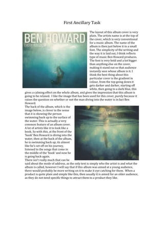
  • 1. First Ancillary Task The layout of this album cover is very plain. The artists name is at the top of the cover, which is very conventional for a music album. The name of the album is then just below it in a small font. The simplicity of the writing and the way it is laid out, I think reflects type of music Ben Howard produces. The font is very bold and a lot bigger than anything else on the cover, making it stand out so that audience instantly sees whose album is it. I think the best thing about this particular cover is the gradient in colour, from the top going down it gets darker and darker, starting off white, then going to a dark blue, this gives a calming effect on the whole album, and gives the impression that this album is going to be relaxed. I like the image that has been used for this cover, purely because it raises the question on whether or not the man diving into the water is in fact Ben Howard. The back of the album, which is the image below, is clever in the sense that it is showing the person swimming back up to the surface of the water. This is actually a very common feature of an album cover. A lot of artists like it to look like a book. So with this, at the front of the ‘book’ Ben Howard is diving into the water, then at the back of the album, he is swimming back up, its almost like he’s set off on his journey, listened to the songs that come in the middle of the ‘book’ and now he is going back again. There isn’t really much that can be said about the mode of address, as the only text is simply who the artist is and what the album is called, however I will say that if this album was aimed at a young audience, there would probably be more writing on it to make it eye catching for them. When a product is quite plain and simple like this, then usually it is aimed for an older audience, as they do not need specific things to attract them to a product they like.
  • 2. This is the second album cover that I have chosen to analyze. The layout of the album cover is quite conventional in the sense that there is a main image in the middle of the cover, and then it shows the name of the artist, and name of the album itself above it I think how the picture goes well with the title, ‘hand built by robots’, the image shows a mechanical hand, with different types of people in the palm of it. The font has been chosen to look quite mechanical as well, the big and small letters next to each other are examples of how it can be mechanical, mixed together with the rounded letters and different types of boldness, I think this is a good style of writing to use on this album cover. The colour of the background on this album is meant to connote the sky, the dark blue with white clouds in the middle represent the calm feel to the album, and this then reflects the hectic mechanical style that is originally seen. The back of the album cover is probably what you would expect to see on this sort of album. The list of the songs that are included are placed in the middle, so it is the very first thing you see, the font is still the same as the font that was used for the title of the album on the front, and so this makes it all come together. The astronaut that is pictured on the left of the cover, is the same one that was shown in the same place on the front, I think this was used to remind the audience that the album is called ‘hand built by robots’ therefore is probably set more in the future than anything. Another big convention of a album cover is the barcode at the back, and this is something I need to consider when designing my album cover because it is an important factor when trying to make it look realistic.