
Recommandé
Contenu connexe
Tendances
Tendances (20)
En vedette
Similaire à Question 1
Similaire à Question 1 (20)
Plus de KatieSalter1998
Question 1
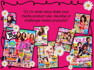
- 1. Q1) In what ways does your media product use, develop or challenge media products?
- 2. My magazine uses conventions of real pop magazines, like lots of images on the pages within the magazine. This convention is present throughout pop magazines, like mine, the target audience tends to be young girls so images are a good way of catching the eye of a person of this age.
- 3. Bright colours are a convention present in pop magazines and this is a reason, which I have used them in my work. I have used multiple bright colours, like blue, yellow, pink, orange, and green to appeal to my target audience as they engage them. When I originally created my magazine I created it using lots of pink, this is very typical of the genre but after getting some audience feedback I decided to add a variety of bright colours as it give the magazine a older feel and gives it a more exciting look. This additionally breaks the convention, making the magazine less feminine, and therefore not encouraging girls to conform to the stereotypes associated with the colour.
- 4. Additionally a convention of pop magazines in the specific type of language. The magazines use very informal language, in order for the reader to feel comfortable. This is because teenagers use lots of colloquial language, slang, and abbreviations in everyday life. I noticed whilst researching pop magazines they incorporate a lot of slang and abbreviations to appeal to their target market and continue to use the conventions of a pop magazine.
- 5. For example, on my front cover I wrote 1D instead of One Direction as this is what the band name is commonly referred to as. On my contents page I use the greeting ‘hiya’, which is very informal. I additionally use hash tag trending, and OMG. On my double page spread I presented the text in an interview style, commonly used in pop magazine. I additionally created a section on my artists favourite songs of 2015, as this is the type of information my audience is interested in.
- 6. I noticed lots of boxes and outlines are used within pop magazines to highlight cover lines or stories on the contents page. I used this convention throughout my magazines as it helped to organise the pages and make it appear less cluttered.
- 7. One of the most important conventions was the use of puffs, plugs and buzz words. These types of words used, make the reader feel like you’re offering them something and hep to engage them when they see the magazine. I made sure that, like in a pop magazine all of the cover line and stories on the contents page were worded in this way. I used words like ‘exclusive’ and ‘revealed’ to tell the reader that you aren’t going to got this information anywhere else and that they must buy this magazine otherwise they’ll never know this ‘exclusive’ gossip. The word ‘free’ additionally engages the potential buyer as they feel as if they’re getting something for nothing, this is a convention used a lot in pop magazines.