
Recommandé
Contenu connexe
Tendances
Tendances (19)
Similaire à Double page and_contents
Similaire à Double page and_contents (20)
Plus de Keara97
Dernier
Dernier (20)
Double page and_contents
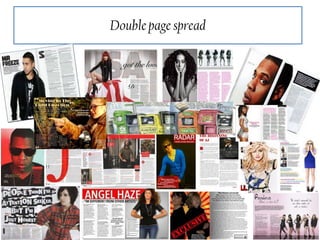
- 2. Conventions of a magazine: Double page spread Drop Caps Masthead Colour scheme Subject name Columns Main image Text Box Fact file features
- 3. Language This double page spread uses many conventions, such as drop caps, headline , a colour scheme through and a typical layout of a double page spread. The main colours used throughout the double page spread are the colours blue and black this is shown by Adele having a blue effect over her face but the rest of the magazine is written in the black colour text. The headline of “The triumph of Adele” has the biggest font and the colour black whereas the rest of the text is the same size and is in proportion. This magazine have used a single column to layout the text. This will then make it easier for readers to read the text. The article begins with a statement which may make it evident to those who are going to read and entice them to actually read the whole article. There is only one main photo within the spread which makes it evident that this has been done to show the importance of Adele, this is also shown through the fact that Adele is on more than have the page which shows her importance and her dominance to everything else with in double page spread. The image is a close up Adele who isn't looking at the camera and her eyes seem to be focused on something else, this could also have and affect from the masthead “The triumph of Adele” this could suggest why Adele is looking elsewhere which is she is always looking in the right direction and that is why Adele has become so big within the music industry.
- 4. Rolling stones Institution/Ideology Rolling stones music magazine is a magazine which is published every two weeks. Rolling stones music magazine was founded in 1967 and is based in San Francesco, and was founded by Jann Wenner. Although Rolling stones main importance is there weekly fixture of there magazine, they have also come online now for many years which they then select the most important current articles and reviews. Rolling stones main focus within there magazine is for there political reporting. But Rolling stones once tried to change there format to appeal to a younger generation, they done this by speaking about current and music which they the n believe would attract more readers who are part of a younger generation. But this did not work as Rolling Stones original followers did not like this. This then lead to Rolling stones going back to there original routes of political writing. They also strive themselves on putting news on there magazine about past music legends such as “The Beatles”. This then ensured that there magazine was then able to appeal to a larger target audience.
- 5. Audience/Representation Rolling Stones target audience are those aged around 20-30 this is because this magazine talks about not only current music but past legends and this would not appeal to those of a younger generation. This is shown in this particular example of the Double page spread because, there are not bright colours being used which suggests the age range because those who are older do not need colours to grab there attention. Also the image is extremely plain could be seen as “boring” which again suggests the older generation. From reading some of the text within the magazine there are longer sentences and some complicated words so again would suggest the older generation. This is also targeted to both men and women. The main representation of the Rolling stones magazine is shown to be a current up to date but will sometimes speak about past legends. The use of Adele being in dull colours and taking up the whole of the double page spread which shows her dominance throughout the double page spread. She is being portrayed as very serious as her facial expressions show her without any emotion on her face.
- 7. Conventions of a magazine: Contents page Masthead Main image Page numbers Columns Colour scheme Editors Note Text box Titles Mix
- 8. Language This double contents page uses many conventions, such editors note, this is represented at the bottom of the contents page, this has been left with an editors note with the headline “Review” . This then makes it clear to readers this has been written by the editors. There is a colour scheme throughout the contents page, with the use of red, black and white. These colours all go well together and the main headlines are written in white but over a red background which again ensures that these stand out. There is also a mix within the bottom of the contents page, this is because there is an image, headline and information given. This follows the conventions of a mix. The image being used, creates and effect of all four men standing on a hill this has been done to portray that this band enjoy being outside. This is a long shot used to get the background within the picture.
- 9. Q Institution/Ideology Q is an extremely popular music magazine which is published monthly throughout the UK. Q music magazine was first published by EMAP media group, in 1986. This gained knowledge by having higher standards of photography and printing. Originally this magazine was called the “Cue”, the was then changed to what it is called today the “Q” which is because they believed single-letter title would be more prominent on news stands which means it would stand out more to readers. Q magazine main focus within there magazine is high standard images and printing. This may be because they are trying to appeal to different class of people because of the such high standards. This ensures that Q want to be within the high standards of the music magazine industry. They also strive themselves on there printing, they believe that the printing needs to be at a very good standard for people to actually want to read the magazine.
- 10. Audience/representation Q magazine main focus within there magazine is high standard images and printing. This may be because they are trying to appeal to different class of people because of the such high standards. They have done this by using a very basic colour scheme which kept it simple but still looking professional. This also is shown within the main picture used on the contents screen because the image is not very eye catching which means adults would read it more. The main representation shown of the “Q” magazine is shown to be a current magazine which speaks about past legends within the music industry. The use of older bands as there main image will make people aware that it is not just current up to date music.