This magazine article summarizes and evaluates the layout, design, and target audiences of two magazines: Empire movie magazine and Thrasher skateboarding magazine. For Empire, the cover focuses on the new Superman film, using large bold text and imagery of Superman to appeal to fans of superhero films. The layout, colors and fonts are designed to be eye-catching. Thrasher targets skateboard enthusiasts, with its cover typically featuring professional skaters. The layout includes photos of skaters doing impressive tricks alongside interviews, to both entertain and inspire readers.
TEST BANK For Evidence-Based Practice for Nurses Appraisal and Application of...
Unit 51 page layout
1. Unit 51 Page Layout & Design:
For thisunitI will be visualisingandevaluatingmagazinesof all genres.Frommusictomovie
magazinesthe structure andlayoutare all the same so thiskeywayof makingmagazinesappeal to
itsaudience issomethingI needtoconsiderwhenevaluating.
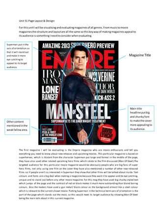
The first magazine I will be evaluating is the Empire magazine who are movie enthusiasts and tell you
everything you need to know about new releases and upcoming movies. This particular magazine is based on
superheroes, which is blatant from the character Superman put large and formal in the middle of the page,
they have also used other related upcoming hero films which relate to the film discussed (Man Of Steel).The
targeted audience for this particular movie magazine would be obviously people who are big fans of super
hero films, not only using one film on the cover they have also mentioned a number of other new released
films so if people aren’t so interested in Superman they show that other films will be talked about inside. Text
colours and fonts are a big deal when making a magazine because they want it to appeal and be eye catching,
unique and to stand out before any other movie magazine. For this mag they have used big chunky styled text
which jumps of the page and the contrast of red on black makes it much more outstanding than bland boring
colours. Also the makers have used a gun metal/ black colour as the background almost like a steel colour
which is relevant to the current shown movie. Putting Superman in the technical term axis of orientation is the
part of the page which stands out the most, so this would meet its target audience by showing Man Of Steel
being the main talk about in this current magazine.
Superman put in the
axis of orientation so
that it will stand out
and make it more
eye catchingto
appeal to its target
audience.
Magazine Title
Othercontent
mentionedinthe
weakfallowarea.
Main title
headline putbig
and chunkyfont
to make the cover
more appealingto
itsaudience.
2. The double page of the magazine hasdefinedtargetaudienceusingthe pictures,fontsanduse of
text.Whenvisualisingthisdouble page spreadof anEmpire magazine itstargetaudience based
uponimageryandstyle of textit’smore aimedat teenage andabove. Mainlybecause kidsand
youngerteenswon’treallyfindthisstyle appealingandquite tame unlessthere seriouslyinterested
inthe filmshownonthe page. The people thismagazine andspecificpage wouldappealtomostlyis
movie enthusiastsandpeoplewholike toreadmagazinesbasedonmovies
The use of textand colourforthis twopage spreadworkswell because the white background
contraststhe goldwritingmakingitstandoutand lookmore appealing,thesecoloursandfontsare
alsorelevanttothe Movie itspromotingas it’san oldfictional filmbasedaroundthe medieval times
gold,silverandwhite shadesof colour relate backtothisfilmandcan show its targetaudience.
What theyhave wrote forthisfilmisquite interesting,theytell the readerthe directorandmakers
of previousfilmswhichtheyhave made,thisisgoodbecause the readerwill become more
interestedif it’smade bybighitfilmmakers.If the audienceenjoysfilmsmentionedsuchasThe
Incredible HulkandAvatarthistwopage spreadcontainsthe leftpage beingacomplete picture of a
character out of the filmandthe otherside beingthe informationandanalysisof the filmexplained.
Anchorage isusedinthe lefthandside picture withthe filmcharacterput bigin the middle of the
page whichkindof makesyou intimidatedhow he’slookingstraightatyoualmostcomingoff the
page.Filmmakersandmagazine creatorsdo thisuse of methodinmagazinestomake youmore
enduredandinterestedinthe film,becausethispicture doesn’ttellyoumuchaboutthe movie it
makesyouwant to knowmore aboutit withthe unusual costumesandsceneryitdoesn’texplain
much aboutthe filmbesidesthe alliterationandpunctualitythe magazinearticle hassaidaboutit.
3. For my secondmagazine Iwill be reviewingandtalkingaboutthe worldwide bighitThrasher
magazine.Thrasheriscurrentlythe biggestandbestsellingskateboardmagtodate withover15
yearsof progressandsellingmillionsof copiesperyear,the mag isskateboardbasedandmostof
the contentstoredinthismagazine will be aboutskateboarding. Reviewingthe coverof the
magazine itisknownas a big accomplishmentinthe skateboardindustrytogetthe coverbecause all
the professional skaterswant it.The coverislike a bigcontestamongthousandsof skaterso when
addingquotesandinformationthe Thrashercreatorsdotheirbestnoto ruinany of the shoton the
cover.Lookingat the coverabove the title isblatantand eye catchingbeingablock white shade big
and longat the top of the page,alsoabove the title there isprofessionalskatersnameswhichmight
appeal tofans whoare quite unsure withThrashermagbutwiththeirfavourite skatersbeing
featureditwill convince themabitmore tobuyit. The magazine creatorshave addedcolourto the
backgroundof the covershot,thisisjust to make the coverlooklessblandandmore eye catchingas
it’sthe cover andwill needtolookasgood as it can be
The two page article forthrashermag is usuallyinterviewswiththe bestcurrentandupcoming
skaters. Or a bigshot of a pro pullingatrickwhichwouldamaze the reader,thiscontentappealsto
the readerbecause readingisn’tnecessarilyfunbutfindinginformationaboutyourchildidol could
be inspirational andmotivational.Ilike toreadaboutthisstuff to getan image of what there life is
like asa skater andwhat theywentthroughtoget to where theyare,it’sjustgreat hearingabout
someone you’ve grew uplookingupto,andhearing abouttheirlife.Around50% of skateboard
magazinesare shotsof pro skaterswhichappealstomostpeople because the shotscouldbe
somethingmind-blowingandeveryone whoreadsThrasherexpecttosee at leastone shotof
someone doingsomethingamazing.Talkingaboutthe layoutforthisarticle one page issimply
corner tocorner shot of a pro SeanMalto pullingamanoeuvre onhisboard,thisisjustclear to the
readerand iseye catchingwhenturningthe page.The otherpage is full of writing,mainly an
interview of someone important,theyalsohave quotesandsayingsputinbigboldandcoloured
letterswhichlooksgoodandsuitsthe colourscheme.There’salsoasubheadingatthe topright
handcorner of the page whichsays‘Cut-&-Sew what?’ whichdoesn’treallymake sensesoreading
the informationbelowwillgive youthe ideaof the whole reasonbehindthisweirdheading.