
Recommandé
Contenu connexe
Tendances
Tendances (20)
Plus de LewisSaunderson
Plus de LewisSaunderson (20)
Dernier
Dernier (20)
Rihanna Advert Poster
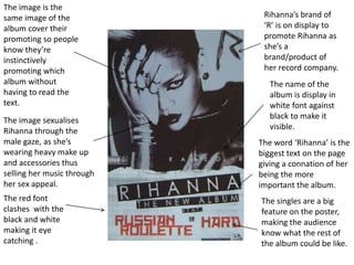
- 1. The image is the same image of the album cover their promoting so people know they’re instinctively promoting which album without having to read the text. The image sexualises Rihanna through the male gaze, as she’s wearing heavy make up and accessories thus selling her music through her sex appeal. Rihanna’s brand of ‘R’ is on display to promote Rihanna as she’s a brand/product of her record company. The name of the album is display in white font against black to make it visible. The word ‘Rihanna’ is the biggest text on the page giving a connation of her being the more important the album. The red font clashes with the black and white making it eye catching . The singles are a big feature on the poster, making the audience know what the rest of the album could be like.