
Recommandé
Contenu connexe
Similaire à IN Entertainment Co. Brand Identity (Melanie Rodriguez)
Similaire à IN Entertainment Co. Brand Identity (Melanie Rodriguez) (20)
Dernier
Dernier (20)
IN Entertainment Co. Brand Identity (Melanie Rodriguez)
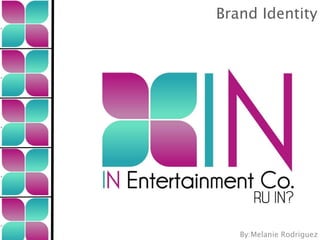
- 1. Brand Identity By:Melanie Rodriguez
- 2. Why IN Entertainment Co.? Strengths: Classification: Arbitrary -The word in can be used in many contexts. (In the box, -It is short, simple and recognizable, the latest news, or go in the door.) making it easy to remember and pleasant to say. According to USPTO.gov: There are no direct matches for the name. Making it possible for us to Background: acquire the necessary domain. The whole idea behind the creation of this company comes from family experience. This is why the only logic thing to do when it came to create the brand identity, I turned to the person who inspired me, my dad. I remembered that he and his friends (potential future clients) are always interested in whats new, hip and most importantly what is IN?, hence IN Entertainment Co.
- 3. All about the logo... All about the logo... Symbol Name Tagline
- 4. All about the logo... All about the logo... Colors: SHAPE: The colors chosen for the logo are very modern, fresh, distinctive and go with -Horizontal rectangle, the location of the company, a in accordance with law caribbean island. of Shape. Color: Teal Turquoise Represents: Water, Freshness, Peacefulness -The font is simple, Business Science Color: Loyal. Peaceful. Trustworthy. Blue is modern, clean and very the most popular and neutral color on a global scale. A safe choice for a business building customer loyalty. visible. Color: Maroon Fuchsia Represents: Modern, Women Oriented, Business Science Color: Appreciation, Delicate, Femininity, Floral, Gentle, Girly, Gratitude, Innocence, Romantic, Soft and Tranquil Color: Black Represents: Elegance, Formal, Serious, Sophisticated Business Science Color: Authority, Bold, Classic, Conservative, Distinctive, Formality, Mystery, Secrecy, Serious and Tradition
- 5. All about the logo... The logo can be categorized under: ABSTRACT MARKS / SYMBOLS -Abstract marks and symbols use visual form to convey a concept that is relevant to the brand message. -Using the flower as a symbol is a great to promote our company’s location and origin. We are Unique! The combination of tropical colors and the flower symbol represents our location and origins. However, the logo and name represent sophistication and professionalism. We believe that having a balance between what’s modern and business, attracts our target market and other clientele.
- 6. All about the logo... All about the logo... Competition: Desired Logo Type: Type: Letterform Colors: Orange Type: Letterform Colors: Assorted Colors Although the Puerto Rico Tourism company is not a direct competitor This is a very inspirational logo. The colors are very attractive and fun. This we do share a similar target market. is the symbol for a tropical destination, This is why we can categorize them similar to my company’s origin and as competition. We can compare and location. The font used is very modern contrast some similarities within and fresh. Overall, the same vibe and their branding and logo. spirit we desire for IN Entertainment Co.
- 7. Logo Summary The company The logo includes the The logo is an name next to the company name, abstract mark type, symbol is written in symbol and tagline. followed with the name of the upper case letters company in the right with the company’s and with the primary colors . complete name on Underneath this, is the bottom. the company’s name, the first two letters are written with the company colors and the rest in black . The logo is in accordance with the law of Shape, due to its horizontal shape. The logo is arbitrary, since it has a name that can be used in many contexts. Yet the logo is short, simple, and Company colors are: modern. Making it attractive, easy to Teal Turquoise, Maroon Fuchsia & Black remember and easy to recognize.
- 8. Company Culture COMPANY OBJECTIVE: COMPANY VALUES & BELIEFS: COMPANY EXECUTIONS: -Our company’s primary -We believe that our services - Our company will hold an objective is to create an and events will enrich and annual “Top Client” Event, where innovative, top of a class enhance corporation relations new offer, services and packages corporate convention or event with their clients or employees, will be presented to our clientele. Here they will have the option to that is both cost efficient and while having fun. see what’s IN, new ideas on memorable. corporate events and conventions -Excellence, innovation, moral and they can even negotiate and ethical conduct must be prices. Is not only a business present in all we do. event but a nice way to acquire feedback from our clients.
- 9. Mission Statement, Mantra, & Tagline At IN Entertainment Co. we thrive to create new, innovative and cost effective company conventions or events. Adding innovation, creativity, affordability, and customer satisfaction, our clients end up with memorable unique experiences. Statement IN is for INnovation... -IN Entertainment Co. is not only the first corporate Mantra The tagline is RU IN? convention and event oriented company in Puerto Rico, (Are you in?) Upper case but we guarantee that all of our events are as are innovative and as creative as our company. letters, making it demanding. Tagline
- 10. Mission Statement - The mission statement will be communicated on most of the company’s literature, website, and social media accounts. It is directed to both employees and clients. -The mission statement is passion driven, has focus and demonstrates the company’s goals and direction in a very simple way. -The mission statement and the mantra tell the company’s story in less than 30 seconds. They are both unique and precise. - Having no direct competitors gives us an advantage and let’s us be creative with our company’s vision, mission and culture.
- 11. Tagline (Are you in?) The tagline RU IN?, all It is a very intriguing in uppercase letters and catchy tagline, plus can be categorized as It distinguishes us it purposely includes provocative. It’s main from our the name of the purpose is to reel you competitors since it company having more in and find out what emphasizes our brand positioning. It is exactly do you have to thrive to be an effective tagline due join or missing out on. innovative, creative It is directed towards to its simplicity, uniqueness and and untraditional. our clients or potential future clients. shortness.
Notes de l'éditeur
- \n
- -The whole idea behind the creation of this company comes from family experience. This is why the only logic thing to do when it came to create the brand identity, I turned to the person who inspired me, my dad. I remembered that he and his friends (potential future clients) are always interested in whats new, hip and most importantly what is IN?, hence IN Entertainment Co. \n
- -Logo details. \n
- Shape and color description. \n
- \n
- \n
- \n
- \n
- \n
- \n
- \n
- \n