
Recommandé
Recommandé
Contenu connexe
Dernier
Dernier (20)
En vedette
En vedette (20)
Our Digipak: Evaluation Question 1 (forms and conventions)
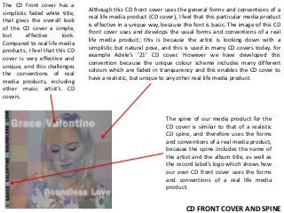
- 1. The CD front cover has a simplistic faded white title, that gives the overall look of the CD cover a simple, but effective look. Compared to real life media products, I feel that this CD cover is very effective and unique, and this challenges the conventions of real media products, including other music artist’s CD covers. Although this CD front cover uses the general forms and conventions of a real life media product (CD cover), I feel that this particular media product is effective in a unique way, because the font is basic. The image of this CD front cover uses and develops the usual forms and conventions of a real life media product; this is because the artist is looking down with a simplistic but natural pose, and this is used in many CD covers today, for example Adele’s ‘21’ CD cover. However we have developed this convention because the unique colour scheme includes many different colours which are faded in transparency and this enables the CD cover to have a realistic, but unique to any other real life media product. The spine of our media product for the CD cover is similar to that of a realistic CD spine, and therefore uses the forms and conventions of a real media product, because the spine includes the name of the artist and the album title, as well as the record label’s logo which shows how our own CD front cover uses the forms and conventions of a real life media product. CD FRONT COVER AND SPINE
- 2. CD BACK COVER AND SPINE Our final CD back cover generally covers and uses the forms and conventions of a usual CD back cover as a real media product. This is because our CD back cover includes the song list, a copyright piece of text, logos for the record labels, an original image and a barcode for the purchasing in shops as if the CD was a real media product. However, using the same colour design scheme for our CD front cover, we have created an overall media product that develops and challenges the forms and conventions of real media products. Our CD back cover develops the usual conventions by using a unique colour scheme and design, that is not similar to any other real media product of this form. The background image of the boy and girl holding hands both uses and develops the conventions and forms of real life media products, because many real life media products include an image of actors. However, the majority of CD album covers nowadays only include an artistic image or an image of the music artist for promotional purposes. Therefore I feel that my CD back and front cover develops and also challenges most recent real media products effectively.
- 3. The overall concept of this free image/poster with the CD is to promote our created album for the digipak; Boundless Love. There is no title for this image, however the logo ‘GV’ promotes our music artist, Grace Valentine. The image shows the music artist laying down and smiling with her eyes closed. The pose of our created music artist represents the artist in a simple surrounding, with simplistic and basic editing, that can represent simplicity, innocence with the white colours and white background. The overall image uses the forms and conventions of real life music videos and media products, because the pose the artist uses is a general, very popular pose that is taken by music artists nowadays, and is popular around music artists such as Jessie J, Adele, and Taylor Swift. The free image/poster is fairly simplistic and may develop the forms and conventions of real media products as well as using them, because the colour scheme of the grey, black, white and burgundy colours can represent simplicity, innocence and romance.
- 4. This is our final lyric page, and the lyrics are a faded white colour, that sit on the background image of our final scene for our music video, a still shot of the boyfriend character, looking at the grave of his girlfriend with a flower in his hand. This scene along with the lyrics as one page challenges and develops the conventions of real media products in my opinion, because I feel that the image chosen for this lyric page is not at all the usual type of image that would be used; for the majority of music artists nowadays, they generally have lyric pages and booklets that include only images of themselves or their poses within their music videos from the album, therefore my lyric page is very different to the usual conventions, and includes a character from our music video, rather than our music artist, we used this idea as we felt that it would be different to the usual expected forms and conventions of a lyric page as a media product.
- 5. Our final magazine advertisement poster is an image of our music artist, ‘Grace Valentine’, with font that states when the debut album is released, as well as the promotional logos for the record label and a website. The black and white with red theme matches up with our themes of simplicity, innocence and love/romance throughout our music video and digipak. The artist poses with a guitar, which uses the usual forms and conventions of a real media product, because many music artists hold guitars in their images including Taylor Swift who was our inspirational artist for our entire music video and digipak. However our advertisement promotional poster also develops the forms and conventions of real life media products, because the poster has it’s own individual and unique theme of white, black and red, which suits my individual digipak.