2. Who is he?
A British designer and artist responsible for more classic album covers than
you can possibly imagine one person could create in a lifetime.
From Pink Floyd to Audioslave, The Cranberries to Muse, he
has produced the most compelling and memorable album
artworks of the last 40 years.
3. How? The 6 steps
An excellent exhibition of his artwork ran in the east-London Idea Generation Gallery from April 2nd to
May 2nd, 2010. Part of the exhibition highlighted his creative process for a specific case study. Here’s a
quick overview:
The Brief . The designer listens to the music (possibly only demos at this stage), reads the lyrics, and talks
to the band. These create a ‘brain soup’, from which ideas can be extracted to form the brief.
Roughs. Over a number of meetings/days, the designer meets the band again for discussions, in an
attempt to pin-down a theme or big idea. This stage is creative, with word-play, honest thoughts, and
scribblings. The best are converted to more complete illustrations (the ‘roughs’).
Tests . Once a rough is accepted and a budget agreed, a prototype is often created to ensure that the
idea works. Depending on the idea, this could involve the creation of scale models from clay or
polystyrene. If everything works, the final models are constructed.
4. The 6 steps continued…
Shoot. A location is researched and booked, possibly for a long-time if outdoors and in uncertain
weather. Models are erected and positioned, with help from volunteers if the shoot is big and
complex. A wide range of photographs are then taken, under varying light/weather conditions and
filters.
Editing. This could be called ‘selection’, where the best shot from the shoot is chosen. This can take
several days, if hundreds of similar shots need to be compared.
Artwork. Finally, having chosen the perfect shot, any cleaning-up or final
computer editing is performed, before handing over the final product.
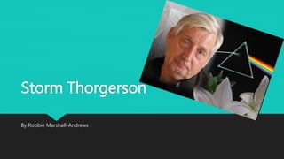
5. Pink Floyd – Dark side of the moon
This is the Album artwork for the Pink Floyd album – Dark side of the
moon, it is one of the most well known album covers but also one of
the most simplistic.
The design represents three elements; the band's stage lighting, the
album lyrics, and Richard Wright's request for a "simple and bold"
design.
The prism design was inspired by a photograph that Thorgerson had
seen during a brainstorming session with Aubrey Powell.