
Recommended
More Related Content
What's hot
What's hot (16)
Viewers also liked
Viewers also liked (20)
Similar to Presentation2
Similar to Presentation2 (20)
More from Rochella
Presentation2
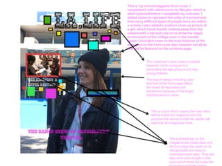
- 1. This is my school magazine front cover. I completed it with reference to my flat plan which is what I planned before I completed my outcome. I added colors to represent the unity of a school and how many different types of people there are within a school. I also added a medium close up picture of a girl, which I took myself, looking away from the camera with a hat and coat on to show the happy environment of the college even in the outside space. I included some on the main features of the magazine on the front cover also however not all as that will be featured on the contents page. The masthead I have chose is playful however not to young as in a secondary the age group is not very young children. The layout design including color and font of the front page reflect the mood of happiness and excitement because of the bright bold fluorescent colors. This is a lure which means the main story will be inside the magazine and the purpose this serves is that the reader will read into the magazine more. The subheadings on the magazine are made clear and the font stays the same so its recognizable and easy to understand and read. They are also short and straight to the point which does not make the
- 2. This is my contents page for my magazine. I kept the same theme and the the same color scheme. I also included the title again however smaller as it had already been advertised. As well as this I also included the issue number on the contents page along with pictures to match the features of the magazine. Furthermore, I also included diagonal words as I think it looks more creative and better to look at. The masthead ‘LA.LIFE’ has been incorporated into the contents page also. It is not as big as its not the front page and it does not to be re- introduced. The colored boxes are the same on the contents page as the front page which keeps the them the same throughout. The numbers on the contents page are focused on a lot and and have still kept the theme of different colors however not as many colors as it may be to much for the reader to concentrate on. As well as the numbers the writing has the same theme.
- 3. This is my contents page with added changes. I added more content page conventions assuring that it looks even better. I have made sure that I have separated the head teachers Also there was not words to everything else in the enough contents page contents page. This is the conventions. a equivalence to an editors I have included commentary competition opportunity on the page as it fills out the page and is also another convention of a contents page. I have made Here I have made sure I sure that the have kept the same house regulars are style assuring I resembles also clear on what a contents page the contents should look like. page. Which is feature of a contents page.