Windows 8 App UI touch and mouse support
•
0 j'aime•701 vues

Windows 8 introduces a new app platform and UI designed for touch that also supports mouse and keyboard. It allows apps to be written once and run across both x86 and ARM architectures using common tools and languages. The Windows Store provides an easy deployment and commerce platform for apps, and app isolation improves security. Built-in integration features allow apps to work together.

Recommandé
Contenu connexe
Similaire à Windows 8 App UI touch and mouse support
Similaire à Windows 8 App UI touch and mouse support (20)
Plus de SAP PartnerEdge program for Application Development
Plus de SAP PartnerEdge program for Application Development (20)
Dernier
Dernier (20)
Windows 8 App UI touch and mouse support
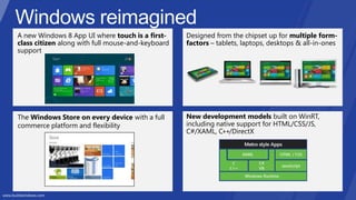
- 1. A new Windows 8 App UI where touch is a first- class citizen along with full mouse-and-keyboard support New development models built on WinRT, including native support for HTML/CSS/JS, C#/XAML, C++/DirectX Designed from the chipset up for multiple form- factors – tablets, laptops, desktops & all-in-ones The Windows Store on every device with a full commerce platform and flexibility
- 2. Cross Architecture Write once, run across x86 and ARM Use What You Know Same tools, languages and back-end infrastructure you already have Deployment Easier, faster deployment with Store, side-loading Security Reduced system vulnerability with isolated app containers Integration Built-in App-to-App integration with Windows App Contracts
- 51. Contoso Travel Featured destinations Last minute deals My TripsFeatured destinations Last minute deals My Trips
- 52. Contoso Travel 7 night Alaska Cruise Barcelona, Spain
- 53. Contoso Travel Featured destinations Last minute deals My Trips Ocean View Cabins Upgradefrom an inside cabin and save $43/night/person! Picture windows with oceanandport views From $2,099 — only $150/night/person basedon double occupancy Suites Upgradefrom an inside cabin and save $43/night/person! Picture windows with oceanandport view From $2,099 — only $150/night/person do
- 55. 1. 2. 3. 4. 5.
- 75.
Notes de l'éditeur
- Windows reimaginedFor consumers, for developers
- Key MessagesMetro style apps are part of an overall app portfolio letting you target both touch and mouse/keyboard scenarios and enabling you to bring apps across laptops, desktops and tablets Metro style apps run across x86/64 and ARMBuild Metro style apps with same Tools in Visual Studio, same Languages and Frameworks, same Infrastructure you already useMetro style apps are easier and faster to deploy. Side-loading for Metro style apps is available for EnterprisesMetro style apps are inherently more Secure, because they isolated from the system and each otherMetro style apps reduce the need for expensive custom app integration by leveraging App contractsWindows 8 gives you the ability to deliver a complete app portfolio spanning Metro style apps, Desktop apps and Internet Explorer.Talk TrackSo moving existing devices and existing apps in your organization from Windows 7 to Windows 8 is the best story we’ve ever told for Windows. But what about support for new ARM devices and new Metro style apps? Metro style apps are part of an overall app portfolio letting you target both touch and mouse/keyboard scenarios, enabling you to bring apps across laptops, desktops and tablets They run across architectures. So an app written for the WinRT (Windows APIs for building Metro style apps) can simply run on both x86/64 and ARM devices. Developing Metro style apps starts from the same place – the same place devs have always started. Open Visual Studio -> File->New. It’s the same tools they already know, the same source controls. We’ve just also added more support in Visual Studio for web languages and technologies like HTML5, CSS3 and Javascript. And new templates for building Metro style apps using C#, VB, or C++. Just like Desktop apps, Metro style apps can do NT Authentication and connect to remote SQL servers with WCF. So your devs can get started building Metro style apps with the same Tools, the same Languages and Frameworks, and the same Skills they already have, leveraging the same Infrastructure you already use today.Metro style apps are easier and faster to deploy. They are zero-install packages. You can deploy and update Metro style apps through the Windows Store. We support Group policy and whitelisting/blacklisting with App Locker for Metro style apps. Or if you don’t want them to be publically available in the Windows Store, you can side-load Metro style apps directly onto devices. You can host and manage your apps centrally and push those apps to your employees on a web portal, through group policy logon scripts, through installer apps, just like you do with .exe’s today. We will share more about this exciting opportunity in future briefings. Metro style apps are intrinsically more Secure, because they are isolated from the system and other apps. While they can interact with the file system and Web services, being sandboxed in an app container makes it much more difficult for apps to install malware or compromise the performance and reliability of the system. The way Metro style apps interact with each other is through Windows App contracts, like Search, Share, File Picker, Play to and Settings. Contracts are simple to implement and allow the user to interact with other apps and app data without leaving the context of what they are doing. They dramatically reduce the need for users to move and manage across multiple apps and reduce the need for expensive custom app integration. So there are a lot of benefits and a lot of reasons to be excited about Metro style apps. But again, not all apps should be Metro style. One of the great things about Windows 8 is that it gives you the ability to deliver a complete app portfolio spanning Metro style apps, Desktop apps and Internet Explorer.
- 8 traits of great Metro style appsI can get content from and share content with people I care about
- Content before Chrome is a core principle to Metro-styled design
- The shift in focus is crucial – it means that the users, instead of remembering how to use the software, are remembering the content – the news story they read about, the social updates from their friends, the products they are shopping for.
- Windows 8 is about putting the app on the center stage. Content is the heart of any experience, and everything else are only tools to let you consume and interact with your contentIt’s important to think about how to leverage this real estate and place content first, so that users can actually be immersed in the things they love.Where does chrome come from? LayoutCommandsNavigationLet’s look at how we handle these in a Content first world
- Content before Chrome is a core principle to Metro-styled design
- Remove lines and boxes and create openness by using whitespace Use crisp visuals and avoid unnecessary graphical effects such as blurs and gradient on visuals
- Another example of leveraging space to augment the content. Space is as much a part of the content and can be beautiful and aspirational.
- Metro is founded on clean typographyA Typographic ramp is used to establish a sense of hierarchy for the content.Only a fixed set of sizes (4) to convey hierarchical information – and each font sizes are multiples of 20px. The proportions allow users to really easily establish an understanding of the structure of the content. Beyond this size granularity, users will not be able to differentiate where a piece of content fits within the overall hierarchy
- Use the default stylesheetto get the styling in a pre-defined type ramp with the Segoe UI font A Typographic ramp is used to establish a sense of hierarchy for the content.Only a fixed set of sizes (4) to convey hierarchical information – and each level is proportionally larger than the previous (42pt = 80px, 20pt = 40px). The proportions allow users to really easily establish an understanding of the structure of the content. Beyond this size granularity, users will not be able to differentiate where a piece of content fits within the overall hierarchy
- HeaderSubheaderBody copyItem titleItem subtitleItem body
- Metro is founded on clean typographySegoe UI is the primary font for the Metro-style design languageOnly a limited set of sizes (4) to convey hierarchical information. Beyond this granularity, users will not be able to differentiate where a piece of content fits within the overall hierarchy
- On panning: Design for landscape first to cater to all form factorsIn landscape, panning along the horizontally
- When we had chrome, it formed the identity of the app (first sketch). In the absence of chrome, when users are focusing on the content, the formation of your content is what forms the identity. The silhouette is what allows your eyes to recognize something as a Metro style app, as opposed to a webpage, or a traditional app, before you even really process it. This layout allows you to provide the users with a feeling of familiarity and confidence.
- In the absence of chrome, when users are focusing on the content, the formation of your content is what forms the silhouette. This shape is what allows your eyes to recognize something as a Metro style app, as opposed to a webpage, or a traditional app, before you even really process it. This layout allows you to provide the users with a feeling of familiarity and confidence.
- In the absence of chrome, when users are focusing on the content, the formation of your content is what forms the silhouette. This shape is what allows your eyes to recognize something as a Metro style app, as opposed to a webpage, or a traditional app, before you even really process it. This layout allows you to provide the users with a feeling of familiarity and confidence. Align elements on a grid to create a structured and consistent layoutTop, left, and bottom margins create a ‘C’ with negative space to indicate panning directionThe headers are in the same position, use the same type treatmentConsistent type sizes are used throughout and in parallel locations: Large, medium, small
- There are specific pixel values to this layout: title is baselined at 100px, content starts 120px from the left.The easiest way is to get this layout is by starting with the templates.
- http://www.aisleone.net/page/71/ The grid provides a plan and foundation.Gives a structure and basis to build out a design.Grids do not limit design – they help create balance give a framework for creativity.
- http://www.aisleone.net/page/71/ The grid provides a plan and foundation.Gives a structure and basis to build out a design.Grids do not limit design – they help create balance give a framework for creativity.
- Content before Chrome is a core principle to Metro-styled design
- Integrate commands into the content
- Integrate commands into the contentRemove the “remote controls”
- Integrate commands into the contentLight dismiss model for transient UI such as flyouts. No need for close buttonFlyoutsFlyouts should always appear adjacent to item that the user tapped to invoke it. Users can respond to the flyout efficiently with touch and mouseThe flyout’s context as it relates to the anchor is very clearFlyouts are great as confirmation messages rather than using dialogsThe purpose of a confirmation is to make sure the user hasn’t tapped a significant command accidentally so all you need is a second tap – you should be a lightweight and unobtrusive as possible getting the confirmation since it’s likely that the user did mean to press it the first time
- Bringing up the app barBringing up the app bar programmatically: Users will know to swipe from edge. There is no need to bring up the app bar programmatically just to show that it is there. If you find yourself going back to the app bar every few seconds… While doing a specific task, you can still use a transient app bar but make it non-light-dismissedAll the time while using the app, you can set the app bar to persistent
- Leave only the most relevant elements are on screen Use the app bar to tuck away commanding chrome until needed by the usersUse the system charm for search and settings
- Leverage the edgeIn an immersive
- In the browser, their primary view is fully immersive, so the commands (moving between web pages) are in the bottom app bar and navigating the app (switching between multiple tabs) use the top app bar.
- Contextual commandsCommands are generally on the rightNew is on the far rightWhen an item is selected, the app bar shows, and a new contextual command shows on the other side (easy to notice and differentiate)When the app bar comes up because of selection it is sticky – no longer light dismiss
- Show commands contextually, only when needed, instead of at all times.
- Place commands in the bottom app barErgonomically, bottom left and right are the most convenient places to touch when holding a slate. Commands can be global or contextualApp bar is great way for providing commands on-demand, so that they are not distracting users when they are not usedBy the same principle, only show commands if they are relevant to the current context
- Provide errors information in the focal area, inline with where to resolve.
- Content before Chrome is a core principle to Metro-styled design
- Viewsshould be about where you are at, not where you might go
- Viewsshould be about where you are at, not where you might go
- 15:30
- 17:00
- Integrate navigational elements into the contentThe group headers are a part of the content and inform you of what you are viewing.Reasons why people build tabs: Want a way for people to see all the groups availableWant to quickly jump from one group to anotherBoth of these can be accomplished with semantic zoom
- Semantic zoom is the quick, fluid way of jumping within a long list. You can view all the groups available, and they can be presented in a visual, content-focused way.
- UI Structure
- UI Structure
- 20:00
- Ex: Size of an item in the zoomed out view can show how big the group isEx: Color of an item in the zoomed out view can represent the popularity of the groupEx: Curated promotional images to attract users to different groups
- 1. Animation is a core part of the Metro design language, just as much as typography or imagery.2. Motion is more than just visual adornment. It provides information and helps people understand. Everything in the system comes from somewhere and goes somewhere. Imagine if there is no motion.3. The Animation Library provides a set of pre-designed motion tailored for common app scenarios. It is purposely scenario-centric and is designed to convey specific information. Scenario centric - there is NO flip or rotate or spin around animations – you can see from the name that each one is designed intentionally for a scenario, to help visually illustrate what is happening. Leverage standard animations to provide your users a sense of familiarity and confidence. The motions help users know what behaviors to expect, and they reinforce concepts and how the system works.
- Animation Library: Animation is a core part of the Metro design language. The Animation Library is purposely scenario-centric and are designed specifically to convey information. Scenario centric - there is NO flip or rotate or spin around animations – you can see from the name that each one is designed intentionally for a scenario, to help visually illustrate what is happening. Leverage standard animations to provide your users a sense of familiarity and confidence. The motions help users know what behaviors to expect, and they help reinforce UI concepts and functionalities.
- We have over 2 dozens pre-designed animations. Some are baked into the controls already. E.g. App barOthers can be easily added to your app. You can just specify what UI elements you would like to animation using one of these animations from the library and all the motion and timing will be taken care of. There will be a later deep dive into this topic.
- RE: Actions should be reversible so users can safely explore. Example – swipe to select is reversible
- RE: Actions should be reversible so users can safely explore. Example – swipe to select is reversible
- Examples: Buttonsprovide visual change on touch down, drag away (reverse) to cancel, commit on touch up Swipe to select and rearrange – sliding interactions with item always following fingers
- Your app can be displayed in any of the following sizes:Snapped: 320x768 (a minimum of 1366x768 is required to support snapped view)Full screen landscape / filled: minimum 1024x768Full screen portrait: minimum 768x1024Although there are an infinite number of supported sizes, it is important to verify your application in the most common application dimensions, namely:1024px by 768px1366px by 768px
- Call to action: Design your snap view to be useful so users will want to keep you on screenFor a content provider – lists/grids, then this is about relaying out.For other apps, think about the scenarios that are valuable and useful in the snapped view: Tile puzzle and Word Hunt are both great examples. They almost feel more tailored in snapped view. Example of leveraging the snapped view: In Word Hunt, in addition to the game board, provide a word list with links to definitions. Tapping on it will open the browser in filled.
- Apps with a purposeful snapped view are more likely to stay on screen.
- As screen’s pixel density increase, UI elements will get smallerTo maintain consistent physical sizes of UI elements for touchability and readability, the system automatically scales UI up by 1.4x or 1.8x based on DPI & resolution
- Use common system entry points, Charms, as a predictable consistent way of accessing contract functionalities so users do not have to relearn
- Keep the look and feel the same between your share target page and your primary app.
- Do not use Search for FindThe difference between Find and Search is in the scope. “Find” is looking for something that is already on the current page, but the user just need help locating it. For example, think: Ctrl+F in Word, or in IE – you would type in something that you expect to already be in the doc or the html page, and Find locates it for you. “Search” on the other hand has a much broader scope, and is looking across your application regardless of what the user is viewing (they can be anywhere within your app, or not even in your app at all!). The result of Search is usually a list of items within the app that contain the search term, and you can navigate to then navigate to view the item from the search result page (as opposed to Find, where you are already viewing the item).
- After your app has registered for the Picker File ExtensionYour app will appear in the list of locations the users can navigate toYou can specify which file types are relevant to your app
- Tile templates: A lot of rendering options available from Pure text to Pure images.
- 2 sizes: Small is required. Large is optional. Use Large if you have live content
- Toast notifications use the same template architecture as live tilesRich set of rendering options available
- Pride in craftsmanship: Layout, every pixel matter. Details like type size matters.Do more with less: Content before chrome. Showing less on screen to let people focus on what matters.Be fast and fluid: Designing with motion and designing for touchAuthentically digital: Being connected and alive with tiles & notifications, Leveraging the cloud to roamWin as one: Using contracts to work with other apps to complete scenarios. 1:1=3