
Recommandé
Contenu connexe
Tendances
Tendances (19)
En vedette
Similaire à Movie magazines
Similaire à Movie magazines (20)
Plus de SamanthaHabgood
Plus de SamanthaHabgood (20)
Movie magazines
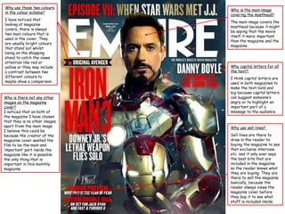
- 1. Why use these two colours Why is the main image in the colour scheme? covering the masthead? I have noticed that The main image covers the looking at magazine masthead because it might covers, there is always be saying that the movie two main colours that is itself it more important used in the cover. They than the magazine and the are usually bright colours magazine. that stand out whilst being on the shopping stand to catch the views attention like red or yellow or they may include Why capital letters for all a contrast between two the text? different colours to I think capital letters are maybe show a comparison. used in both magazines to make the text bold and big because capital letters Why is there not any other can suggest someone’s images on the magazine angry or to highlight an cover? important part of a I noticed that on both of message to the audience. the magazine I have chosen that they is no other images apart from the main image. Why use sell-lines? I believe this could be because the creator of the Sell-lines are there to magazine cover wanted the draw in the reader to film to be the main and buying the magazine to see ‘important’ part inside the that exclusive interview magazine like it is possible etc. and it only ever says the only thing that is the best bits that are important in this monthly included in the magazine magazine. so the reader knows what they are buying. They are there to sell the magazine basically, because the reader always views the magazine cover before they buy it to see what stuff is included inside.
- 2. Why use these two colours The date is always in the colour scheme? important to put on the I think using a orange and cover because it could be turquoise is quite weird a weekly or monthly considering they aren’t magazine so people need the brightest of colours to know when to buy it but they work together again and when a new issue they give a sense of of the magazine will be calmness and it makes it out. self different to the other magazine but using different colours to the rest. I didn’t noticed this when I first saw it and it think its very effective because once you have seen it you cant unsee it. And it should of plays on your mind which might suggest Why is the barcode on the that that is what the film front instead of the back? is like also. I don’t understand why the barcode is on the front because you could include variable advertisement space but the barcode is located underneath the Daniel Radcliffe in Hammers (all capitals) suggesting that maybe this is why you should buy the magazine.