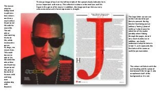
SlideShare a Scribd company logo
1 of 4
The reason
why the
background
is split into
two colours
could very
much reflect
his personal
life with his
music life.
The red
colour
representing
his music
life, which
involves the
genres
of, drugs, mo
ney and sex.
This could
show one
side of his
life while the
colour blue
could portray
his personal
life, such as
the birth of
his new child
and long
term
relationship
with
Beyoncé.

The large image of Jay-Z on the left hand side of the spread clearly indicates he is
just as important as the story. This reflects his stature in the media as well his
figure in the genre of his music. In addition, the image portrays him as a very
serious musician as his facial expression is straight.

The large letter we can see
on the text could be put
there to prevent the big
block of text being just an
ordinary ‘boring’ piece of
writing. It also draws the
attention of the reader
possibly when flicking
through the pages, since it
very much stands out. In
addition, we clearly
understand why the letter is
in fact ‘J’, as it represents the
first letter of his name as
well the pronunciation.

The colour red links in with the
sub heading and the piece of
text beneath the image. It also
compliments half of the
background as it is red.
This double
spread seems to
follow the same
layout as many
others, it has a
large image on the
left with the
article and other
text on the right.
In addition, the
spread has a
carried out theme
of its magazine
quite well, as it
has a sky blue
theme and that is
shown well across
the page. It is also
the primary colour
used and as a
bright colour it
clearly stands out
well.

The setting the individuals are sitting down are clearly
portrayed as a stereotypical teenage room( posters of
bikini models on the wall), again this narrows down the
audience to not only teenagers, but males as well.

The title of spread, 'The Teenagers’, already narrows the
audience down to teenagers of a certain age group.
Readers of this age group are reassured that the info that
they are about to read, they may relate to.

The sub-heading ‘Everyone’s
talking about’ is a heading
which most teenagers can
relate to, as teenagers are
known to be interested in the
latest news and trends. This
can easily draw their
attention into reading on.

The white writing easily stands out with
the blue setting being used around it.
This draws the eye of the reader.

The topic ‘sex’ also enhances the fact it is a
popular subject among teenagers, readers
who are of this age category could relate to
this, so it will draw their attention into
reading it more further.
We see the individual breathing out smoke, from this we can obviously tell he smokes. This may
portray him as a person who doesn’t really care about the future, since smoking can have a impact
on your health in the long run, but tries to focus on having fun in the present. This gives us an idea
about his attitude towards life, his YOLO(you only live once) attitude goes hand in hand with his
genre of music, as young adults from this category are usually stereotyped as this.

The colours of the letters
at the top of the image
link in with the image, as
the background is
black, and the colour of
the hat is yellow. There
is also a contrast of
colours, which balances
out the positive with the
negatives, possibly him
having a dark past, while
looking forward to a
bright future.

This image represents the
individual as a person who has a
type of ‘laid back’ attitude, him
staring at the reader suggests he
certainly doesn’t lack any
confidence. This clearly reflects his
genre of music, which is urban
grime music, as young people from
this genre are stereotyped as over
confident, chilled attitude. From
this image, he has certainly lived
up to that stereotype.

The ‘HOW HIGH’ pun is clearly intended, as
looking at the image we can link the smoke
with the ‘high’. Smoking can get you high, and
the way he looks, he doesn’t seem far off it.
The white background and
the black costume worn by
Florence contrast with
each other, making her
stand out, this emphasises
the importance of
Florence Welch, making
the whole article about
her. The expressions is also
quite edgy and
aggressive, which relates
to the eccentric costume.

The mis-en-scene is clearly
obvious, not many props have
been used. The artist is sitting
on box covered by red and
white sheets, which sticks to
the colour scheme of the page.
The red and white sheets that
has been along with the ‘USA’
text in the background , gives
the whole cover an American
look. This clearly reflects the
nationality of Florence Welch
which is American.

The feature headline ‘Got the
love’ relates to Florence Welch as
well as one of her famous songs
which is also called ‘Got the love’.
Any reader who is familiar with
Florence Welch would know
this, which shows the

The style of photography and font used
is very sophisticated, while the plain
white background with the red and
white sheets contrast with each
other, as well as Florence’s costume
which is black. The sophistication and
stylistic theme reflects Florence’s
pose, which gives the whole page a
‘sexy, classy and stylistic look’.

More Related Content

More from SameemQ

Documents peter andre
Documents peter andreDocuments peter andre
Documents peter andreSameemQ
 
Mind map
Mind mapMind map
Mind mapSameemQ
 
Question 7
Question 7Question 7
Question 7SameemQ
 
Question 6
Question 6Question 6
Question 6SameemQ
 
Question 4
Question 4Question 4
Question 4SameemQ
 
Question 5
Question 5Question 5
Question 5SameemQ
 
Question 1
Question 1Question 1
Question 1SameemQ
 
My magazine front cover
My magazine front coverMy magazine front cover
My magazine front coverSameemQ
 
Audience profile
Audience profileAudience profile
Audience profileSameemQ
 
Mood board
Mood boardMood board
Mood boardSameemQ
 
Typography
TypographyTypography
TypographySameemQ
 
Double page spread
Double page spreadDouble page spread
Double page spreadSameemQ
 
Magazine contents page
Magazine contents pageMagazine contents page
Magazine contents pageSameemQ
 
Contents page presentation
Contents page presentationContents page presentation
Contents page presentationSameemQ
 
Magazine front cover
Magazine front cover Magazine front cover
Magazine front cover SameemQ
 
Initial ideas for a music magazine
Initial ideas for a music magazine Initial ideas for a music magazine
Initial ideas for a music magazine SameemQ
 

More from SameemQ (17)

Documents peter andre
Documents peter andreDocuments peter andre
Documents peter andre
 
Mind map
Mind mapMind map
Mind map
 
Question 7
Question 7Question 7
Question 7
 
Question 6
Question 6Question 6
Question 6
 
Question 4
Question 4Question 4
Question 4
 
Question 5
Question 5Question 5
Question 5
 
Question 1
Question 1Question 1
Question 1
 
My magazine front cover
My magazine front coverMy magazine front cover
My magazine front cover
 
Audience profile
Audience profileAudience profile
Audience profile
 
Mood board
Mood boardMood board
Mood board
 
Typography
TypographyTypography
Typography
 
Double page spread
Double page spreadDouble page spread
Double page spread
 
Magazine contents page
Magazine contents pageMagazine contents page
Magazine contents page
 
Contents page presentation
Contents page presentationContents page presentation
Contents page presentation
 
Magazine front cover
Magazine front cover Magazine front cover
Magazine front cover
 
Initial ideas for a music magazine
Initial ideas for a music magazine Initial ideas for a music magazine
Initial ideas for a music magazine
 
Brief
BriefBrief
Brief
 

Double page spread

  • 1. The reason why the background is split into two colours could very much reflect his personal life with his music life. The red colour representing his music life, which involves the genres of, drugs, mo ney and sex. This could show one side of his life while the colour blue could portray his personal life, such as the birth of his new child and long term relationship with Beyoncé. The large image of Jay-Z on the left hand side of the spread clearly indicates he is just as important as the story. This reflects his stature in the media as well his figure in the genre of his music. In addition, the image portrays him as a very serious musician as his facial expression is straight. The large letter we can see on the text could be put there to prevent the big block of text being just an ordinary ‘boring’ piece of writing. It also draws the attention of the reader possibly when flicking through the pages, since it very much stands out. In addition, we clearly understand why the letter is in fact ‘J’, as it represents the first letter of his name as well the pronunciation. The colour red links in with the sub heading and the piece of text beneath the image. It also compliments half of the background as it is red.
  • 2. This double spread seems to follow the same layout as many others, it has a large image on the left with the article and other text on the right. In addition, the spread has a carried out theme of its magazine quite well, as it has a sky blue theme and that is shown well across the page. It is also the primary colour used and as a bright colour it clearly stands out well. The setting the individuals are sitting down are clearly portrayed as a stereotypical teenage room( posters of bikini models on the wall), again this narrows down the audience to not only teenagers, but males as well. The title of spread, 'The Teenagers’, already narrows the audience down to teenagers of a certain age group. Readers of this age group are reassured that the info that they are about to read, they may relate to. The sub-heading ‘Everyone’s talking about’ is a heading which most teenagers can relate to, as teenagers are known to be interested in the latest news and trends. This can easily draw their attention into reading on. The white writing easily stands out with the blue setting being used around it. This draws the eye of the reader. The topic ‘sex’ also enhances the fact it is a popular subject among teenagers, readers who are of this age category could relate to this, so it will draw their attention into reading it more further.
  • 3. We see the individual breathing out smoke, from this we can obviously tell he smokes. This may portray him as a person who doesn’t really care about the future, since smoking can have a impact on your health in the long run, but tries to focus on having fun in the present. This gives us an idea about his attitude towards life, his YOLO(you only live once) attitude goes hand in hand with his genre of music, as young adults from this category are usually stereotyped as this. The colours of the letters at the top of the image link in with the image, as the background is black, and the colour of the hat is yellow. There is also a contrast of colours, which balances out the positive with the negatives, possibly him having a dark past, while looking forward to a bright future. This image represents the individual as a person who has a type of ‘laid back’ attitude, him staring at the reader suggests he certainly doesn’t lack any confidence. This clearly reflects his genre of music, which is urban grime music, as young people from this genre are stereotyped as over confident, chilled attitude. From this image, he has certainly lived up to that stereotype. The ‘HOW HIGH’ pun is clearly intended, as looking at the image we can link the smoke with the ‘high’. Smoking can get you high, and the way he looks, he doesn’t seem far off it.
  • 4. The white background and the black costume worn by Florence contrast with each other, making her stand out, this emphasises the importance of Florence Welch, making the whole article about her. The expressions is also quite edgy and aggressive, which relates to the eccentric costume. The mis-en-scene is clearly obvious, not many props have been used. The artist is sitting on box covered by red and white sheets, which sticks to the colour scheme of the page. The red and white sheets that has been along with the ‘USA’ text in the background , gives the whole cover an American look. This clearly reflects the nationality of Florence Welch which is American. The feature headline ‘Got the love’ relates to Florence Welch as well as one of her famous songs which is also called ‘Got the love’. Any reader who is familiar with Florence Welch would know this, which shows the The style of photography and font used is very sophisticated, while the plain white background with the red and white sheets contrast with each other, as well as Florence’s costume which is black. The sophistication and stylistic theme reflects Florence’s pose, which gives the whole page a ‘sexy, classy and stylistic look’.