White, sophie QUESTION 1
•Télécharger en tant que PPTX, PDF•
0 j'aime•224 vues

Part one, question one

Recommandé
Contenu connexe
Tendances
Tendances (20)
En vedette
Similaire à White, sophie QUESTION 1
Similaire à White, sophie QUESTION 1 (20)
White, sophie QUESTION 1
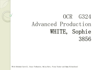
- 1. OCR G324 Advanced Production WHITE, Sophie 3856 A2 Media Soap Trailer & Ancillary Products Evaluation (With Rebekah Carroll, Grace Todhunter, Moiza Butt, Fiona Tucker and Emma Richardson)
- 2. Evaluation Questions: 1. In what ways does your media product use, develop or challenge forms and conventions of real media products? 2. How effective is the combination of your main product and ancillary texts? 3. 4. What have you learned from your audience feedback? How did you use media technologies in the construction and research, planning and evaluation stages?
- 3. My Products:
- 4. Final Soap Opera Trailer: BORDERLINE (Click to watch)
- 5. Final Magazine Front Cover: TELEVISION NOW
- 7. Question 1 1. In what ways does your media product use,developorchallenge forms and conventions of real media products? Colour coded words apply throughout this question
- 8. I have used three different existing media products to inspire and inform me of the conventions of soap trailers. 1.
- 9. Comparing the 90210 trailer that inspired my own trailer with my finished media product. 1. Click above image to see trailer.
- 10. What I have learnt from the 90210 trailer... Two Person close up. Lighting: Soft, warm lighting, to complement the sad, but comforted emotion in the scene 1. Main character is wearing hardly any makeup to show that she has her emotions on display and isn't hiding anything Also because she is the one portraying the emotion. The two person close up allows the viewer to feel like they are actually in the scene, watching the conversation. Female slightly larger and in better focus than male in shot, due to soap being a “female” dominated genre.
- 11. What I have learnt from the 90210 trailer... Two Person close up. Lighting: Cold, bright, outdoor lighting, to complement the threatening situation shown. 1. Colour coding the lipstick shows the characters personality and also the emotions she is feeling e.g: fear, danger. The two characters have relatively equal spacing on the shot because they are both females, and both their emotions are equally important in the scene.
- 12. What I have learnt from the 90210 trailer... One Person close up; off centre. Lighting: The lighting is warm because that is the general atmosphere of the soap, but brighter than the previous shot because the emotion is harsher. 1. The colour red is used to connote the confusion and negative emotions the character is showing. The background is out of focus so that the whole attention of the viewer is on the character. The character in shot is filling the right half of the screen. He is not central because this shows that there is a disequilibrium in the shot/scene.
- 13. What I have learnt from the 90210 trailer... One Person close up; off centre. 1. Lighting: Like the inspiring shot, the lighting is warm, but bright. The running makeup is a audience recognised indication of someone who has been crying. The character is looking down to signify her storyline: alone, sad, hiding something. The background is plain so as not to detract from the characters performance. The colour red is used to connote the negative emotions the character is showing.
- 14. What I have learnt from the 90210 trailer... Off centre, long shot. Body language here shows the relationship between the two people; angle, proximity, etc. 1. Lighting: The lighting is warm because that is the general atmosphere of the soap, and also quite dark to signify that they are indoors. The Mise en Scene of the shot is created to show that they are in a hotel lobby, due to the layout and features. The out of focus couple is here to show the audience what the in-focus couple are looking at.
- 15. What I have learnt from the 90210 trailer... Off centre, long shot. 1. Lighting: The character is walking away from a very bright light, through a shady area. This is reflective of the characters storyline. The railings here are used to reflect the negative storyline of the character. The use of dark colours contrasts with the bright light behind, and again is used to reflect the inner darkness of the character. The effect of being able to see the whole of the character means that the audience can read the body language of the character: fast walking = urgency, moodiness.
- 16. 1. The main convention that I took from the 90210 trailer was the fact that most of its scenes were random flashes of information, that to a new viewer would look confusing, but will entice them to watch it to understand it.
- 17. Comparing the Downton Abbey trailer that inspired my own trailer with my finished media product. 1. Click above image to see trailer.
- 18. What I have learnt from the Downton Abbey trailer... Both: Crash zoom, medium close up 1. Lighting: Dark, lit from one side, to show the atmosphere. Links with dark music. Lighting: Not particularly bright, but cold, so as to reflect the atmosphere.
- 19. What I have learnt from the Downton Abbey trailer... All: Extreme Close up of eyes. 1. Extreme close ups of eyes help the viewer to empathise and recognise the emotion being displayed
- 20. 1. Much like in the 90210 trailer, the Downton Abbey trailer has inspired my use of short, effective, non-connecting shots to grab the attention of the viewer.
- 21. Comparing the Hollyoaks trailer that inspired my own trailer with my finished media product. 1. Click above image to see trailer.
- 22. What I have learnt from the Downton Abbey trailer... Both: Crash zoom, medium close up 1. The crash zoom in the Hollyoaks trailer is used to show that the character is shocked, or suddenly worried about something, due to the facial expressions. I have used the crash zoom to emphasise the anger and sadness of the character, which I think is developing the convention.
- 23. What I have learnt from the Downton Abbey trailer... Character similarities. 1. In the Hollyoaks trailer, there appears to be a character who is obsessive over another girl. She is seen in a close up two shot with the girl, and portrayed in cleverly emphasising lighting. In my trailer, I have used a similar character, and portrayed her in candle light, next to a picture of the stalk-ee. The candle-light relies on the viewers prior knowledge to link this set up to shrines and places of worship.
- 24. 1. As in the other trailers, the main convention that I used from the Hollyoaks trailer is the fast editing, and the use of short, unexplained shots to capture the audiences curiosity.
- 25. The music used in the Hollyoaks trailer was also the main influence for my own music choice. The heavy distressed guitar effect targets the intended audience. Although guitar music isn't often used in this genre, I believe that the blurring of the boundaries between soap and TV drama means that it still attracts the correct audience. See slide 43 1. Click image to watch YouTube video of my chosen song
- 26. 1.
- 27. 1.
- 28. Features I have used from the existing products... Highlighting important words. 1. Similar button, red, contrasting white. Inspired by second existing product. Contrasting colours Existing soap logos that audiences are familiar with Yellow ‘halo’around main characters to highlight Red colour-coding White outline around ‘cut out’characters from other soap Rhetorical questions Barcode
- 29. After creating our original magazine front cover, my group and I decided that it did not conform to enough magazine front cover conventions so we created another which seemed to be more like existing products of a similar genre.
- 30. Banner Logos of actual broadcasters Date Bold, clear font title Other pictures from other soaps in buttons and bubbles, anchored to associated text website Barcode Eye contact with audience Capitalised, attention-grabbing words Most important feature stands out more than others and is anchored to cover star subheadings In-Show pictures in boxes strap
- 31. FLAT PLAN
- 33. blue to link in with the colour of the cover-stars shirt
- 34. Black to link to the hair, eyeliner and jumper of the cover starDate Bold, clear font title website Other pictures from other soaps in buttons and bubbles, anchored to associated text Barcode Capitalised, attention-grabbing words Eye contact with audience Most important feature stands out more than others and is anchored to cover star In-Show pictures in boxes subheadings strap