Dahod Call Girl 📞 8617370543 Low Price Genuine Service
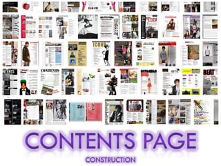
Contents Page Construction - AMPLIFY
1.
2.
3. To create my contents page, I started off with a blank canvas filled it in black and gradually built up my contents page by layering and overlapping , images, shapes and text. Firstly I created a new page on Adobe InDesign , and made a new layer and used the “rectangle tool” to create a black background. I did this because black represents Protection, power and authority it also evokes strong emotions and by using this colour I am showing the sheer passion which is spread through music in the hip-hop genre
4. On the contents page I decided to put red and blue rectangular boxes across the outline of the page to frame my contents page and make it look more colourful and tried to keep the layout similar to the layout of the front cover. Also on my front cover I used blue and red coloured boxes to underline the key aspects of my music magazine, I also added the magazines name “Amplify” by the heading of the page. However due to the lack of place and my creative mind , I was able to rotate the text so it stood vertically , thus when people turn the page they will still know its an amplify magazine , creating a sense of continuity towards the audience .On the blue rectangular box under the heading I put the season and issue no. so the reader would know what edition of the magazine they are reading
5. After looking at some hip-hop magazine I realised that the colour trend or theme was continued throughout the magazine , so I kept the font “Gill Sans Ultra Bold "the same as I used it for the artist’s name on the front cover. This theme of continuity supported the idea of brand identity , and that the colours enhance and draw in more potential buyers I feel that this font is simple ,bold and gives off a cool trendy look . I used the same technique as I did on the front cover, I used the “outer glow” effect to highlight the readers attention on the heading “contents”, this shows that this page is used to navigate the articles and topics covered in my magazine.
6. I needed a main image on my contents page, to do this I looked back at my flat plan , and researched on who I wanted my magazine to appealed to . I wanted my magazine to appeal to both genders , hence I used a image of a female model. I wanted to place my main image is on the right hand side of my contents page, as would it be in a typical hip-hop magazine . I designed my layout so it matched the outline of real music magazines. In the main image, the model is smiling, even though I wanted to pursue a hard core look on my front cover , by having my model looking more serious and having a male model .However I wanted to create a more fun – loving atmosphere, on my contents page where it would appeal to both genders, of different ages and teenagers from different ethic backgrounds and general lovers of real hip-hop music ,thus increasing my sales. Also because I wanted to make my magazine more original and not be too hard core because it would put off people buying my magazine, and in doing this is I have caused my magazine to look more diverse
7. I uploaded the image I wanted onto Adobe Photoshop I then removed the background, and started removing the small blemishes and sharpen the image using the “spot healing tool”. I then used the “Film Grain” effect to highlight and brighten the image, later I decided to add the “Cut-out” effect to make my image look more authentic and , bubbly as it made my image look more like a painting Stages I took in creating my main image on my contents page
8. After editing my main image I saved it as a PNG file and imported and placed it across onto my contents page on Adobe InDesign. As I wanted my main image on the right hand side of my contents page the hands of the model could not fit, without being squashed or distorted, therefore I cut the hands off, so my image now looked more bigger, better and brighter, I also rotated the image so it was facing the text on the left hand side to focus people attention on the topics. Later on I added multi-coloured boxes to separate articles into different topics/sub-headings, even though pink and orange where not in my colour scheme I believe that it would make the contents page more eye-catching and stand out.
9. I then added the sub-headings and small white rectangular boxes to underline them . After I added the article topics which would be of interest to the typical 16-24 year old hip-hop aspirer. Later I decided to add the models name , again I used the same font and the “outer glow “ tool to highlight the key features of my contents page, I believe this was successful, as I stood at the back of the classroom and mainly saw that the glowing part , stood out the most and therefore I know that it will grab peoples attention when they walk past their local supermarket
10. As I need minimum of four images on my magazine, I decided to add another picture of “Lil Rayne” by the exclusives category where it would enhance readers so that they would read his interview. I wanted to portray “Lil Rayne”, as the real him, as I did not add any effects I only removed the background and saved it a PNG file , then imported it onto Adobe InDesign.
11. After adding the image , there was still a gap under the bottom strip, so I added a strap-line or slogan at the bottom , to summarise what my magazine is all about "Turn up the volume and AMPLIFY your life to the MAX”, this is the main concept of my whole magazine condensed into one line - it evaluates the main point of my magazine and why is appeals to my target audience of 16 – 24 year olds. As your teenage years are usually filled with showers of homework, peer pressure and exams . The main point of my magazine was to show the fun side of growing up and getting your own way and I believe that my magazine’s slogan clearly represents this.
12.
13.
14. Now became another trial and error process . I tested many different ideas asking my peers if they understood the look I tried to achieve, overlapping ,locking and deleting layers , and changing colours so they suited my colour scheme. After many failed attempts – I finally invented a basic layout which complied with my target audience, stayed within my colour scheme and could potentially be a great value for money MAIN IMAGE FEMALE MODEL LIL RAYNE AMPLIFY
15. I now began to rearrange the boxes, by reducing the size therefore enabling me to add a extra topic ,the “ interviews” section. I then created some headings for potential hip hop articles , and filled in the boxes with around 3 - 4 topics each with a Strapline to get a brief understanding about what the article would be about . I continued to fill in the topics and could already see the difference as contents pages are usually crammed with information . I believe the articles where relevant since I gave a variety of artist names and articles all from multicultural backgrounds and ages , so I can attract a wider audience and try and appeal to as many people as possible
16. I then begun editing the picture of “Lil Rayne”, I used a different mid-shot picture of him standing at a 45 degree angle whilst he was looking directly into the camera I believe this was a effective shot as it showed his facial expressions, body language and the branding on his shirt. By using the “spot healing tool “ on Adobe Photoshop, I was able to smoothen out the image to give a matt finish., and with the “quick selection tool” I was able to select certain samples of the skin and change the “ hue saturation” to even out the matt surface and reduce the shadows on the opposite side of the artists face. Later I used the “Clone Stamp tool” to enhance the artist face, by cloning a area of good skin and replicating it on the blemishes and spots. I also used the same technique to remove his unibrow and then darken the colour of his shirt , I did this because the light reflected on the black top and gave a uneven tone on the artist shirt Original Image Edited Image
18. I then saved the image as a PNG file and then created a new layer on InDesign and placed the image , near the interview section where I have mentioned “Lil Rayne's exclusive interview”, thus the image would relate to the article I wrote “Lil Rayne” on top of the picture of the male artist, and highlighted it with outer glow to make the star persona more iconic. I also placed the magazine name “Amplify” onto of the artist head to fill the gap
19. Since the Main Image on my original contents page was pixelated I re - edited the original image so that the image was in sharp focus. I started to edit my *NEW* main image of the female model on Adobe Photoshop. Firstly I used the Magic eraser tool to remove the grey background, and cropped the image. Since I wanted the model to be facing towards the articles I flipped the image by” Flip the canvas horizontally”. Again I used the clone stamp tool to remove blemishes. I then realised that the model eyebrow looks half chopped off so I replicated the sample from the eyebrow and made her eyebrow longer
20. I also used the clone stamp tool on the models hair since the parting was done free hand and therefore there was a small clear patch, so I cloned a sample area of the hair and replicated it on the clear patch.
21. I then selected the models left eye with the quick selection tool, and started to change her colour of her eyes using the Hue/Saturation tool, I did this since even though the stripes on her shirt where royal navy blue I also wanted another aspect of her to reflect my colour scheme so therefore I altered her eye colour to a dark blue
22. Finally I saved the image as a PNG file and placed it onto InDesign, and added her name and Issue date /season.
23. GRADUAL PROGESSION –> CONTENTS PAGE Original Contents Page Tried and tested Contents page *NEW* Developed Content Page