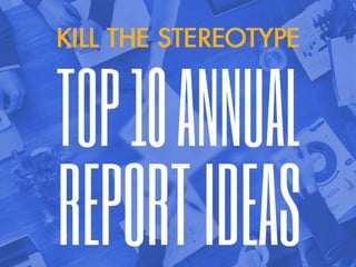
Kill The Stereotype: Top 10 Annual Report Ideas
•
2 j'aime•368 vues

They are often seen as boring and mundane. But truth is, annual reports don't have to be this dull. Here are 10 awe-inspiring annual report design examples that will help you spark off an innovative idea in your next brainstorming session.

Recommandé
Contenu connexe
En vedette
En vedette (11)
Similaire à Kill The Stereotype: Top 10 Annual Report Ideas
Similaire à Kill The Stereotype: Top 10 Annual Report Ideas (20)
Dernier
Dernier (20)
Kill The Stereotype: Top 10 Annual Report Ideas
- 1. Copyright © 2016 Superskill Graphics Pte Ltd. All Right Reserved 1 KILL THE STEREOTYPE TOP 10 ANNUAL REPORT IDEAS
- 2. Copyright © 2016 Superskill Graphics Pte Ltd. All Right Reserved 2 KILL THE STEREOTYPE TOP 10 ANNUAL REPORT IDEAS 1. NTUC FairPrice * designed by Superskill This is a design submitted for a pitch project, with the theme “retailer with a heart” – which explains the illustration of a heart encompassing a happy family and some groceries. The idea is to portray FairPrice as a socially responsible and ethical retailer, be it towards their supplier or their clients. The combination of infographic illustrations and photographs livens up the look and feel, as well as making data and key information easily digestible.
- 3. Copyright © 2016 Superskill Graphics Pte Ltd. All Right Reserved 3 KILL THE STEREOTYPE TOP 10 ANNUAL REPORT IDEAS Ascendas is pretty innovative in terms of their annual report distribution. They combine an offline and online approach, by having a downloadable version online, as well as distributing DVDs to shareholders in a printed folder. This approach not only minimises waste, as annual reports only have a one-year life span; it also helps the company save a lot of cost on print production. Win-win! 2. Ascendas (A-REIT / Ascendas Hospitality Trust)
- 4. Copyright © 2016 Superskill Graphics Pte Ltd. All Right Reserved 4 KILL THE STEREOTYPE TOP 10 ANNUAL REPORT IDEAS 3.BanLeongTechnologies * designed by Superskill (in collaboration with Provomo) Here’s another example of annual report designed by us for a pitch project. The 3D illustration developed for the front cover design represents smart home technologies, where the iPhone is used to illustrate smart tech.
- 5. Copyright © 2016 Superskill Graphics Pte Ltd. All Right Reserved 5 KILL THE STEREOTYPE TOP 10 ANNUAL REPORT IDEAS 4. NIS If we’re going to make a list about annual report designs, NIS cannot be excluded. Just look at the impeccable work – the colour combination, typography choice, engaging graphics, beautiful images. We just love how the long form content can be presented so concisely, yet still leave plenty of breathing space for the other design elements. If you prefer printing over digitizing, do it like NIS does. Perfect. Source: Metaklinika
- 6. Copyright © 2016 Superskill Graphics Pte Ltd. All Right Reserved 6 KILL THE STEREOTYPE TOP 10 ANNUAL REPORT IDEAS 5. Google Speaking of perfection, Google has it all. How can they not? They’re the biggest tech giants in the world after all. And their annual report is just as on point. The sharp edges, grey- scaled cover and corporate colour for the inner pages are the perfect combination. It transforms Google’s previous annual reports into something highly innovative and sophisticated. Absolutely love it! Source: Behance
- 7. Copyright © 2016 Superskill Graphics Pte Ltd. All Right Reserved 7 KILL THE STEREOTYPE TOP 10 ANNUAL REPORT IDEAS 6. WANdisco WANdisco is bringing back the true definition of “less is more” with their minimalist design. It is achieved simply by adding a die-cut that forms their company logo to the cover – thus revealing a bright red colour peeking through the die-cut hole – combined with a blind spot UV varnish on the title. Simply…stunning! Source: Behance
- 8. Copyright © 2016 Superskill Graphics Pte Ltd. All Right Reserved 8 KILL THE STEREOTYPE TOP 10 ANNUAL REPORT IDEAS 7. SAQ Here’s another great example of a minimalist approach. SAQ demonstrates that it’s not always bad to have too much white space – especially for annual reports – as it makes reading much easier. And that means better engagement too. The size of the annual report also mimics that of a menu, with icons like a wine glass, cutlery and bottle on the front cover to represent the company’s line of business. Isn’t it cute? Source: Behance
- 9. Copyright © 2016 Superskill Graphics Pte Ltd. All Right Reserved 9 KILL THE STEREOTYPE TOP 10 ANNUAL REPORT IDEAS5 EASY TIPS TO ATTRACT AND ENGAGE EXHIBITION ATTENDEES 8. FedEx For a logistics and transportation giant, FedEx certainly does not play safe with their annual report design. The concept involves using clocks to portray time assuring delivery – which is the company’s core value – and colour blocks for a bold and bright effect. Each chapter is then represented with a different colour: red, green, orange and blue with overlay bold text on duotone pictures. The outcome is nothing short of amazing. Source: Behance
- 10. Copyright © 2016 Superskill Graphics Pte Ltd. All Right Reserved 10 KILL THE STEREOTYPE TOP 10 ANNUAL REPORT IDEAS 9. Mailchimp For those of us who prefer going against the norm and try something a little more… quirky, perhaps we can all learn a thing or two from Mailchimp. Mailchimp not only makes sending email campaigns a load of fun for email marketers, their annual reports are no exception. They don’t just crush the annual report stereotype (a boring 24pp booklet); they also inject life into it – by making it interactive. Now that’s a killer report! Source: Mailchimp
- 11. Copyright © 2016 Superskill Graphics Pte Ltd. All Right Reserved 11 KILL THE STEREOTYPE TOP 10 ANNUAL REPORT IDEAS 10. Shopify Speaking of going against the mainstream, how could we forget Shopify? It’s one of our personal favourites. Shopify demonstrates yet another great example of digitised annual report. It combines images, animation, graphs and a timeline of events to communicate growing numbers and key information. It is so engaging it makes us want to go shopping right away! Source: Shopify