1. Genre, Iconography and Ideology
By Temi Adeuya
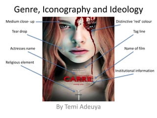
Medium close- up
Name of film
Distinctive ‘red’ colour
Religious element
Tear drop Tag line
Actresses name
Institutional information
2. Something that I would of
expected but is absent is the
other unique selling point of
Julianne Moore’s name not
beings publicized on the poster.
Reason being, I believe that the
distributors wanted the audience
to focus on the central character
of the film, Carrie.
The poster creates a sense of mystery and enigma as it presents
the binary opposition of blood and a tear drop situated on her
face. A sense of this will intrigue to audience to go and see it.
Another interpretation of binary opposition is the theme of
Retribution and forgiveness. Which then determines the seeking
of mercy or despiteful malevolence.
I believe the film producers are
trying to create a sense of
equilibrium, excitement and trill
through the use of the shot type.
As a convention of a horror film, a
third of the main image’s head is
not included in the close up image.
The institutional information I
am provided about the film is
that it is based on a novel by
Stephan King. Having this
stated on the poster itself
promotes the film as he is a
known best selling author in
Britain.
This visual codes that are used
to express the genre of the film
is the symbolic colour ‘red’. This
distinctive shade represents
energy, power and strength that
is about to be exposed by this
out of ordinary young girl.
The written codes that are used to express the genre of the film,
‘know her name. Beware her power’; To me, this is showing
some sort of threat to other stock characters involved and that
are interactive towards this protagonist. Almost as if it is trying
to dictate not to judge a book by it’s cover.