Hire 💕 8617697112 North Sikkim Call Girls Service Call Girls Agency
Dr.Cooper
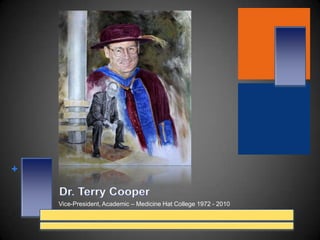
1. Dr. Terry Cooper Vice-President, Academic – Medicine Hat College 1972 - 2010
2. The painting of Dr. Terry Cooper This is a 22"x 25" Pastel drawing of Dr. Terry Cooper Vice President Academic - Medicine Hat College. April 30, 2010 I am very honored to be commissioned for this piece of Dr. Terry Cooper. When Melinda Arthur - Medicine Hat College Executive Advisor approached me with this commission I was standing beside myself...As usual many ideas went through my mind on what the end project was going to look like. Besides having Dr. Cooper as the main character I wanted to bring in a part of the college. As I drove down to the college I was trying to picture what I would like to see in this painting as a reminder to Dr. Cooper. At first the Medicine Hat College sign with the college main building in the background. Then I thought about the beautiful trees on either side the South entrance road with the college in the back ground. I then parked my truck and started walking towards the front main entrance doors where the wonderful architectural design characteristic greeted me. Once I went inside I knew it was something from the inner building that I was going to use. Inside the main foyer there are these marvelous pillar benches spread throughout the main concourse. These majestic silver columns with their wooden round benches gave me the inspiration that I needed. Now I just needed to take pictures.....and of course I didn't bring my camera with me....Why would I bring my camera...? Once inside the college and upstairs in the Senior Administration offices. I met with Melinda where I was presented with several wonderful photos references of Dr. Cooper. One of him in his Convocation ( the Academic Regalia ) and the others of Dr. Cooper standing in different areas of the college. The one that caught my eye was the one of him sitting on the wooden bench with the center pillars. I went with the concept of creating a collage piece where Dr. Cooper would be in full color and a part or a smaller graphite drawing of him. Like I mentioned earlier, in this piece I did the main part, Dr. Cooper, in color then I started the graphite drawing of him. But for some crazy reason I started to add colors to the pillar. You see those pillar's, they have grey in them but also a light blue and a touch of torques blue. Which comes out near the highlight part or reflective part. Then the wooden bench and of course the marble floor with all it's beautiful rustic colors. Oh yeah and the tiles....Wow .there was so much color....!
3. About Joe Versikaitis " There is nothing like going to a live sport event. The excitement of the crowd and the drama of the players is a wonderful sideline to my creative inspiration. As I watch sports from a television’s point of view, I can only tell you who scored, who won, and very little on what the crowd was doing. The real excitement comes from actually being there. Observing the players as they demonstrate their talents and then listening to the reaction of the crowd as they cheer on their super stars. The cheering, booing, clapping, flag waving and the hackling are all elements of any game and therefore are my rendering interpretation. Throughout the years I have created different characters that I incorporate into the crowd of every of my paintings. One sample is the cheering character, the person who has his hands to his face yelling. The other one is the thunder stick person. But I believe the one I really like and I will use more often is the character with the red wig and a black mask. I saw this guy during a break at a Calgary flames game. He was walking towards me wearing this costume. A red afro wig, black mask, face painted red, a Flames jersey, black gym shorts, red leotards and white runners. Oh yeah he was also wearing a red cape and waving a Flames flag…Priceless... These are just a few. With the main character or in this case player it's pretty simple. I’m always looking for a certain pose or a distinguish look of that player. An example of this would be Ken Dryden’s standing and resting his hands on top of his goalie stick. That pose is his character pose. People associate Dryden to that pose. In my world, I would have to say the Theo Fleury painting, that stance is viewed as one of his signature stance. The passionate look just before a face off has to be one of my favorites pose. Do to the fact that A) I had the thrill to watch him play so many times and B) well after painting his portrait, on behalf of my family, it was an honor to meet Theo and his son Josh at the signing of the limited edition prints of " Theo #14 ".. This is what that stance means to me. I've always said that a good painting starts with good reference photography and the proper props. The props are the equipment. This equipment will show me what the fabric does or is doing under certain lights. The leather on the gloves, goalie pads, the cage of the goalie mask or the visor on the helmet each with their own define characteristic on how they reflect or absorb the lights and shadows. I have been fortunate enough to be able to take my own photographs at sport events in the past few years. Whether it is hockey, soccer or baseball I’m always fascinated by the action, the emotions (both players and the crowd) and the talent of these sport minded individuals. It is these individual frames in time and a moment in their lives that I wish to capture first in a photograph and then in a drawing or a painting. To render that pose forever.... I believe the final touch would be to have my image exhibited in the sports fan home.” Joe Versikaitis – Artist * 99 Turner Crescent * Medicine Hat, AB * T1R 4K1 * 403 527-3091 * Joev@shaw.ca * www.versikaitis.com
5. The Layout and the Use of Technology Over the years I have developed a process for my own portrait painting concepts. I have a habit, one of my good habits, often I will do a bunch of sketches of alterations and rough ideas. This usually helps me to get the over all sense of impact and mood of that particular piece. From the time I was in grade 6 to now, I have filled many sketch books with these wonderful ideas. Most of them were just that… ideas. But never the less I like to think that the sketching exercises will develop and keep my art sense sharp… In recent years, with all the technology that is out in the world. I as an artist have diverse way’s to create my work. The use of photos as references and the computer has helped me in many ways. The one way is cutting down on the time used to develop a composition. Yes sketching and drawing things out is a very good way to start a composition. But time is a factor and when I have the knowledge to create an image on the computer screen using photographs I will use it. The image comes to life in a split second. I can see the what the final image is going to look like. Using this technology in this manner, I can see the proper dimensions and how everything is going to fit on the canvas before I actually start to paint. Once I am satisfied of the layout I will create black and white print outs for me to use. I use these print as reference to measure the proper size and proportion which I then lightly draw onto my canvas or in this case paper.
6.
7.
8.
9.
10. I spend a little bit of time on this not too much. I just want to get a feel for the gown.
11.
12.
13.
14.
15. The different work in each photo was was about 20 minutes to ½ hour of work. To create the highlights I use a Kneaded eraser. This easer is call Kneaded for the simple fact that you can shape or form it into any shape you want by kneading it into shape. I can make a small point like the width of a sharpen pencil lead to the size of a 2" cube...
16.
17.
18. Using and electric easer I remove the center part of the pillar. This is the shiniest part of the pillar.
19. After adding the light grey and smudging it I can start to add the darker grey to the outer edge.
22. Using a little bit of yellow and light brown I can add some texture to grain of the wood
23.
24. I work the values of the cap much the same as I did the Graphite drawing. I work lights in first then work in the darker purples. I keep repeating this process until I’m satisfied.
25.
26. I worked the light brown’s and yellow’s to create golden looking strings.
27. The final steps I added bits of pure white to create highlights on reflected light on the tassel.
28.
29.
30. I will start with a light color yellow as a base coat for the floor area.
31. Then a bit of a light brown base coat for the area just in under of Terry’s feet.
32.
33.
34. Before I signed the piece I gave Terry’s shoes a bit of highlights. Here you can see his right shoe and the white parts of highlight.
35.
36. Through tried and true techniques, the most challenging aspect of portrait painting is to capture a real likeness of that particular person. The most fulfilling aspect of all is the delivery of the finished piece to find a pleased patron or a pleased parent. Just knowing that I have capture the likeness of their child or loved one makes me want to continue learning and creating… Joe Versikaitis – Artist joev@shaw.ca or www.versikaitis.com